- Welcome
- Data Overview
- How to Use These Data
- Why These Data are Important
- Implications for Public Health Practice
- Analyses
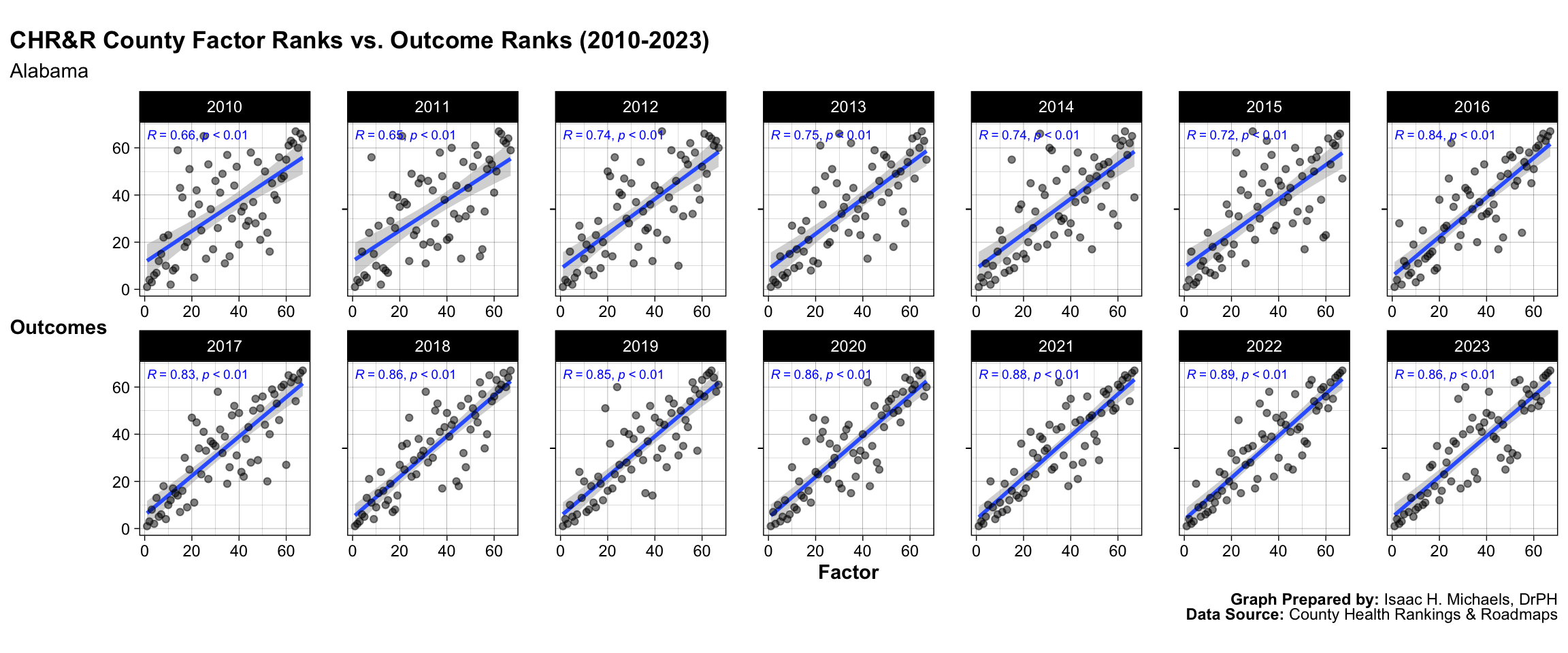
- Alabama
- Alaska
- Arizona
- Arkansas
- California
- Colorado
- Connecticut
- Delaware
- District of Columbia
- Florida
- Georgia
- Hawaii
- Idaho
- Illinois
- Indiana
- Iowa
- Kansas
- Kentucky
- Louisiana
- Maine
- Maryland
- Massachusetts
- Michigan
- Minnesota
- Mississippi
- Missouri
- Montana
- Nebraska
- Nevada
- New Hampshire
- New Jersey
- New Mexico
- New York
- North Carolina
- North Dakota
- Ohio
- Oklahoma
- Oregon
- Pennsylvania
- Rhode Island
- South Carolina
- South Dakota
- Tennessee
- Texas
- Utah
- Vermont
- Virginia
- Washington
- West Virginia
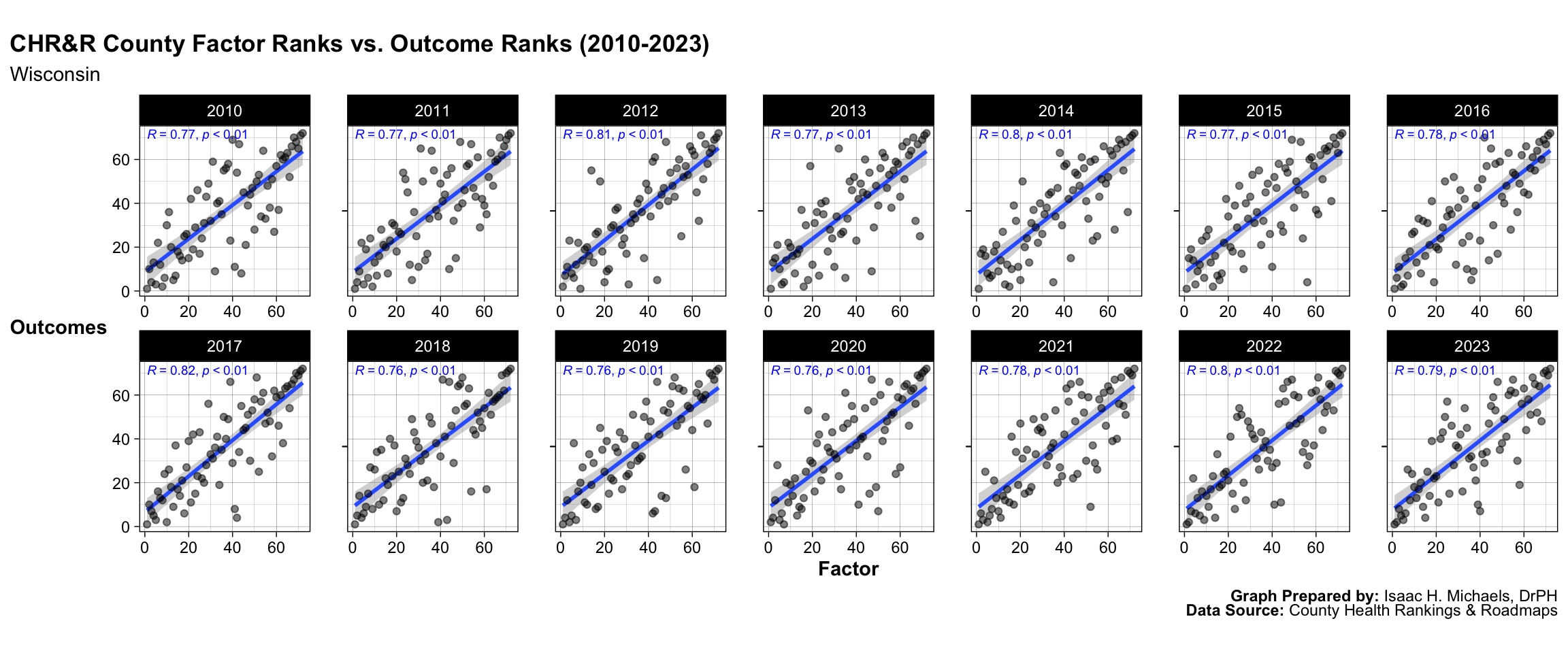
- Wisconsin
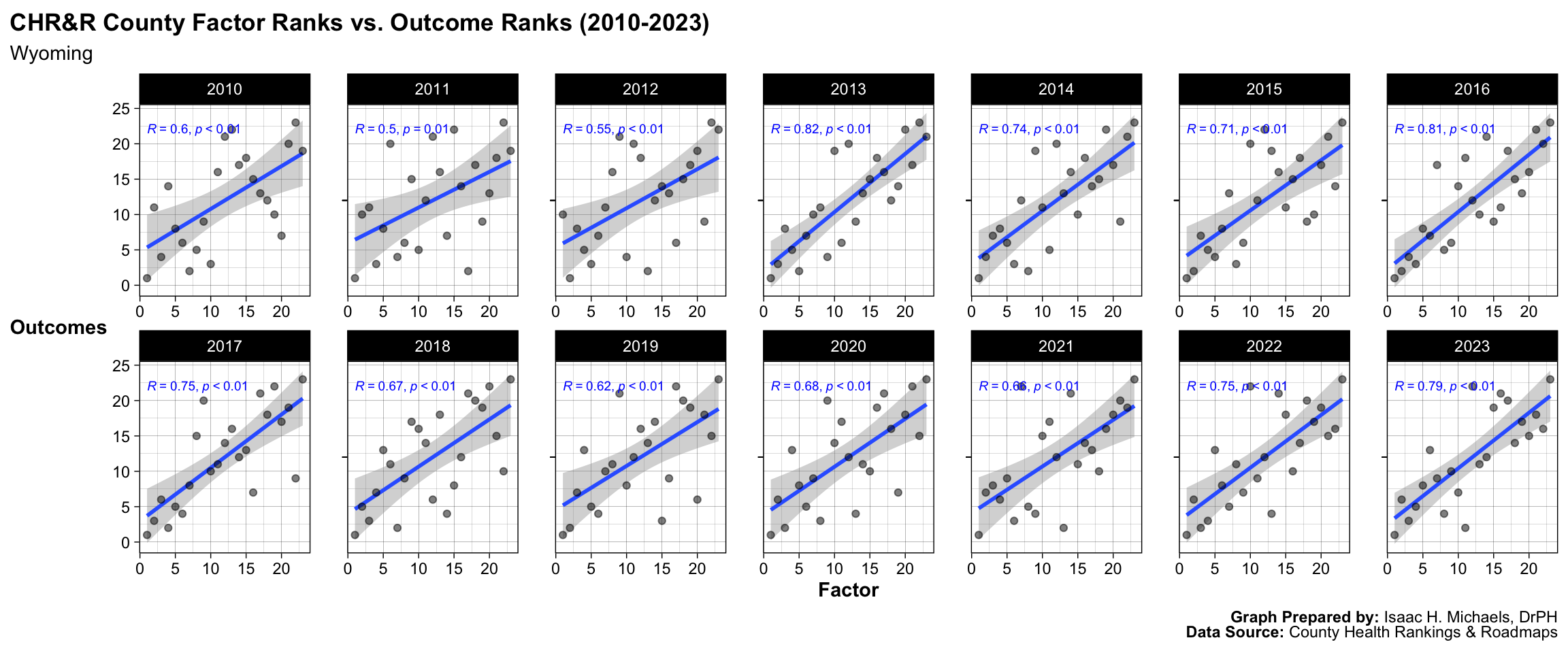
- Wyoming
Published: May 22, 2020
Updated: September 19, 2025 at 01:09AM
Welcome
The focus of this page is to compare trends from 2010 to present in counties’ health factors vs. health outcomes rankings as assigned by County Health Rankings and Roadmaps for each U.S. state.
Data Overview
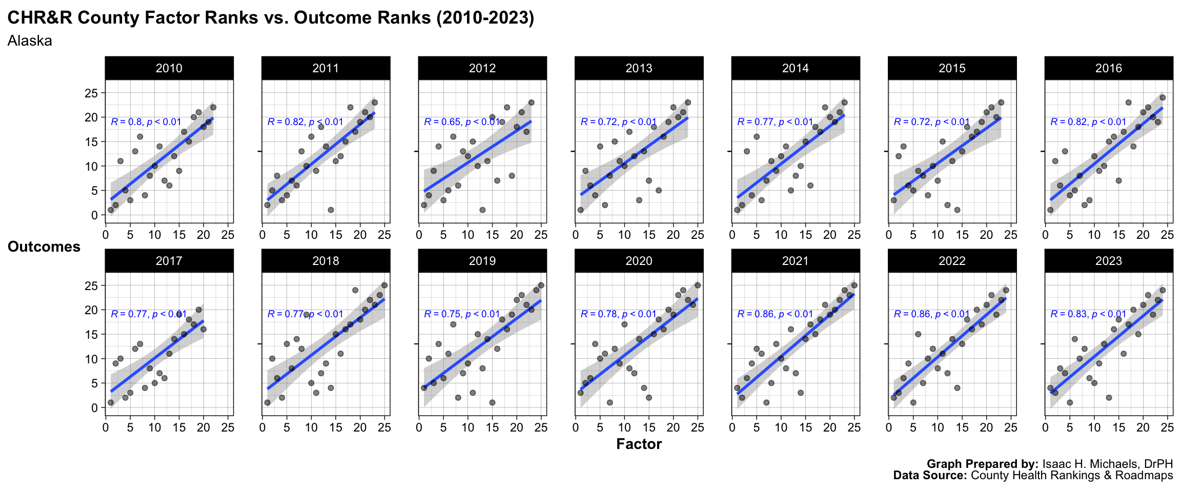
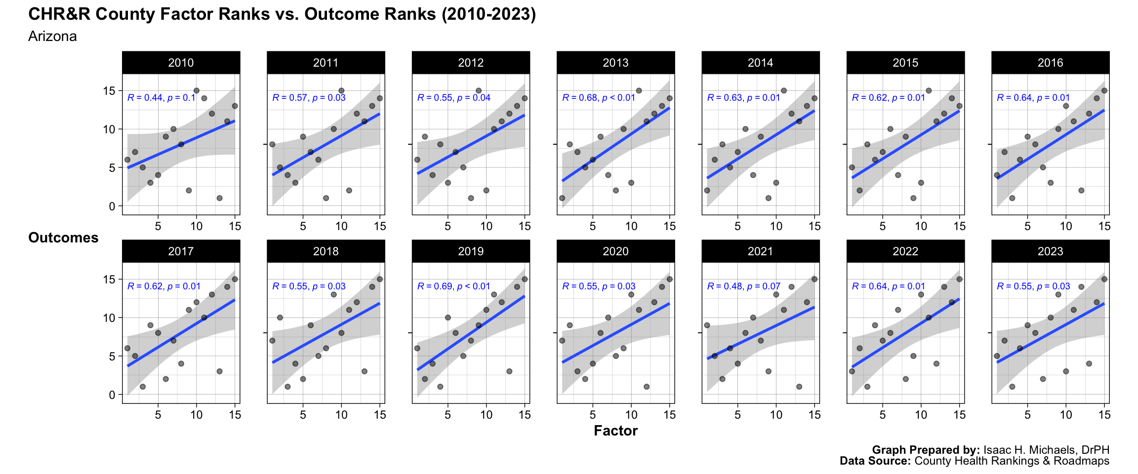
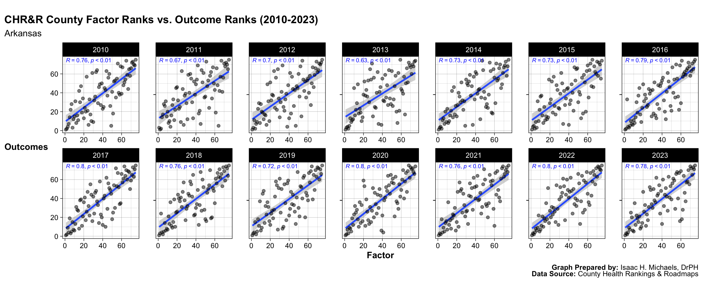
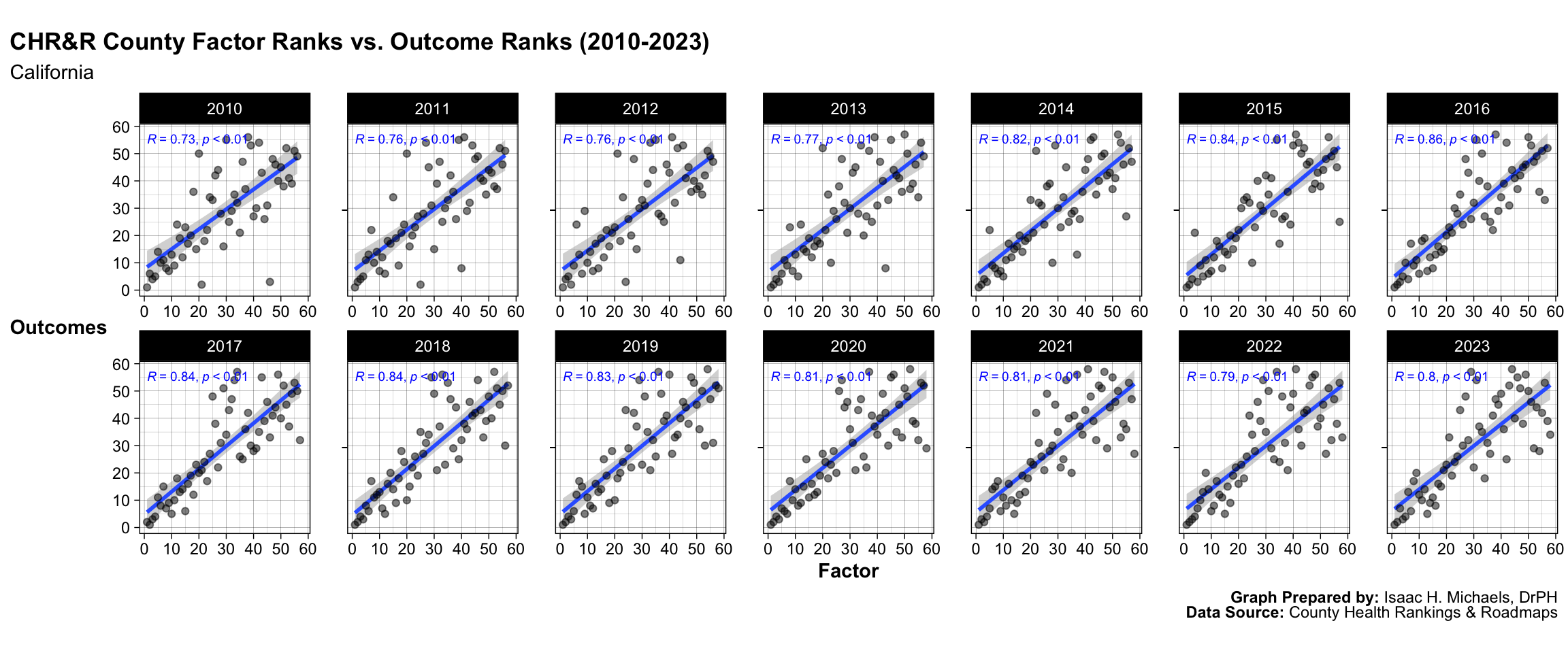
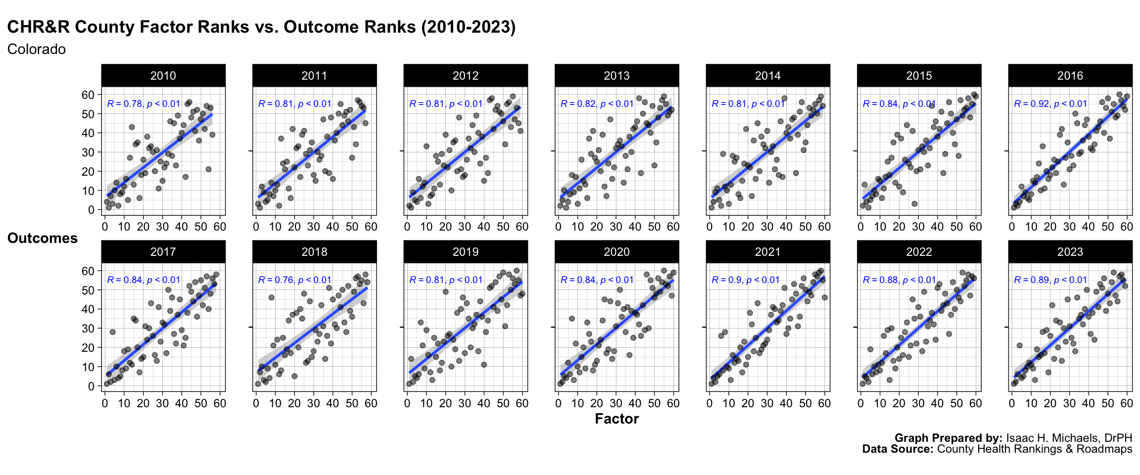
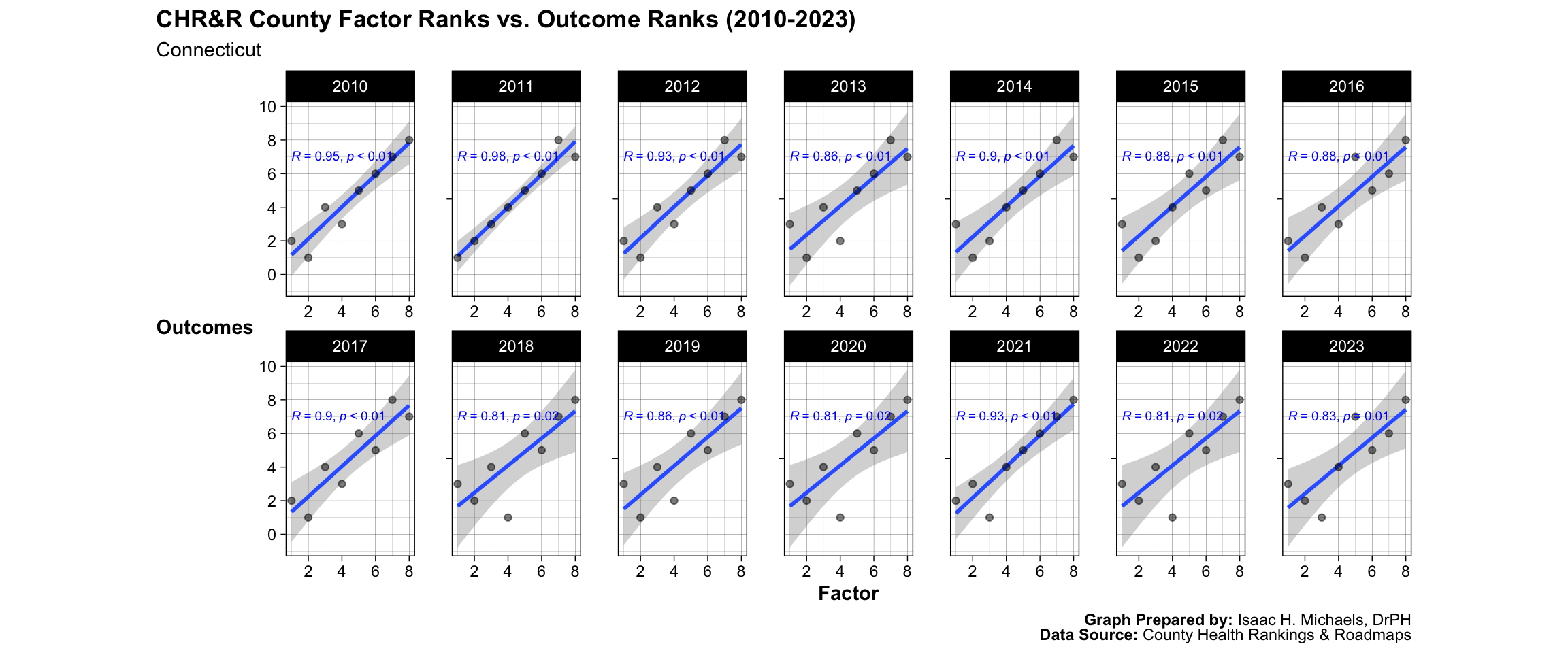
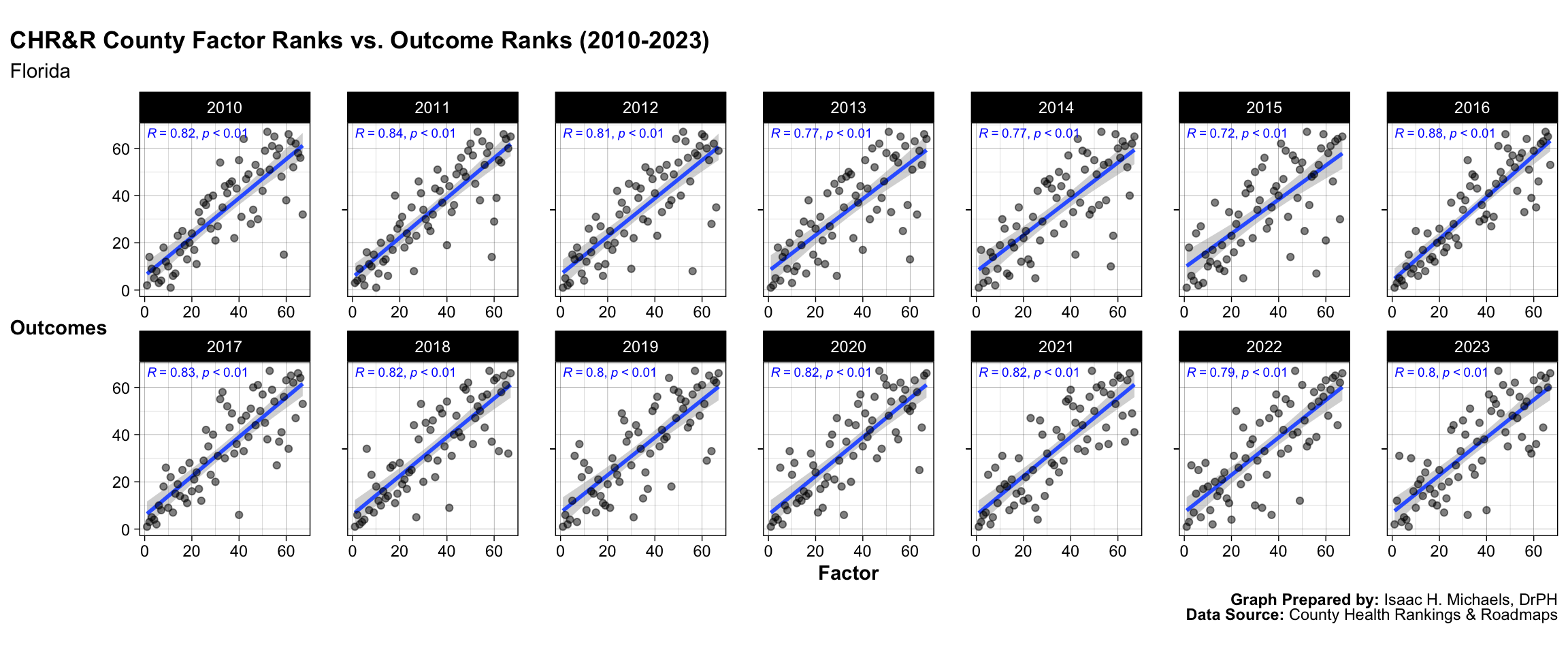
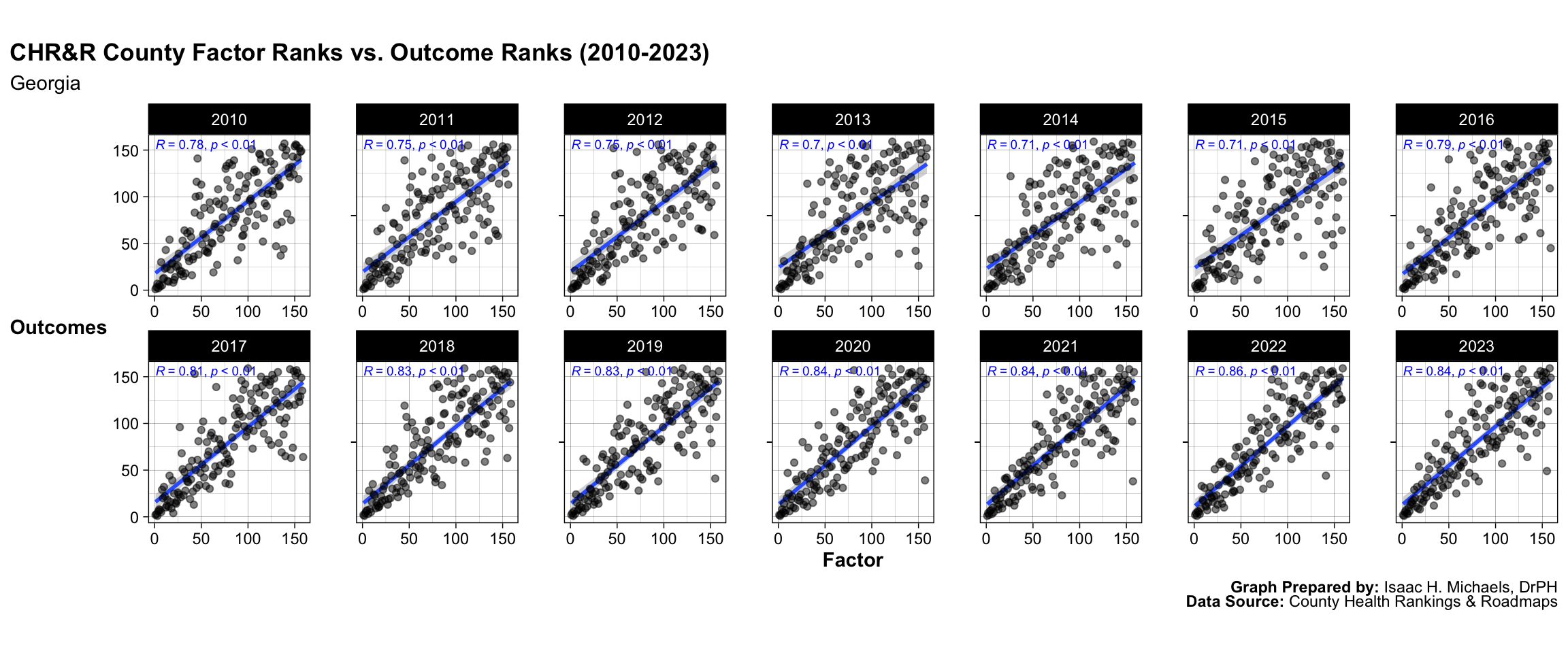
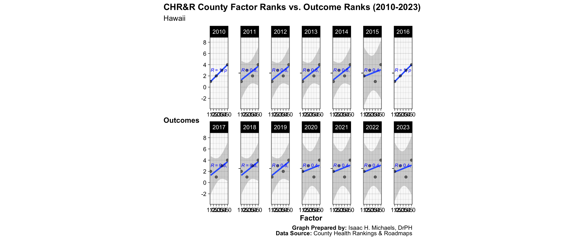
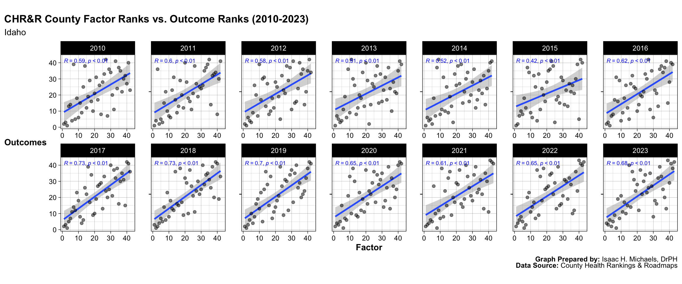
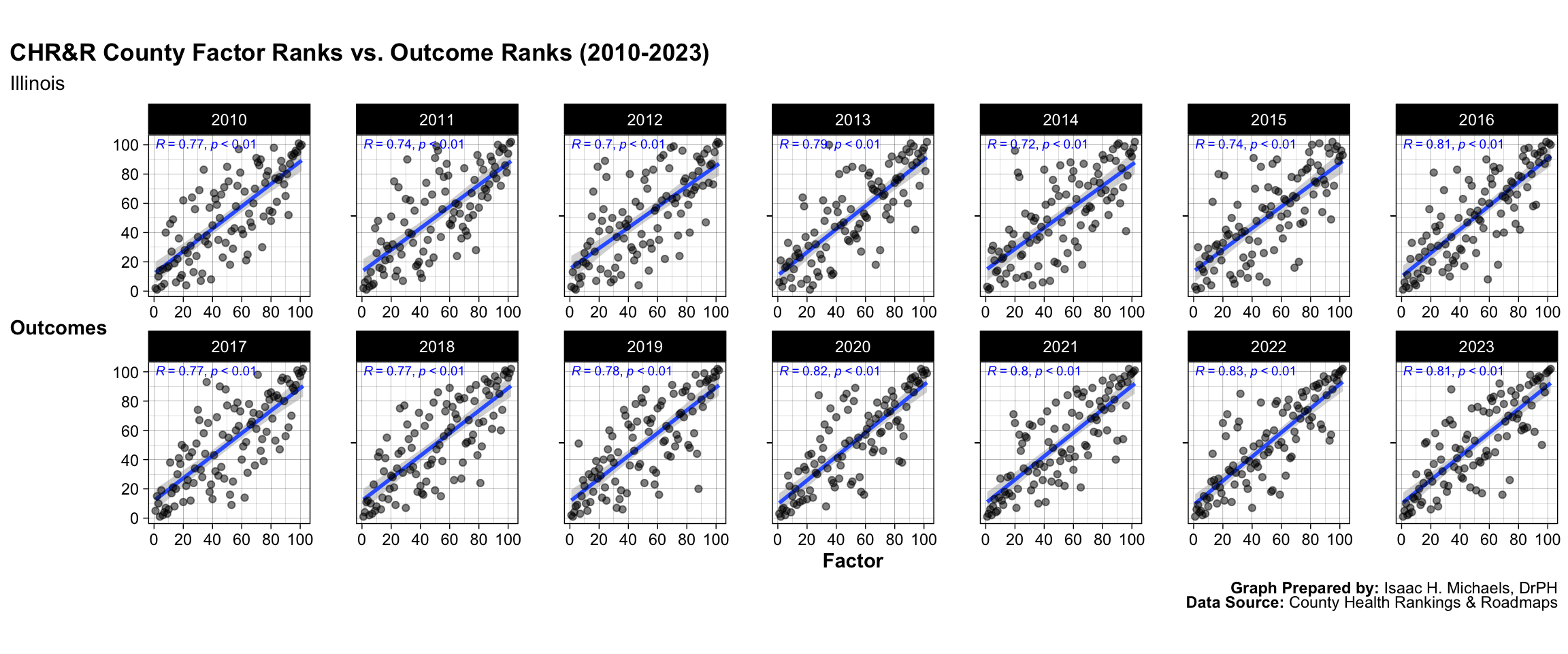
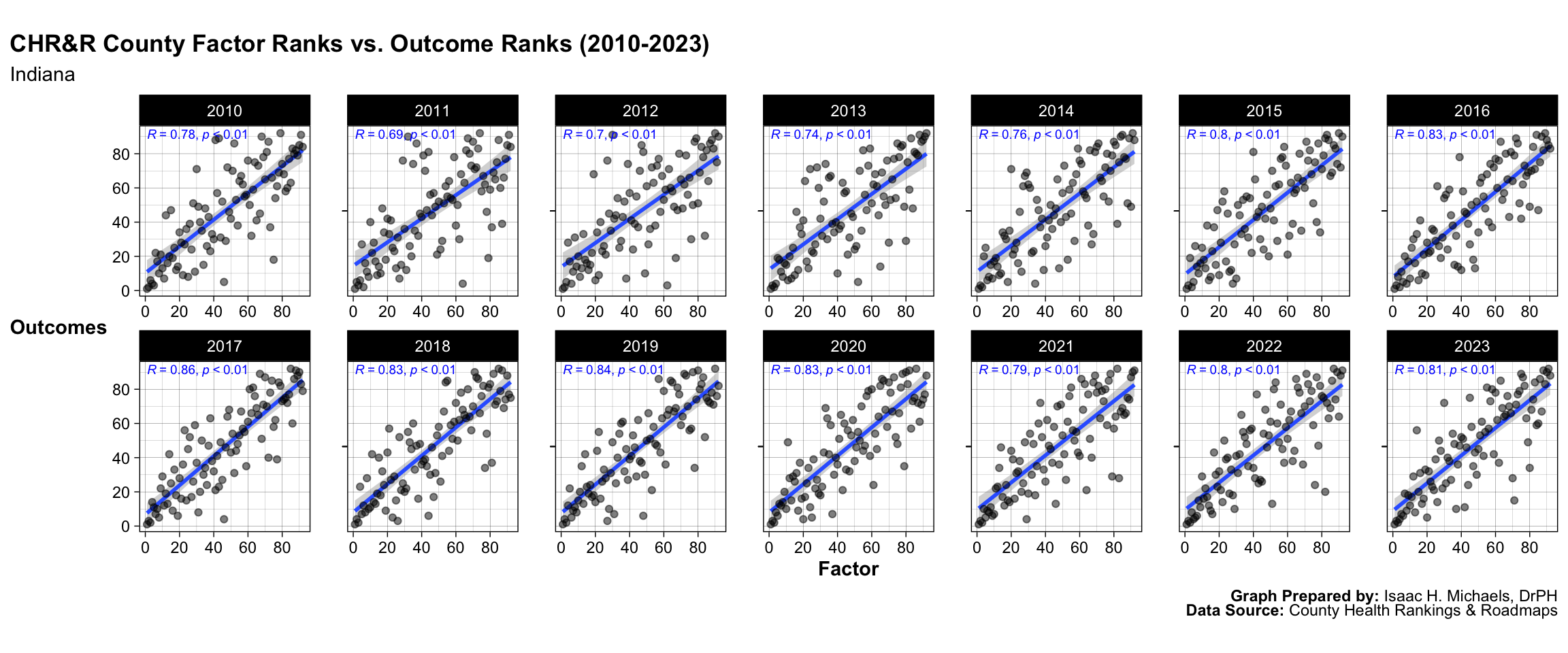
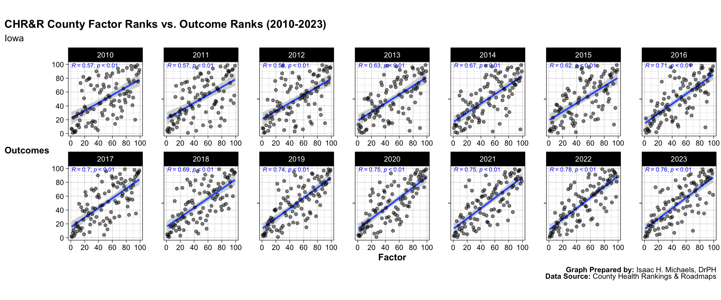
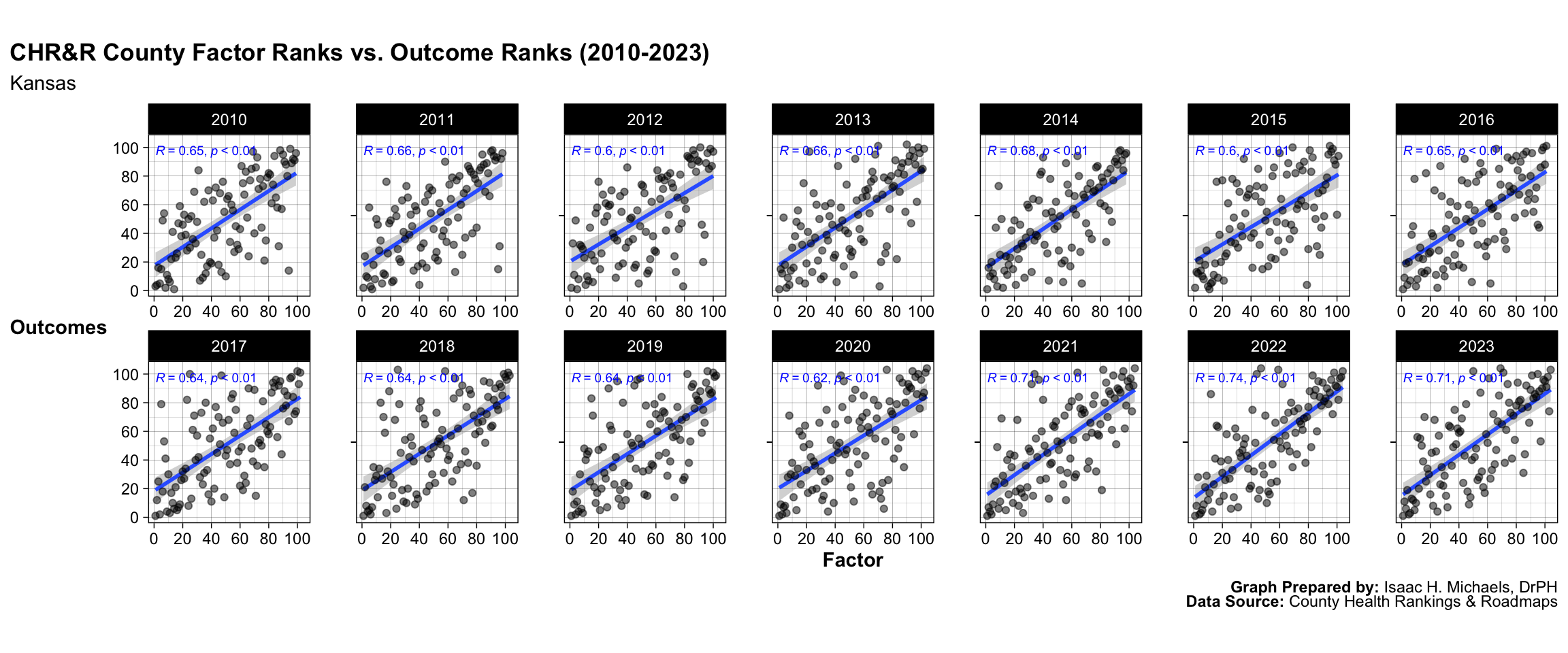
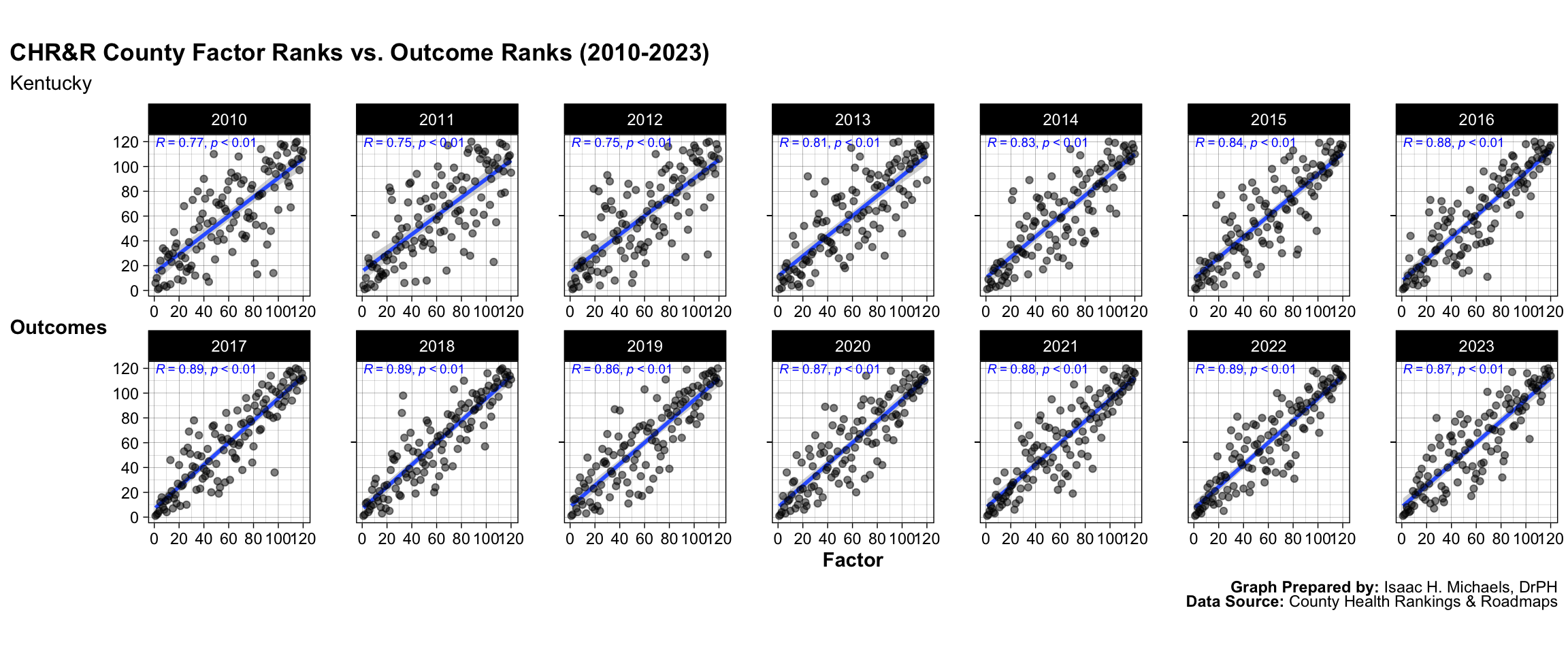
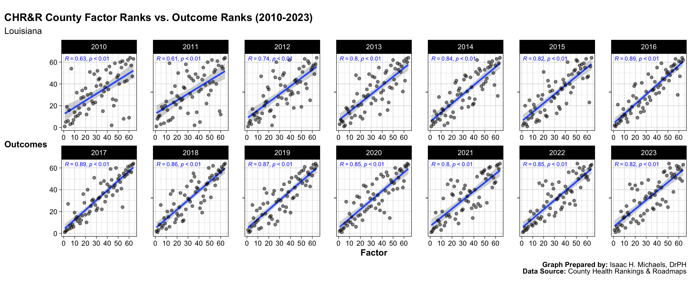
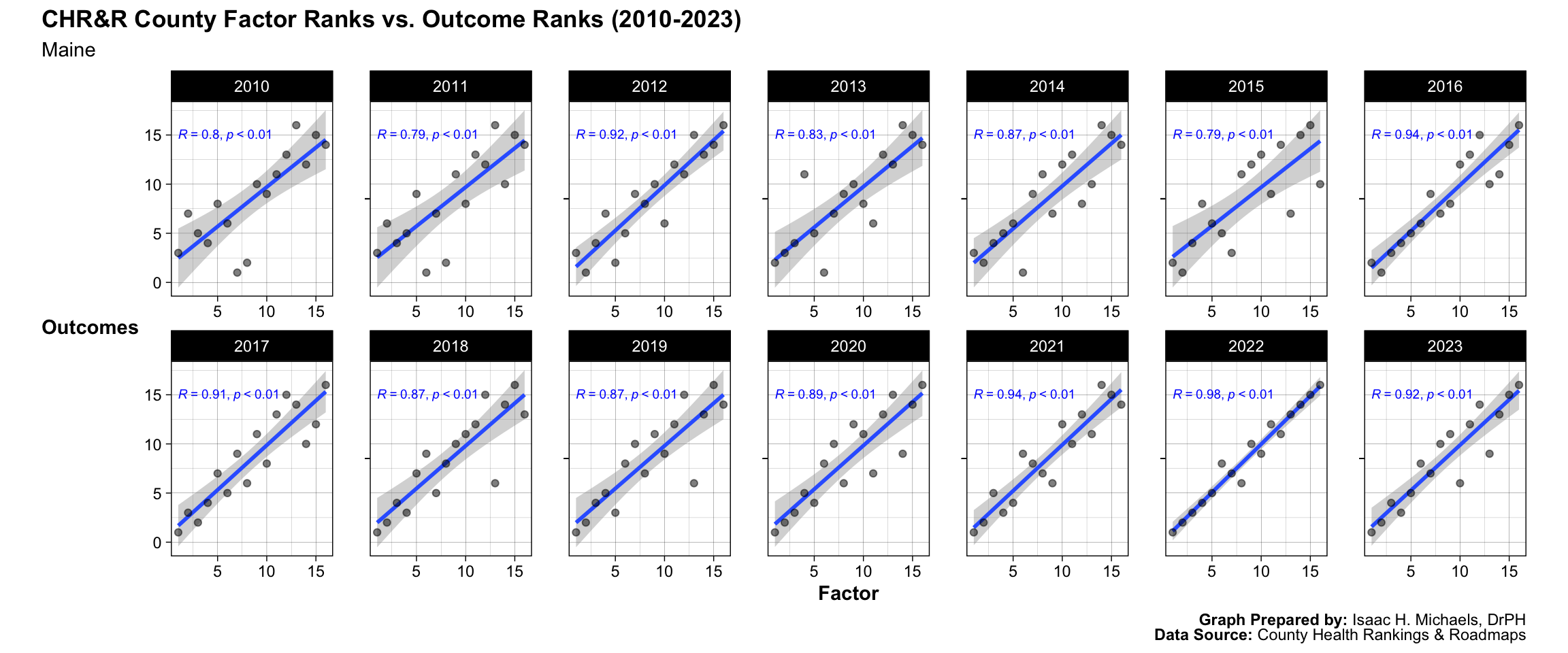
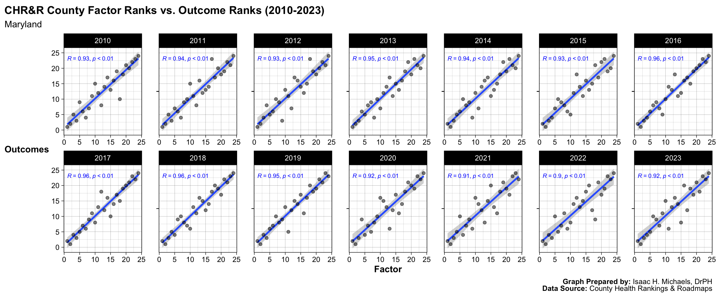
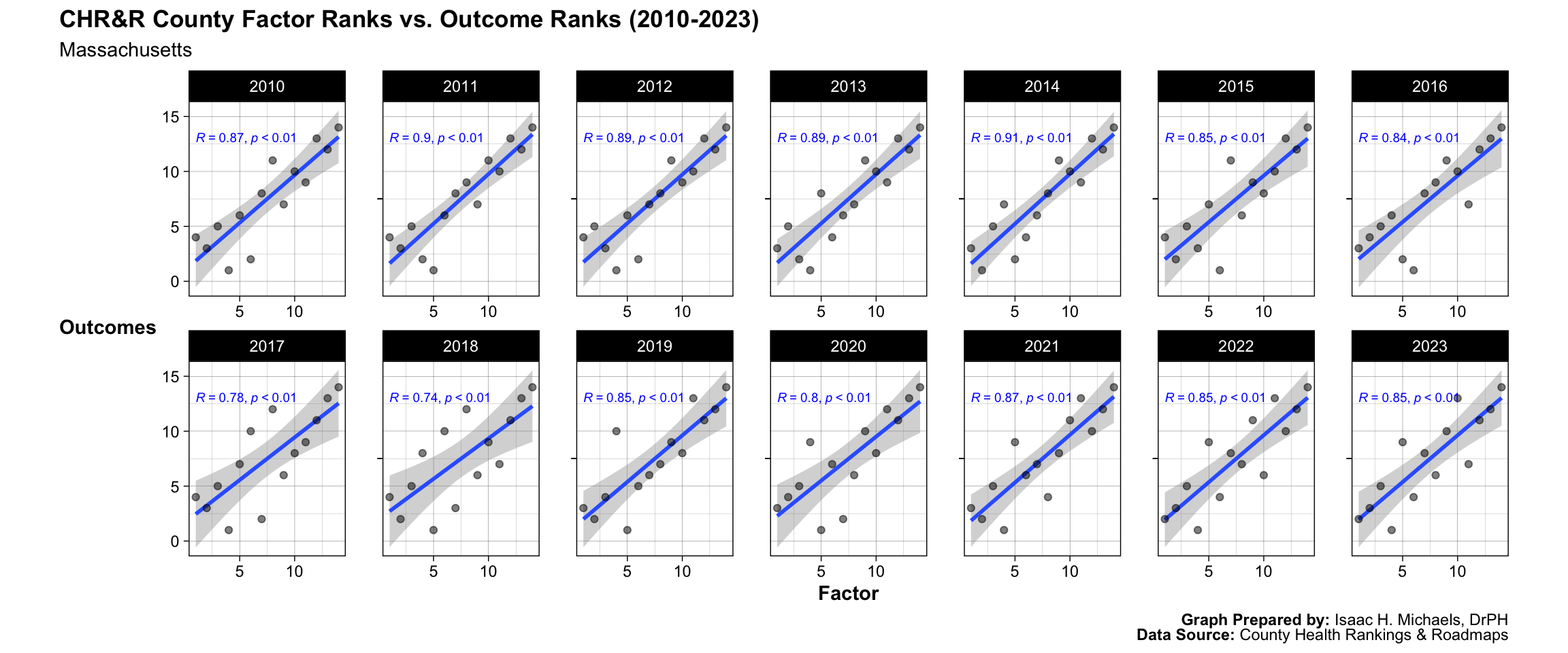
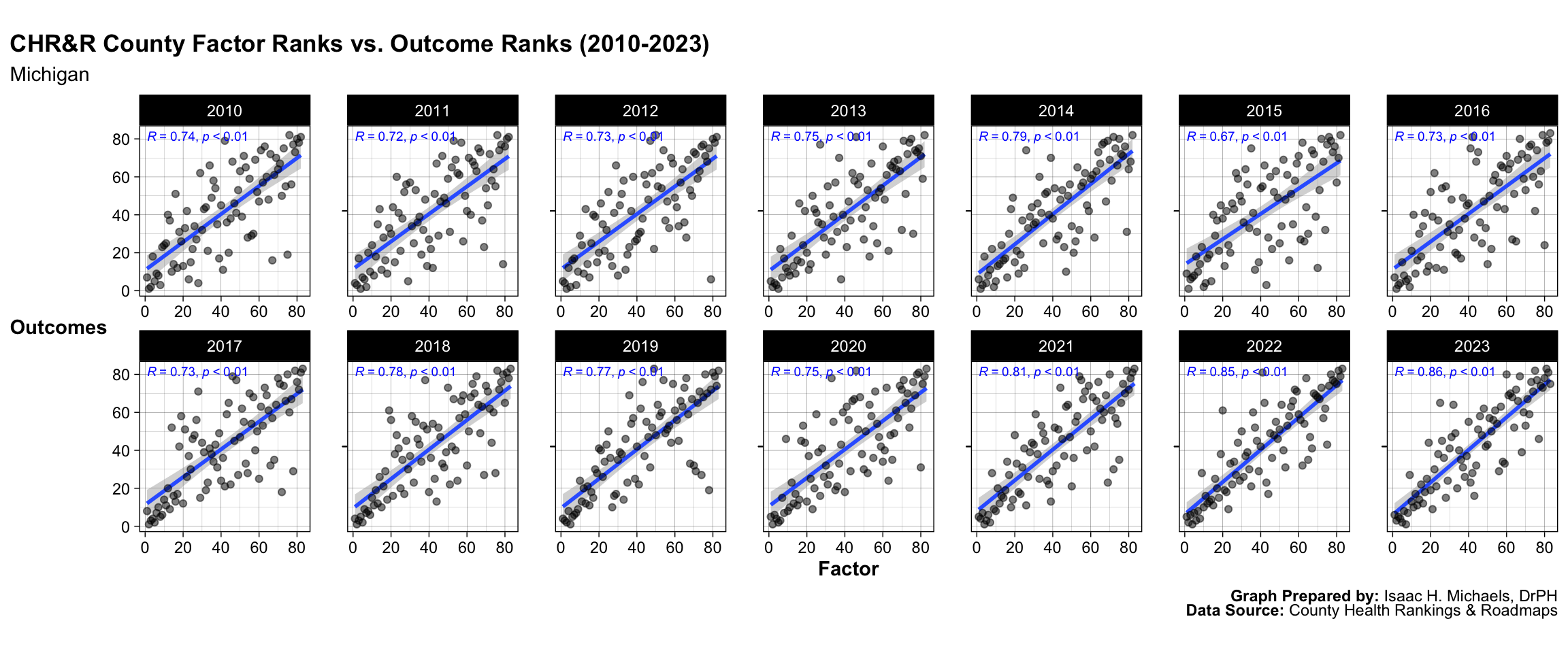
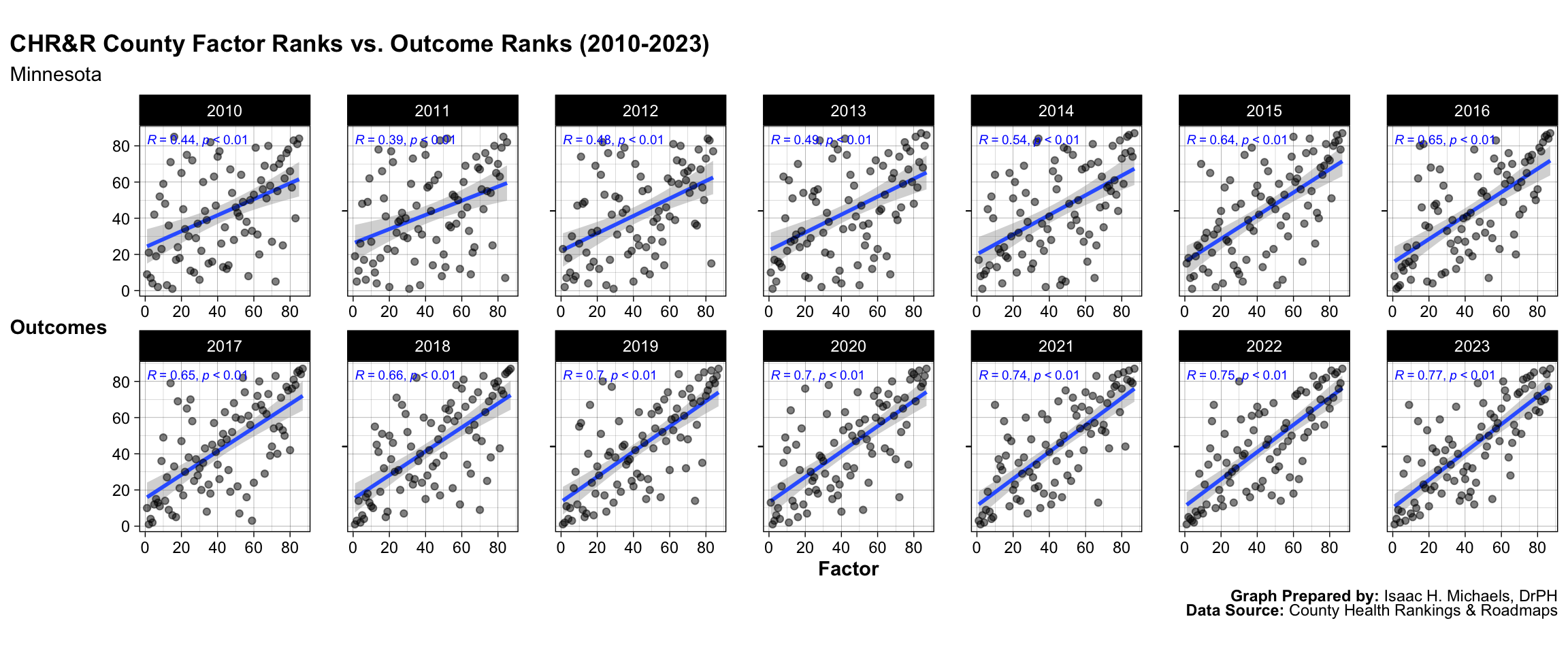
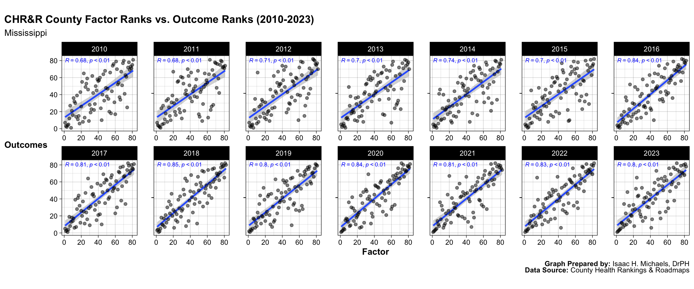
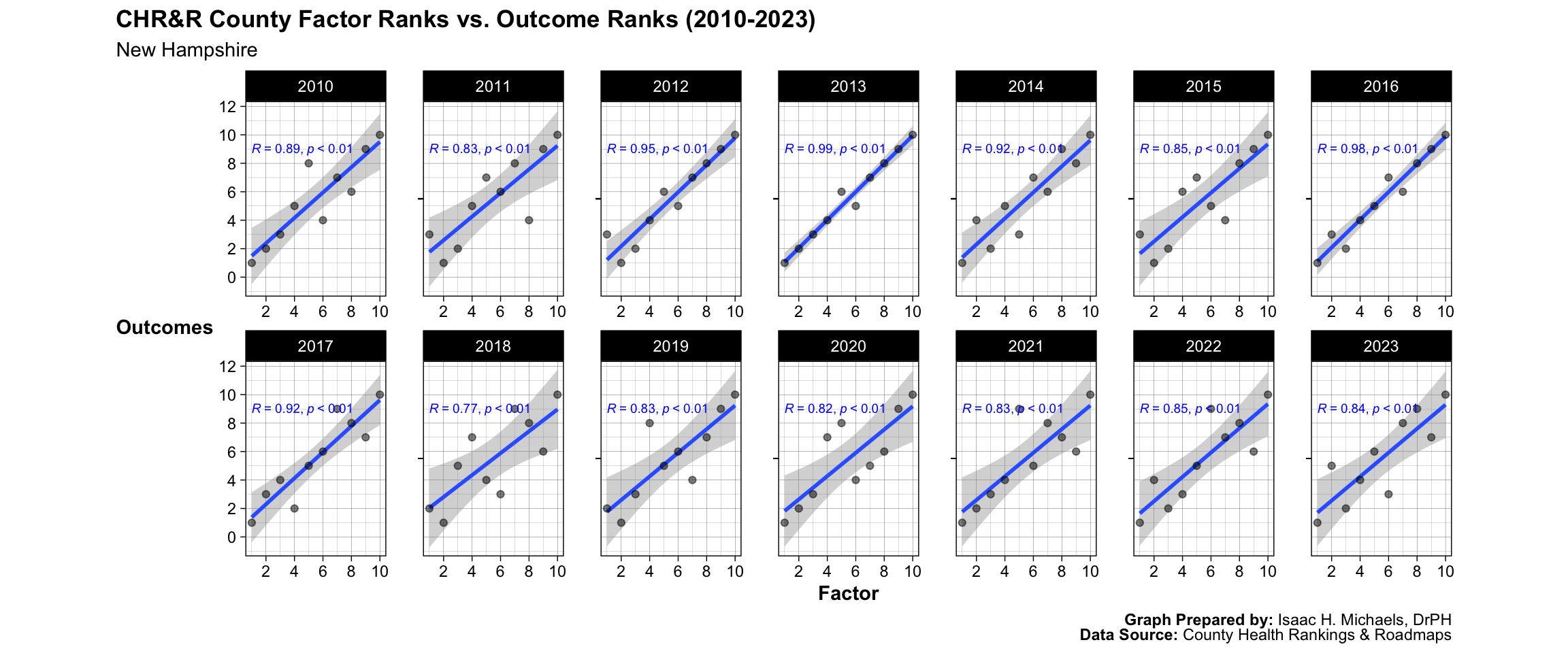
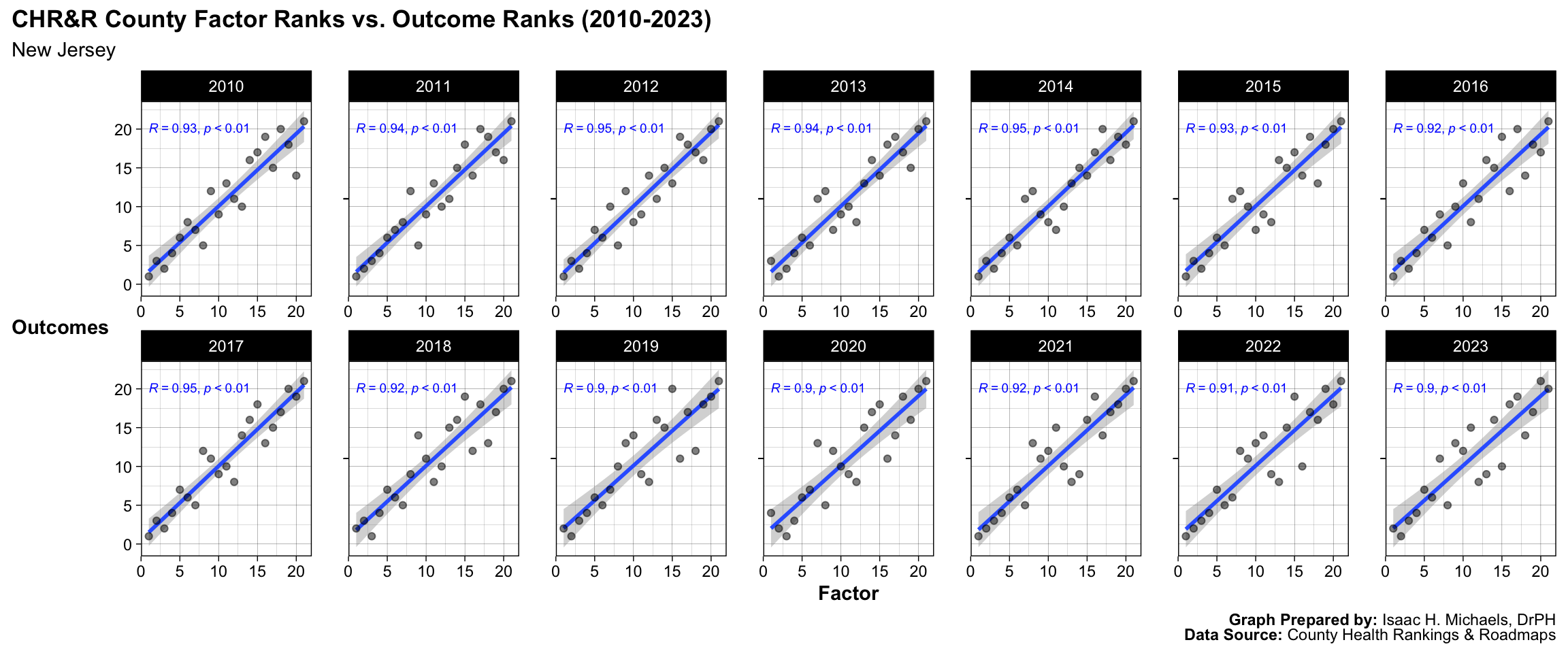
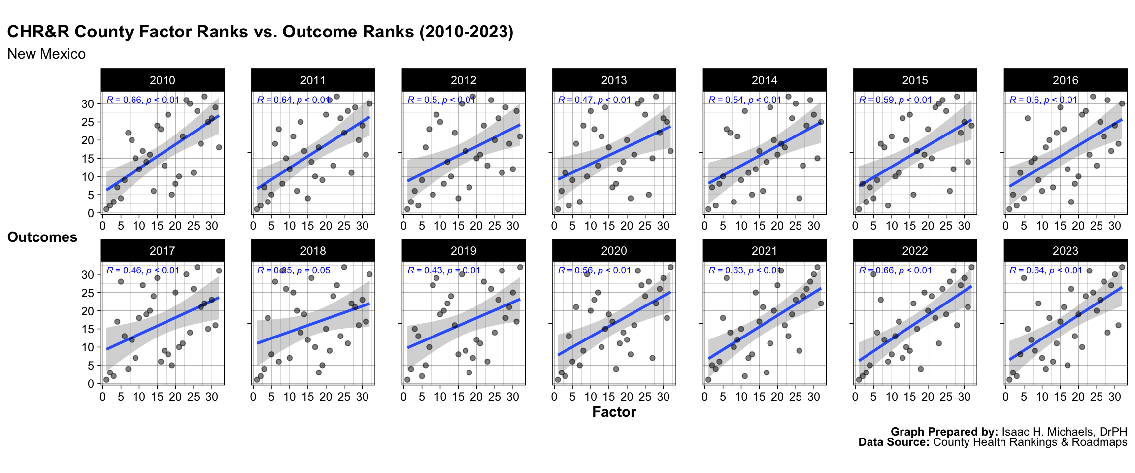
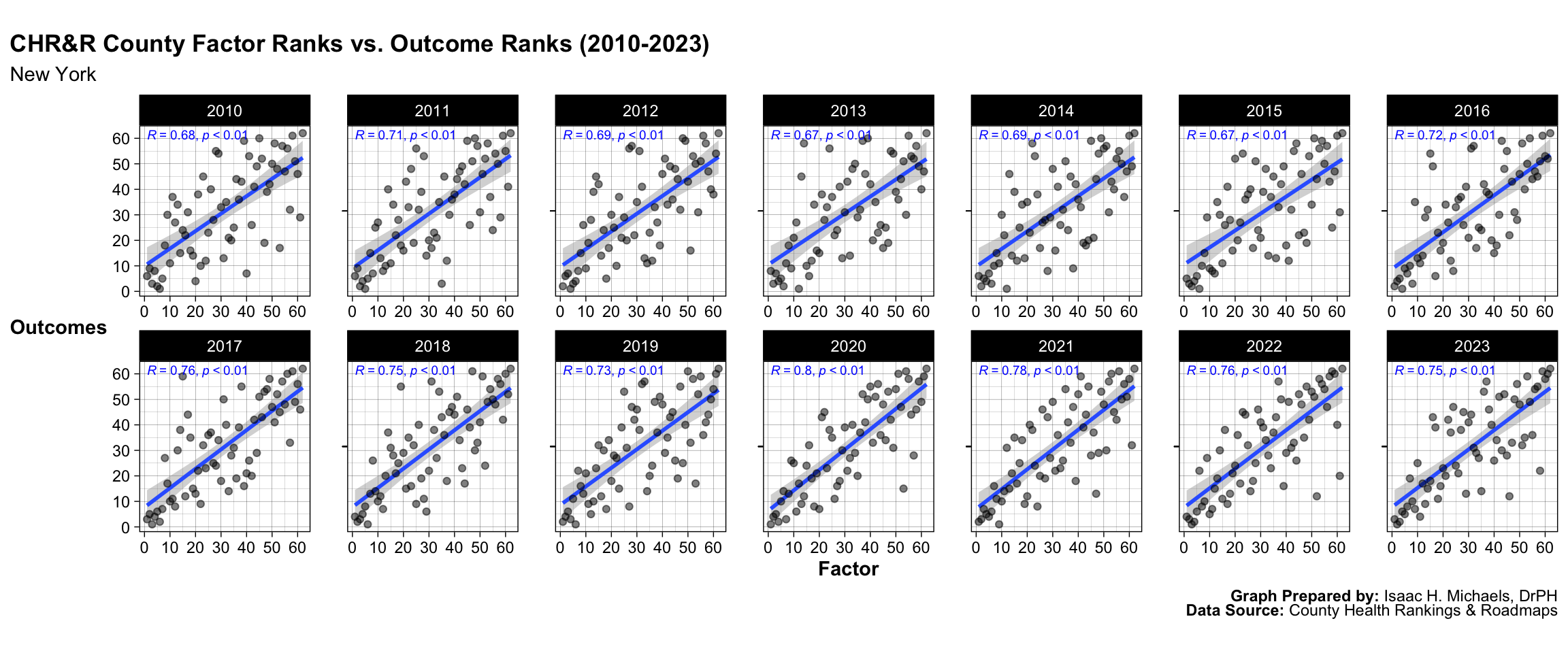
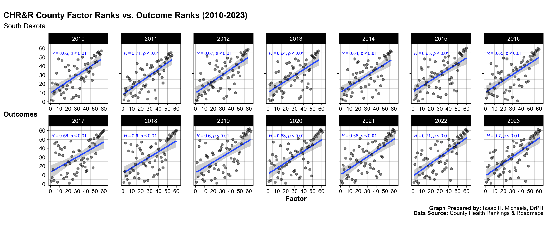
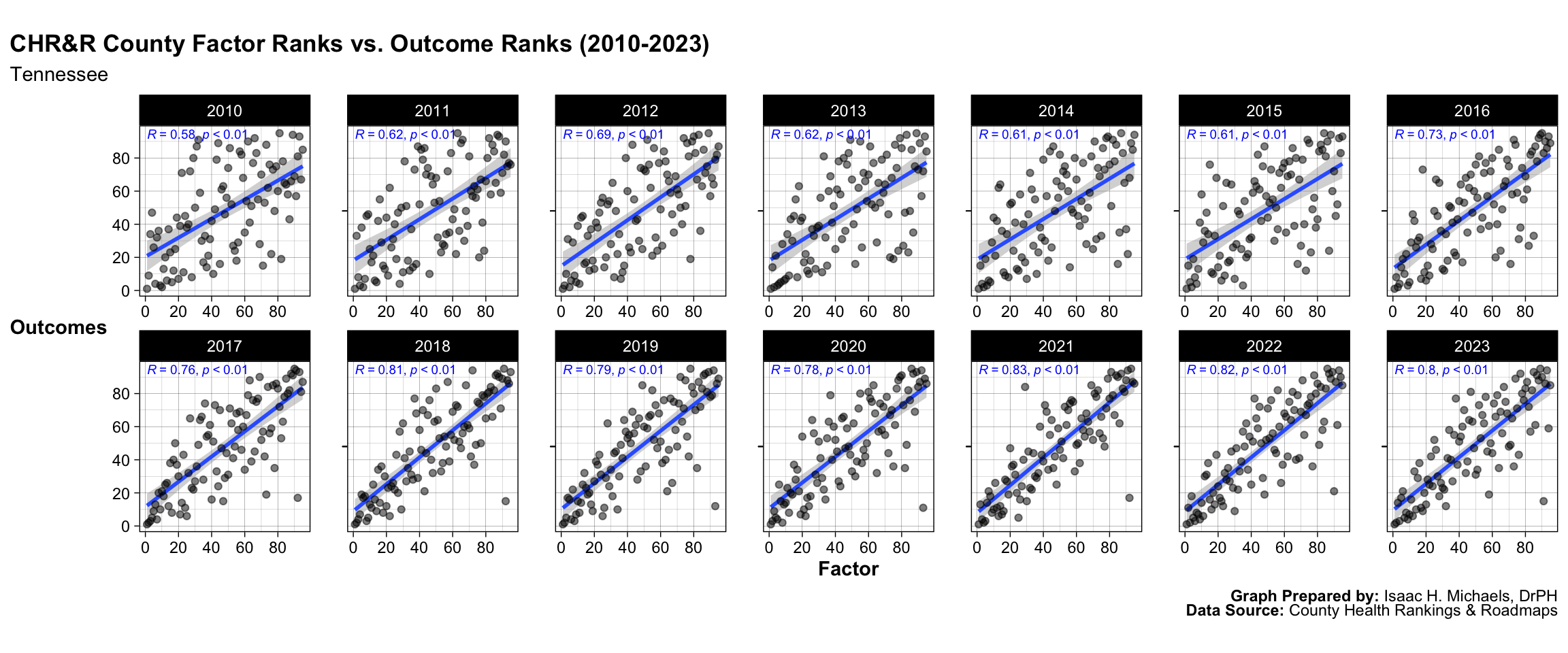
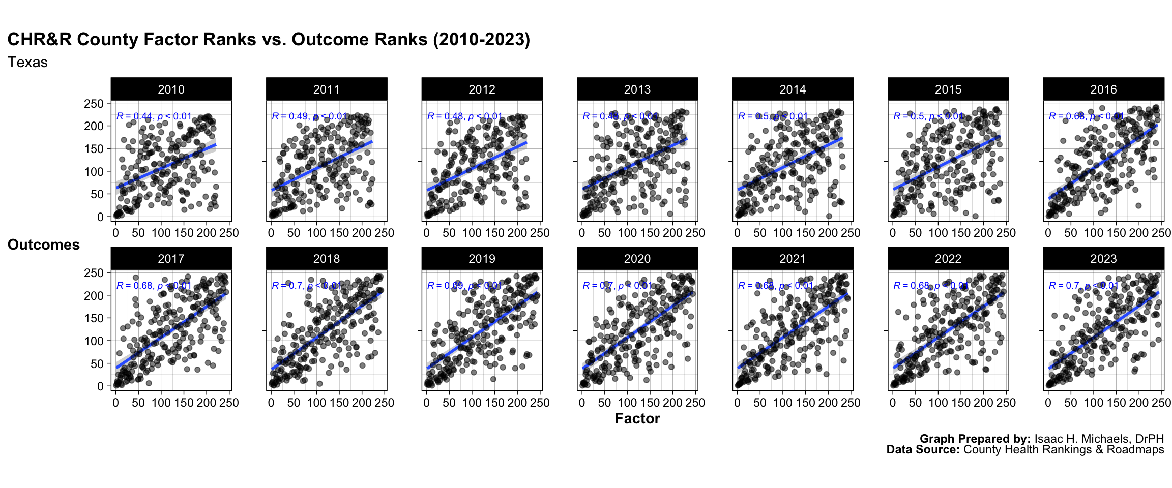
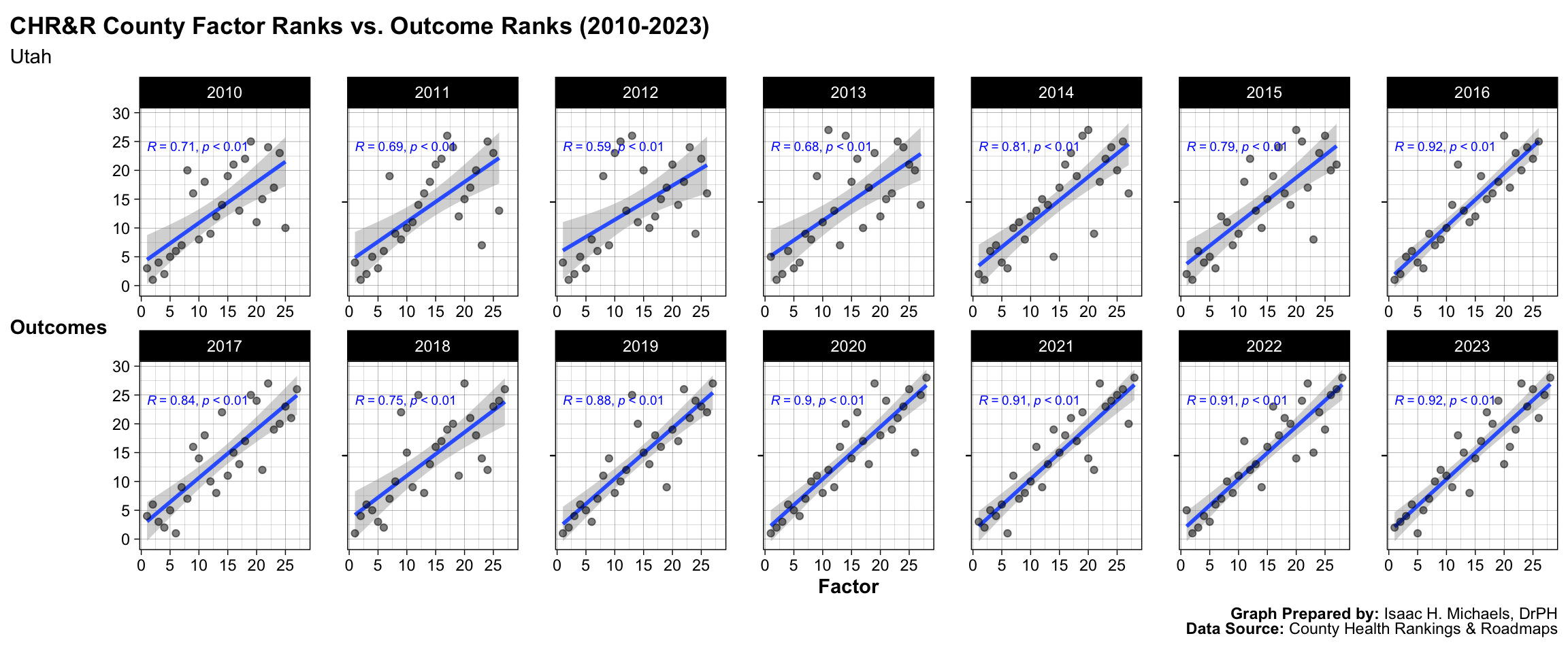
On this page, you will find one graph per state. Each graph contains one panel for each county in the respective state. Each panel presents two lines, one for the county’s health factors rank, and another for the county’s health outcomes rank. The x-axes represent years and the y-axes represent ranks. By comparing the trends, we can visually assess the nature of correlations between factor ranks and outcome ranks at the county level. Additionally, for each state, you will also find a graph containing panels of scatter plots. Each panel represents one year, the x-axes reflect health factor ranks, and the y-axes reflect health outcome ranks. On each panel, there is a linear regression best-fit line overlayed with a 95% confidence interval shaded. Each panel also shows the correlation coefficient and p-value. These scatter plots show the degree to which health factor ranks and health outcome ranks are correlated.
How to Use These Data
These data can be used to identify patterns and correlations between health factors and health outcomes at the county level. The scatter plots provide a visual representation of the degree of correlation between health factors and health outcomes, and the correlation coefficient and p-value provide statistical significance of the correlation.
Why These Data are Important
The County Health Rankings and Roadmaps program is an important tool for public health practitioners, policy makers, and community leaders. It helps raise awareness about the many factors that influence health and that health varies from place to place. Additionally, by providing data on a county-by-county basis, it allows for targeted and localized efforts to improve population health.
Implications for Public Health Practice
These data can be used to inform public health practice by identifying areas in need of improvement, as well as highlighting areas where efforts have been successful. By understanding the correlation between health factors and health outcomes, public health practitioners can prioritize interventions and allocate resources more effectively.
Analyses
Alabama
![]()
Graphs Prepared by: Isaac H. Michaels, DrPH
Data Source: County Health Rankings and Roadmaps
Graphs Prepared by: Isaac H. Michaels, DrPH
Data Source: County Health Rankings and Roadmaps
Alaska
![]()
Graphs Prepared by: Isaac H. Michaels, DrPH
Data Source: County Health Rankings and Roadmaps
Graphs Prepared by: Isaac H. Michaels, DrPH
Data Source: County Health Rankings and Roadmaps
Arizona
![]()
Graphs Prepared by: Isaac H. Michaels, DrPH
Data Source: County Health Rankings and Roadmaps
Graphs Prepared by: Isaac H. Michaels, DrPH
Data Source: County Health Rankings and Roadmaps
Arkansas
![]()
Graphs Prepared by: Isaac H. Michaels, DrPH
Data Source: County Health Rankings and Roadmaps
Graphs Prepared by: Isaac H. Michaels, DrPH
Data Source: County Health Rankings and Roadmaps
California
![]()
Graphs Prepared by: Isaac H. Michaels, DrPH
Data Source: County Health Rankings and Roadmaps
Graphs Prepared by: Isaac H. Michaels, DrPH
Data Source: County Health Rankings and Roadmaps
Colorado
![]()
Graphs Prepared by: Isaac H. Michaels, DrPH
Data Source: County Health Rankings and Roadmaps
Graphs Prepared by: Isaac H. Michaels, DrPH
Data Source: County Health Rankings and Roadmaps
Connecticut
![]()
Graphs Prepared by: Isaac H. Michaels, DrPH
Data Source: County Health Rankings and Roadmaps
Graphs Prepared by: Isaac H. Michaels, DrPH
Data Source: County Health Rankings and Roadmaps
Delaware
![]()
Graphs Prepared by: Isaac H. Michaels, DrPH
Data Source: County Health Rankings and Roadmaps
Graphs Prepared by: Isaac H. Michaels, DrPH
Data Source: County Health Rankings and Roadmaps
District of Columbia
![]()
Graphs Prepared by: Isaac H. Michaels, DrPH
Data Source: County Health Rankings and Roadmaps
Graphs Prepared by: Isaac H. Michaels, DrPH
Data Source: County Health Rankings and Roadmaps
Florida
![]()
Graphs Prepared by: Isaac H. Michaels, DrPH
Data Source: County Health Rankings and Roadmaps
Graphs Prepared by: Isaac H. Michaels, DrPH
Data Source: County Health Rankings and Roadmaps
Georgia
![]()
Graphs Prepared by: Isaac H. Michaels, DrPH
Data Source: County Health Rankings and Roadmaps
Graphs Prepared by: Isaac H. Michaels, DrPH
Data Source: County Health Rankings and Roadmaps
Hawaii
![]()
Graphs Prepared by: Isaac H. Michaels, DrPH
Data Source: County Health Rankings and Roadmaps
Graphs Prepared by: Isaac H. Michaels, DrPH
Data Source: County Health Rankings and Roadmaps
Idaho
![]()
Graphs Prepared by: Isaac H. Michaels, DrPH
Data Source: County Health Rankings and Roadmaps
Graphs Prepared by: Isaac H. Michaels, DrPH
Data Source: County Health Rankings and Roadmaps
Illinois
![]()
Graphs Prepared by: Isaac H. Michaels, DrPH
Data Source: County Health Rankings and Roadmaps
Graphs Prepared by: Isaac H. Michaels, DrPH
Data Source: County Health Rankings and Roadmaps
Indiana
![]()
Graphs Prepared by: Isaac H. Michaels, DrPH
Data Source: County Health Rankings and Roadmaps
Graphs Prepared by: Isaac H. Michaels, DrPH
Data Source: County Health Rankings and Roadmaps
Iowa
![]()
Graphs Prepared by: Isaac H. Michaels, DrPH
Data Source: County Health Rankings and Roadmaps
Graphs Prepared by: Isaac H. Michaels, DrPH
Data Source: County Health Rankings and Roadmaps
Kansas
![]()
Graphs Prepared by: Isaac H. Michaels, DrPH
Data Source: County Health Rankings and Roadmaps
Graphs Prepared by: Isaac H. Michaels, DrPH
Data Source: County Health Rankings and Roadmaps
Kentucky
![]()
Graphs Prepared by: Isaac H. Michaels, DrPH
Data Source: County Health Rankings and Roadmaps
Graphs Prepared by: Isaac H. Michaels, DrPH
Data Source: County Health Rankings and Roadmaps
Louisiana
![]()
Graphs Prepared by: Isaac H. Michaels, DrPH
Data Source: County Health Rankings and Roadmaps
Graphs Prepared by: Isaac H. Michaels, DrPH
Data Source: County Health Rankings and Roadmaps
Maine
![]()
Graphs Prepared by: Isaac H. Michaels, DrPH
Data Source: County Health Rankings and Roadmaps
Graphs Prepared by: Isaac H. Michaels, DrPH
Data Source: County Health Rankings and Roadmaps
Maryland
![]()
Graphs Prepared by: Isaac H. Michaels, DrPH
Data Source: County Health Rankings and Roadmaps
Graphs Prepared by: Isaac H. Michaels, DrPH
Data Source: County Health Rankings and Roadmaps
Massachusetts
![]()
Graphs Prepared by: Isaac H. Michaels, DrPH
Data Source: County Health Rankings and Roadmaps
Graphs Prepared by: Isaac H. Michaels, DrPH
Data Source: County Health Rankings and Roadmaps
Michigan
![]()
Graphs Prepared by: Isaac H. Michaels, DrPH
Data Source: County Health Rankings and Roadmaps
Graphs Prepared by: Isaac H. Michaels, DrPH
Data Source: County Health Rankings and Roadmaps
Minnesota
![]()
Graphs Prepared by: Isaac H. Michaels, DrPH
Data Source: County Health Rankings and Roadmaps
Graphs Prepared by: Isaac H. Michaels, DrPH
Data Source: County Health Rankings and Roadmaps
Mississippi
![]()
Graphs Prepared by: Isaac H. Michaels, DrPH
Data Source: County Health Rankings and Roadmaps
Graphs Prepared by: Isaac H. Michaels, DrPH
Data Source: County Health Rankings and Roadmaps
Missouri
![]()
Graphs Prepared by: Isaac H. Michaels, DrPH
Data Source: County Health Rankings and Roadmaps
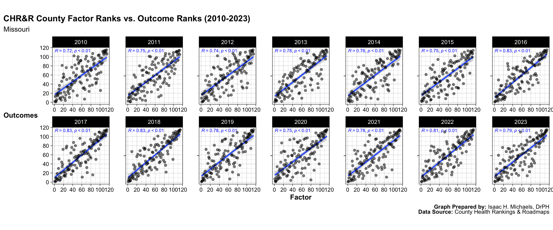
Graphs Prepared by: Isaac H. Michaels, DrPH
Data Source: County Health Rankings and Roadmaps
Montana
![]()
Graphs Prepared by: Isaac H. Michaels, DrPH
Data Source: County Health Rankings and Roadmaps
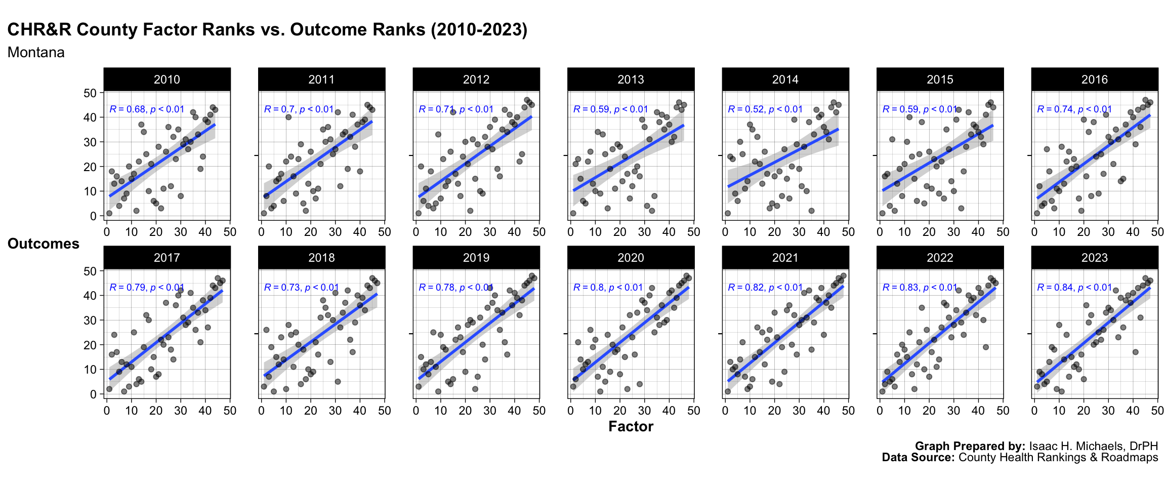
Graphs Prepared by: Isaac H. Michaels, DrPH
Data Source: County Health Rankings and Roadmaps
Nebraska
![]()
Graphs Prepared by: Isaac H. Michaels, DrPH
Data Source: County Health Rankings and Roadmaps
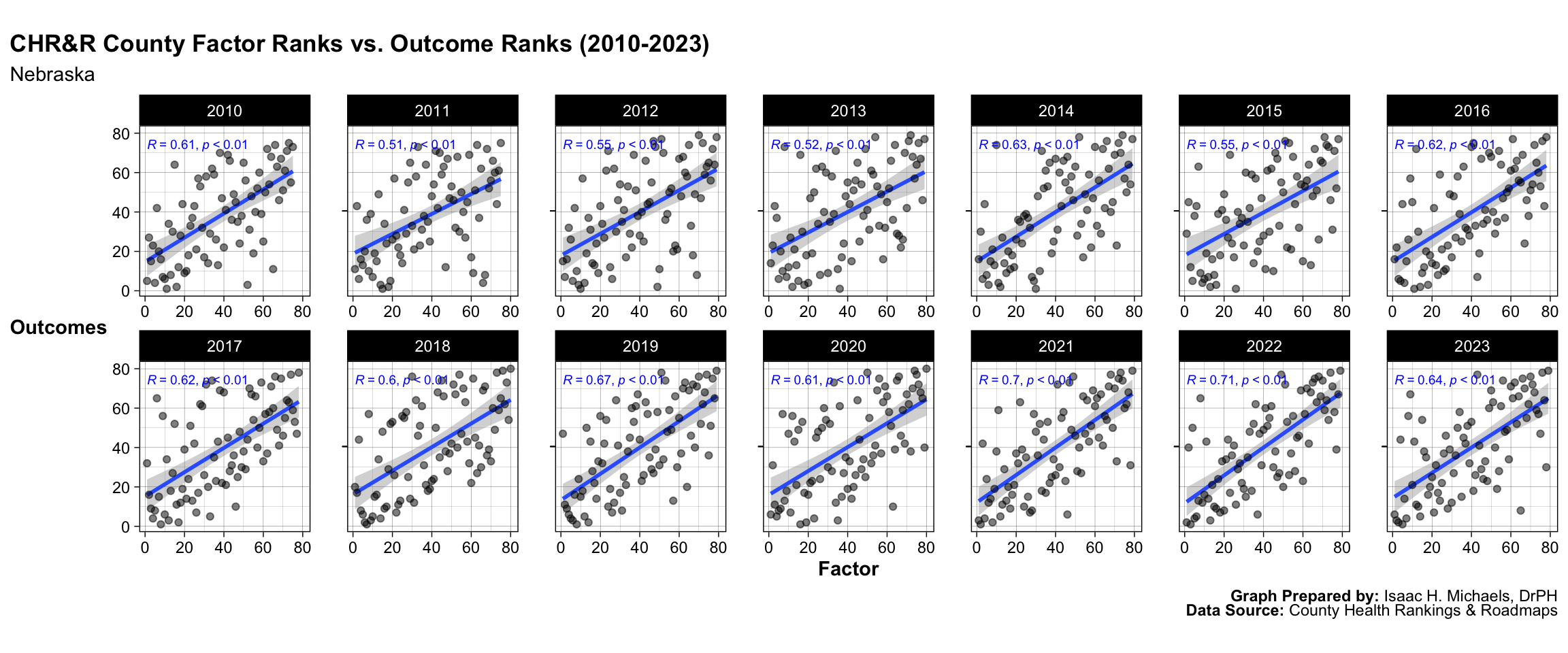
Graphs Prepared by: Isaac H. Michaels, DrPH
Data Source: County Health Rankings and Roadmaps
Nevada
![]()
Graphs Prepared by: Isaac H. Michaels, DrPH
Data Source: County Health Rankings and Roadmaps
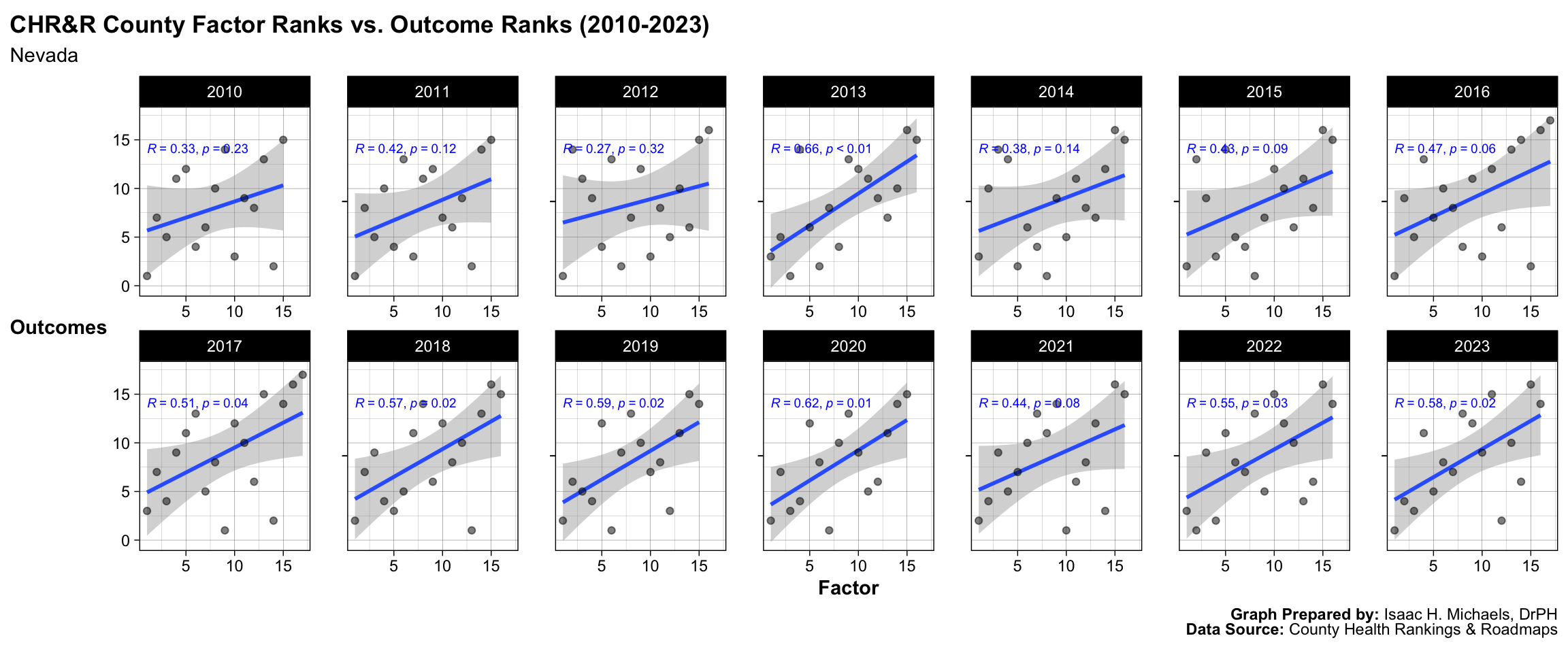
Graphs Prepared by: Isaac H. Michaels, DrPH
Data Source: County Health Rankings and Roadmaps
New Hampshire
![]()
Graphs Prepared by: Isaac H. Michaels, DrPH
Data Source: County Health Rankings and Roadmaps
Graphs Prepared by: Isaac H. Michaels, DrPH
Data Source: County Health Rankings and Roadmaps
New Jersey
![]()
Graphs Prepared by: Isaac H. Michaels, DrPH
Data Source: County Health Rankings and Roadmaps
Graphs Prepared by: Isaac H. Michaels, DrPH
Data Source: County Health Rankings and Roadmaps
New Mexico
![]()
Graphs Prepared by: Isaac H. Michaels, DrPH
Data Source: County Health Rankings and Roadmaps
Graphs Prepared by: Isaac H. Michaels, DrPH
Data Source: County Health Rankings and Roadmaps
New York
![]()
Graphs Prepared by: Isaac H. Michaels, DrPH
Data Source: County Health Rankings and Roadmaps
Graphs Prepared by: Isaac H. Michaels, DrPH
Data Source: County Health Rankings and Roadmaps
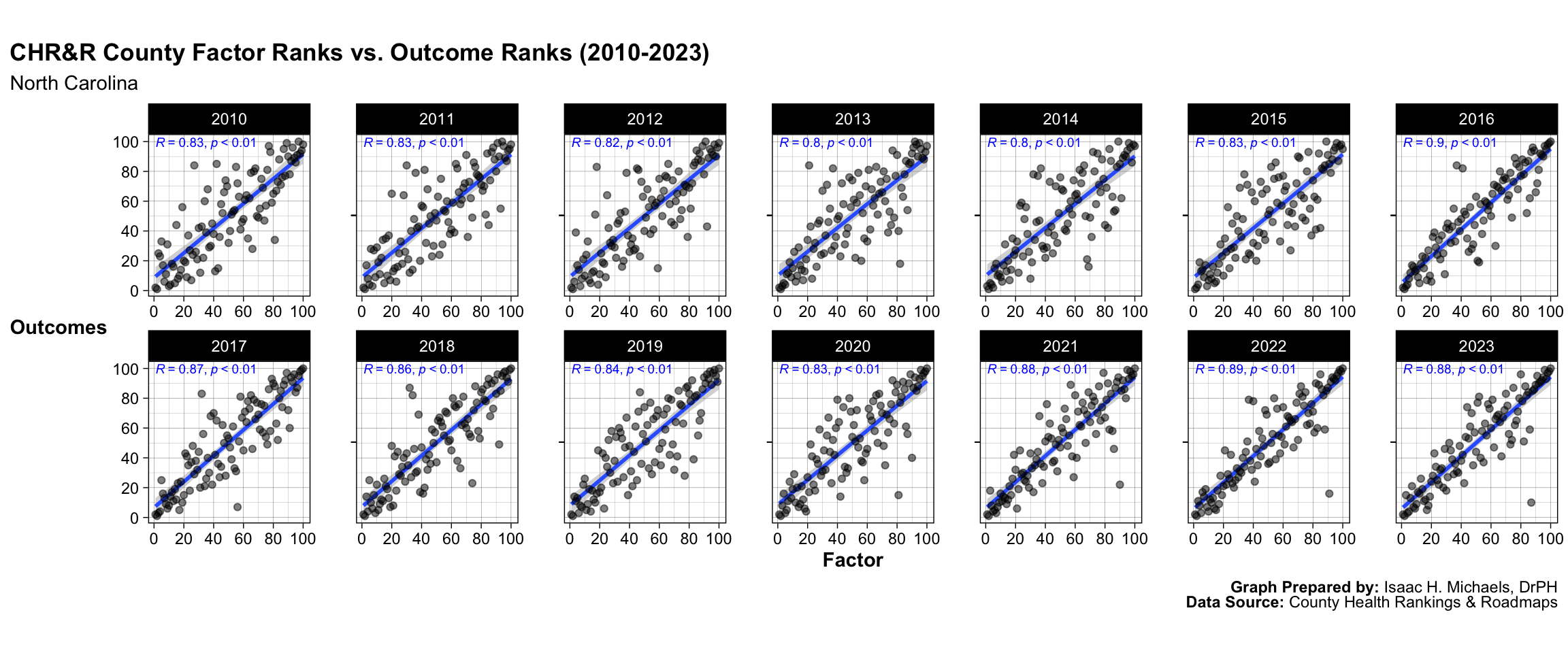
North Carolina
![]()
Graphs Prepared by: Isaac H. Michaels, DrPH
Data Source: County Health Rankings and Roadmaps
Graphs Prepared by: Isaac H. Michaels, DrPH
Data Source: County Health Rankings and Roadmaps
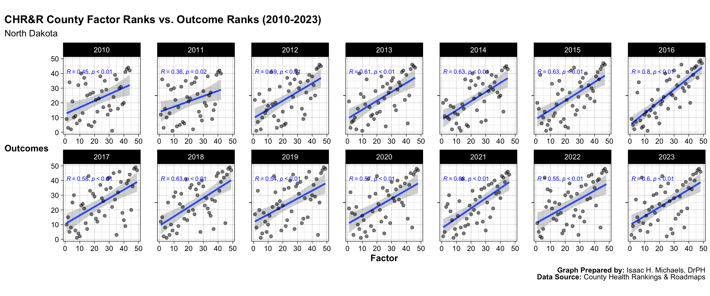
North Dakota
![]()
Graphs Prepared by: Isaac H. Michaels, DrPH
Data Source: County Health Rankings and Roadmaps
Graphs Prepared by: Isaac H. Michaels, DrPH
Data Source: County Health Rankings and Roadmaps
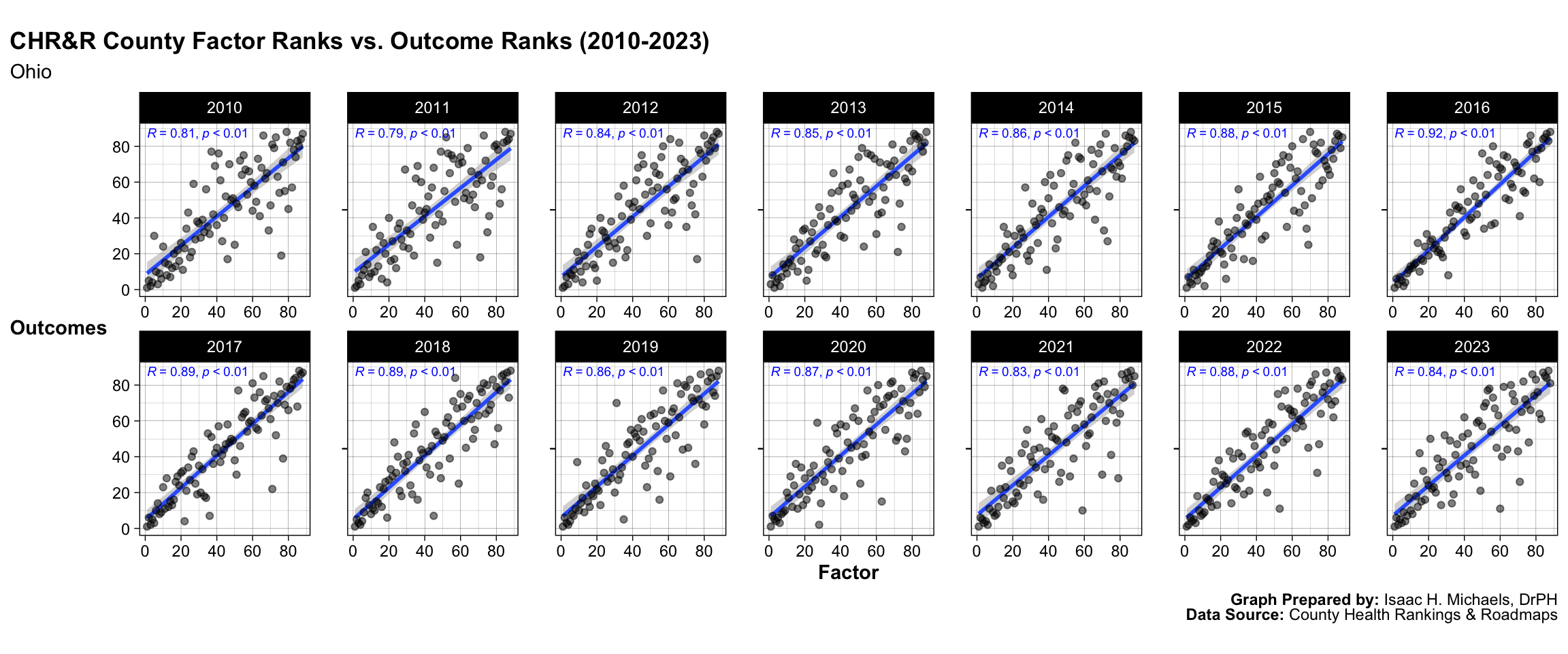
Ohio
![]()
Graphs Prepared by: Isaac H. Michaels, DrPH
Data Source: County Health Rankings and Roadmaps
Graphs Prepared by: Isaac H. Michaels, DrPH
Data Source: County Health Rankings and Roadmaps
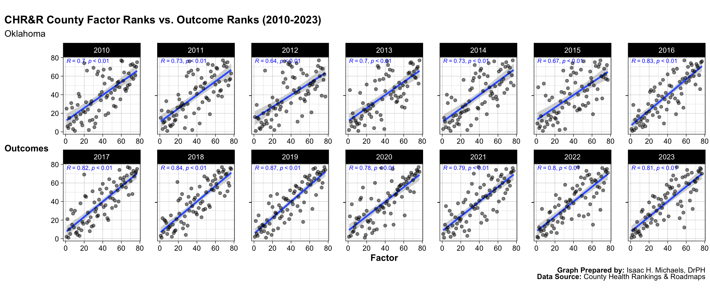
Oklahoma
![]()
Graphs Prepared by: Isaac H. Michaels, DrPH
Data Source: County Health Rankings and Roadmaps
Graphs Prepared by: Isaac H. Michaels, DrPH
Data Source: County Health Rankings and Roadmaps
Oregon
![]()
Graphs Prepared by: Isaac H. Michaels, DrPH
Data Source: County Health Rankings and Roadmaps
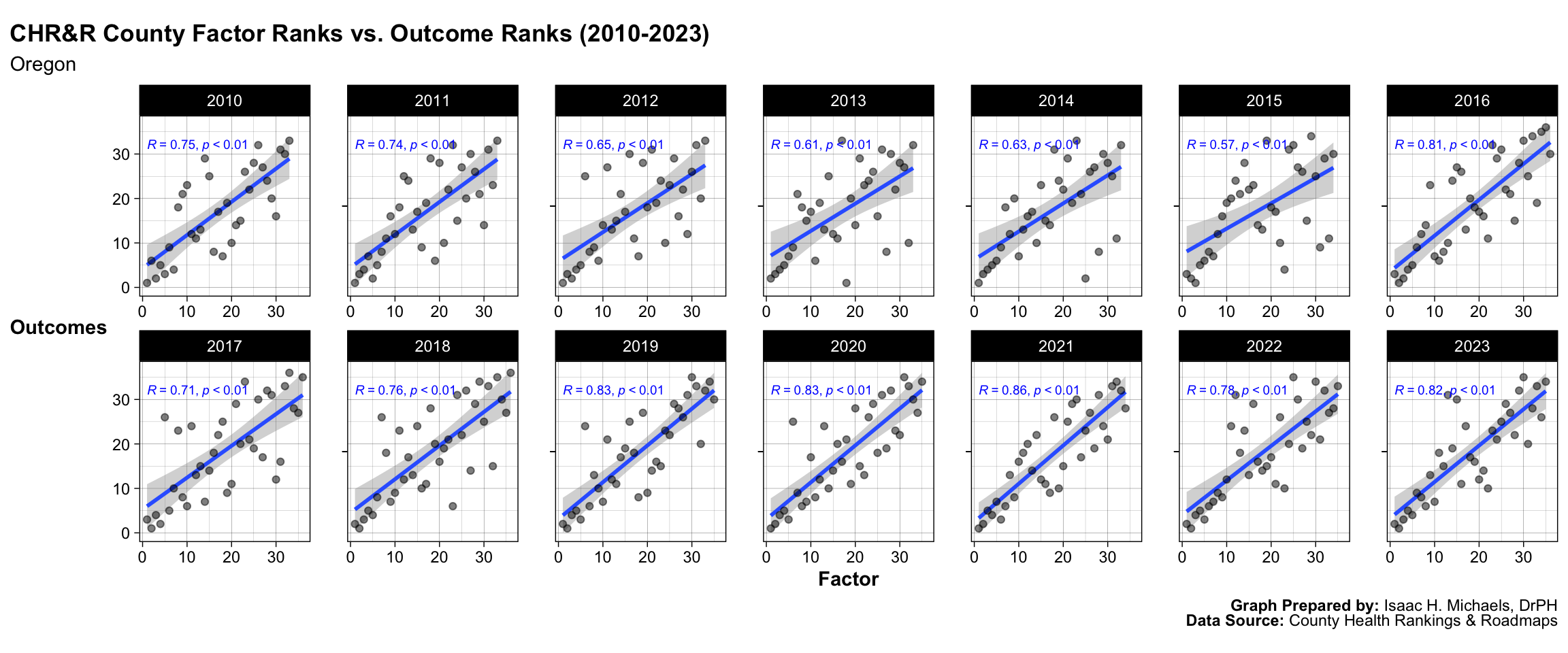
Graphs Prepared by: Isaac H. Michaels, DrPH
Data Source: County Health Rankings and Roadmaps
Pennsylvania
![]()
Graphs Prepared by: Isaac H. Michaels, DrPH
Data Source: County Health Rankings and Roadmaps
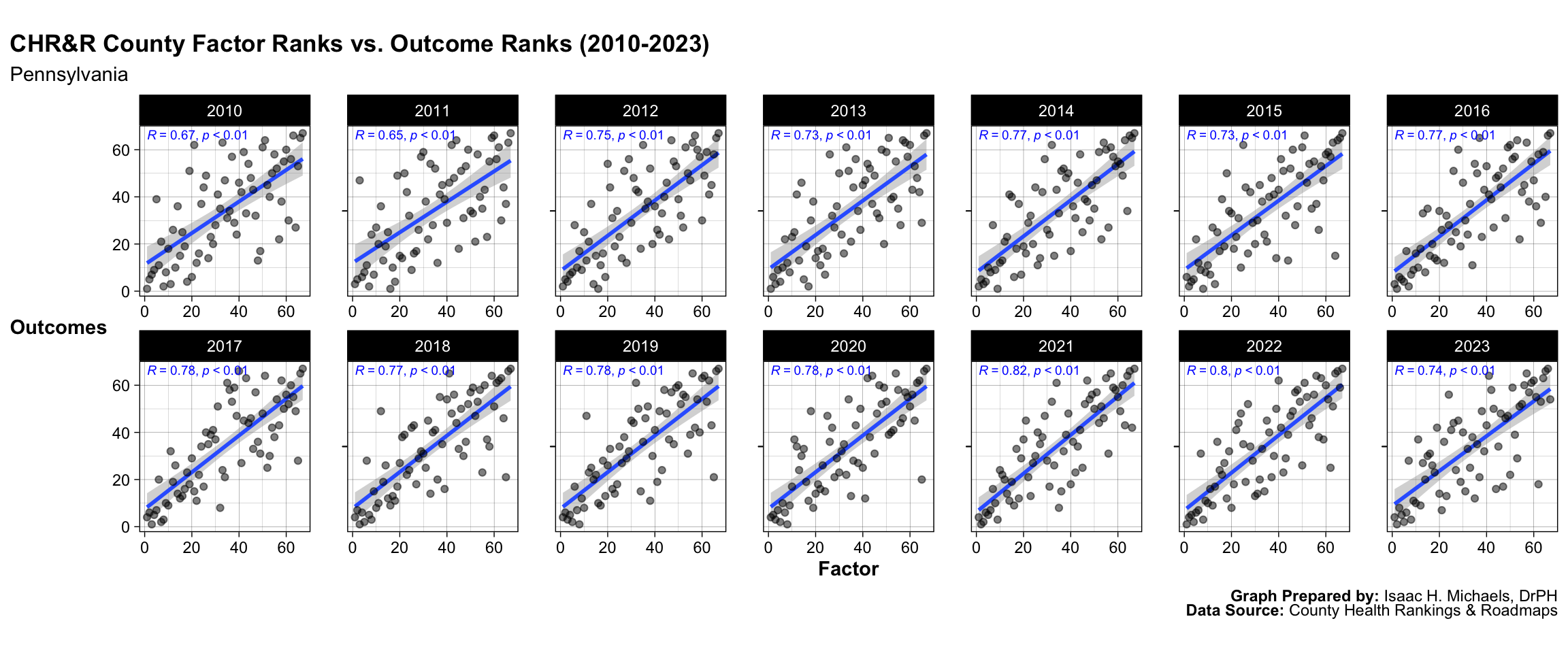
Graphs Prepared by: Isaac H. Michaels, DrPH
Data Source: County Health Rankings and Roadmaps
Rhode Island
![]()
Graphs Prepared by: Isaac H. Michaels, DrPH
Data Source: County Health Rankings and Roadmaps
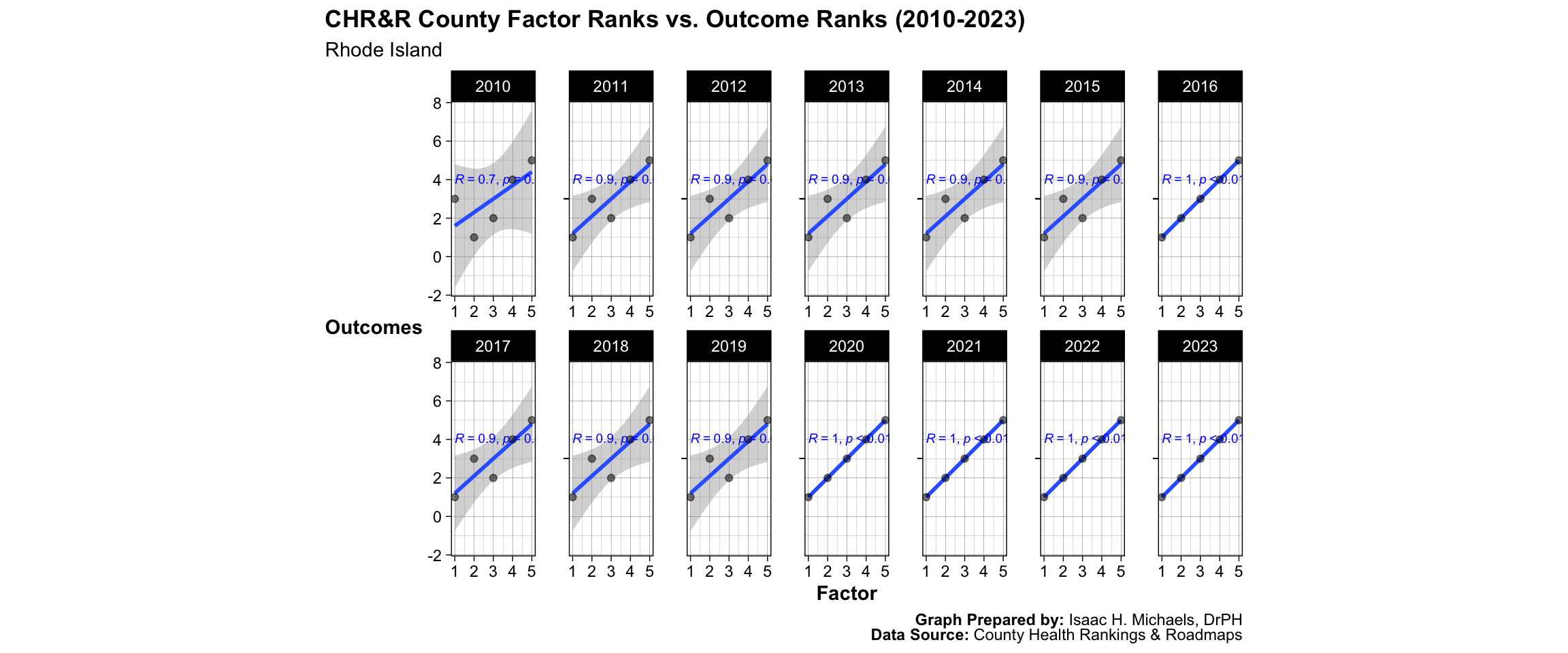
Graphs Prepared by: Isaac H. Michaels, DrPH
Data Source: County Health Rankings and Roadmaps
South Carolina
![]()
Graphs Prepared by: Isaac H. Michaels, DrPH
Data Source: County Health Rankings and Roadmaps
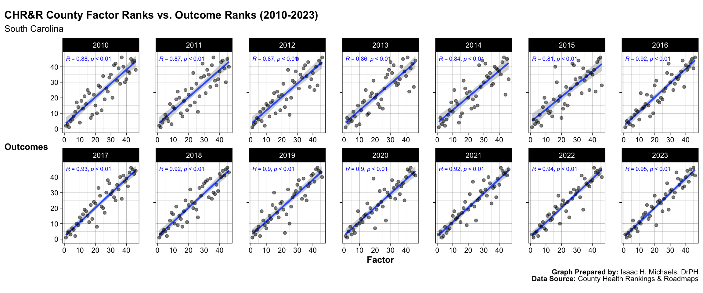
Graphs Prepared by: Isaac H. Michaels, DrPH
Data Source: County Health Rankings and Roadmaps
South Dakota
![]()
Graphs Prepared by: Isaac H. Michaels, DrPH
Data Source: County Health Rankings and Roadmaps
Graphs Prepared by: Isaac H. Michaels, DrPH
Data Source: County Health Rankings and Roadmaps
Tennessee
![]()
Graphs Prepared by: Isaac H. Michaels, DrPH
Data Source: County Health Rankings and Roadmaps
Graphs Prepared by: Isaac H. Michaels, DrPH
Data Source: County Health Rankings and Roadmaps
Texas
![]()
Graphs Prepared by: Isaac H. Michaels, DrPH
Data Source: County Health Rankings and Roadmaps
Graphs Prepared by: Isaac H. Michaels, DrPH
Data Source: County Health Rankings and Roadmaps
Utah
![]()
Graphs Prepared by: Isaac H. Michaels, DrPH
Data Source: County Health Rankings and Roadmaps
Graphs Prepared by: Isaac H. Michaels, DrPH
Data Source: County Health Rankings and Roadmaps
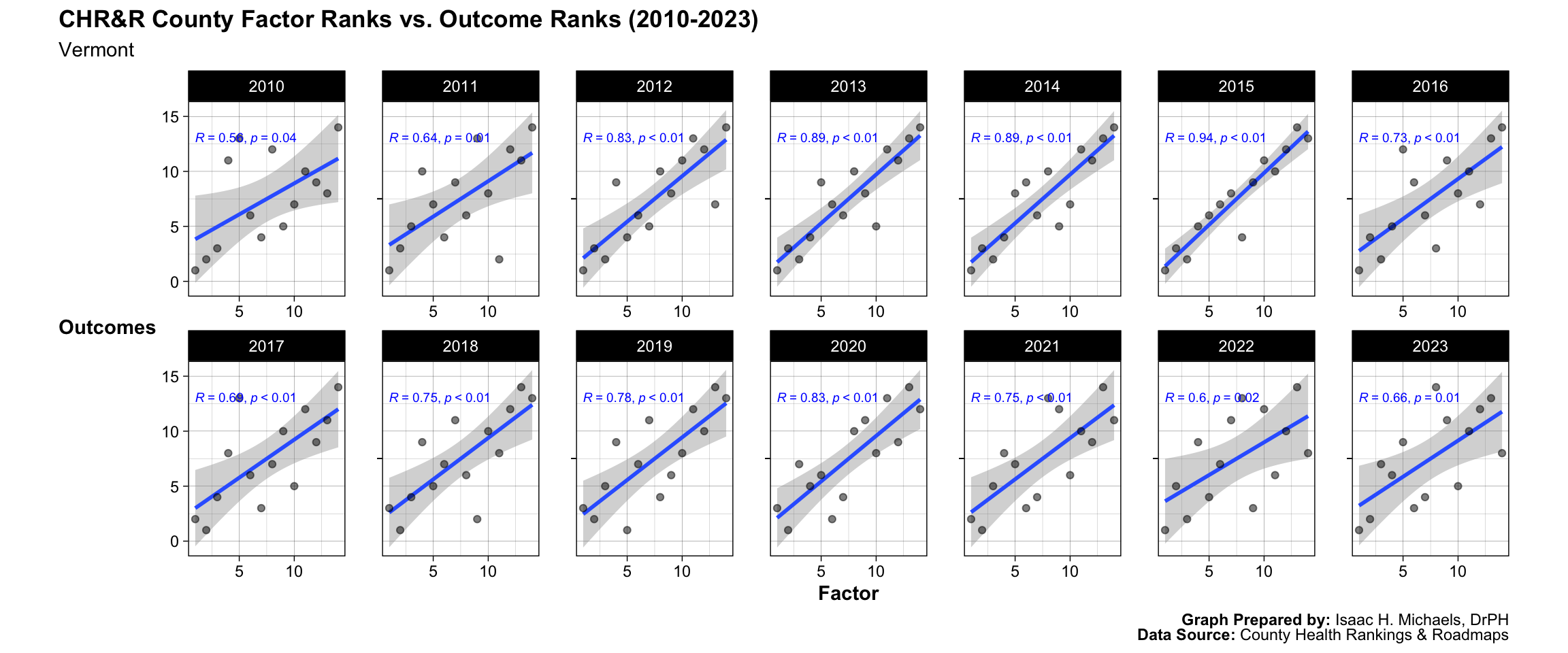
Vermont
![]()
Graphs Prepared by: Isaac H. Michaels, DrPH
Data Source: County Health Rankings and Roadmaps
Graphs Prepared by: Isaac H. Michaels, DrPH
Data Source: County Health Rankings and Roadmaps
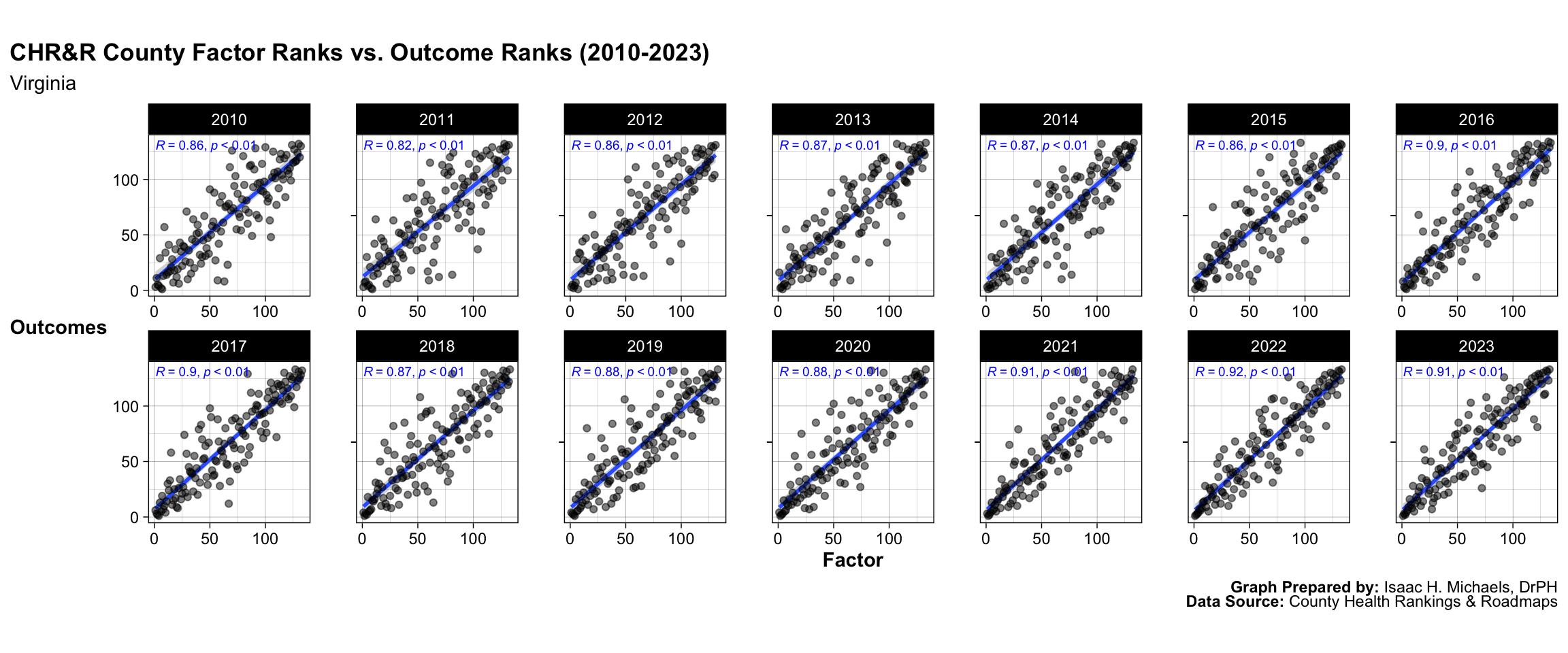
Virginia
![]()
Graphs Prepared by: Isaac H. Michaels, DrPH
Data Source: County Health Rankings and Roadmaps
Graphs Prepared by: Isaac H. Michaels, DrPH
Data Source: County Health Rankings and Roadmaps
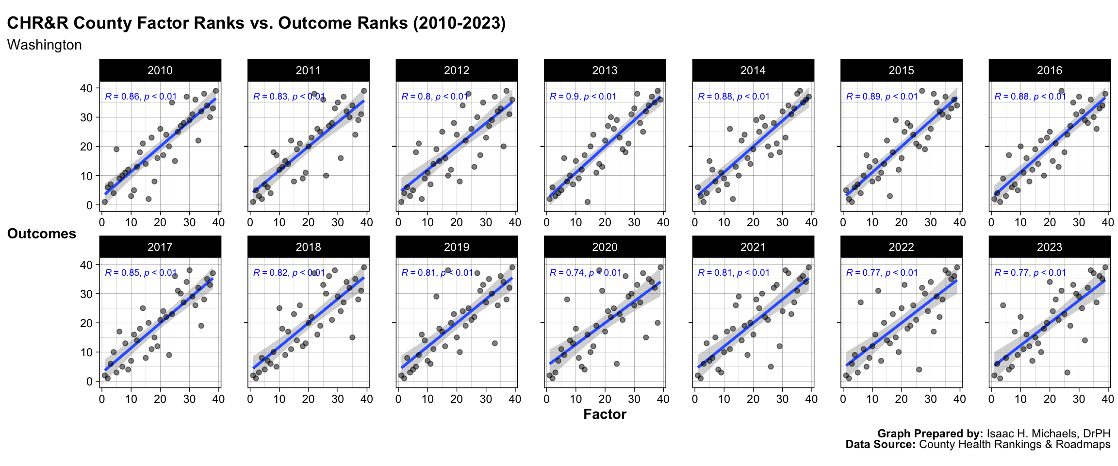
Washington
![]()
Graphs Prepared by: Isaac H. Michaels, DrPH
Data Source: County Health Rankings and Roadmaps
Graphs Prepared by: Isaac H. Michaels, DrPH
Data Source: County Health Rankings and Roadmaps
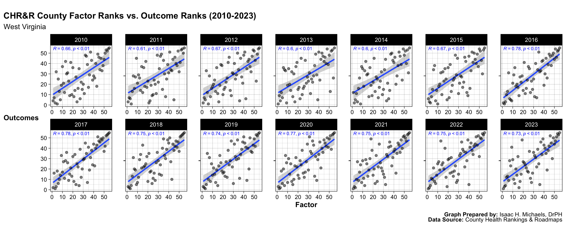
West Virginia
![]()
Graphs Prepared by: Isaac H. Michaels, DrPH
Data Source: County Health Rankings and Roadmaps
Graphs Prepared by: Isaac H. Michaels, DrPH
Data Source: County Health Rankings and Roadmaps
Wisconsin
![]()
Graphs Prepared by: Isaac H. Michaels, DrPH
Data Source: County Health Rankings and Roadmaps
Graphs Prepared by: Isaac H. Michaels, DrPH
Data Source: County Health Rankings and Roadmaps
Wyoming
![]()
Graphs Prepared by: Isaac H. Michaels, DrPH
Data Source: County Health Rankings and Roadmaps
Graphs Prepared by: Isaac H. Michaels, DrPH
Data Source: County Health Rankings and Roadmaps