Published: June 25, 2021
Updated: June 18, 2026 at 06:38PM
Welcome
Welcome to my baseball season data analysis. This page offers interactive visualizations and detailed data tables that capture team and player performance throughout Major League Baseball (MLB) seasons. You can explore cumulative wins, run differentials, scoring trends, and advanced player statistics such as Wins Above Replacement, on-base plus slugging, and earned run average. The charts and tables highlight team momentum, offensive and defensive strengths, and individual contributions, providing a clear view of which teams and players are excelling over time.
All data are sourced from Baseball Reference and updated daily during the regular season, allowing you to track changes as the season unfolds. Whether you’re a fan, analyst, or fantasy baseball player, these visualizations offer an accessible, data-driven perspective on MLB performance. I hope you find these visualizations and data tables helpful in understanding the current MLB season. Thank you for visiting the page.
Executive Summary1
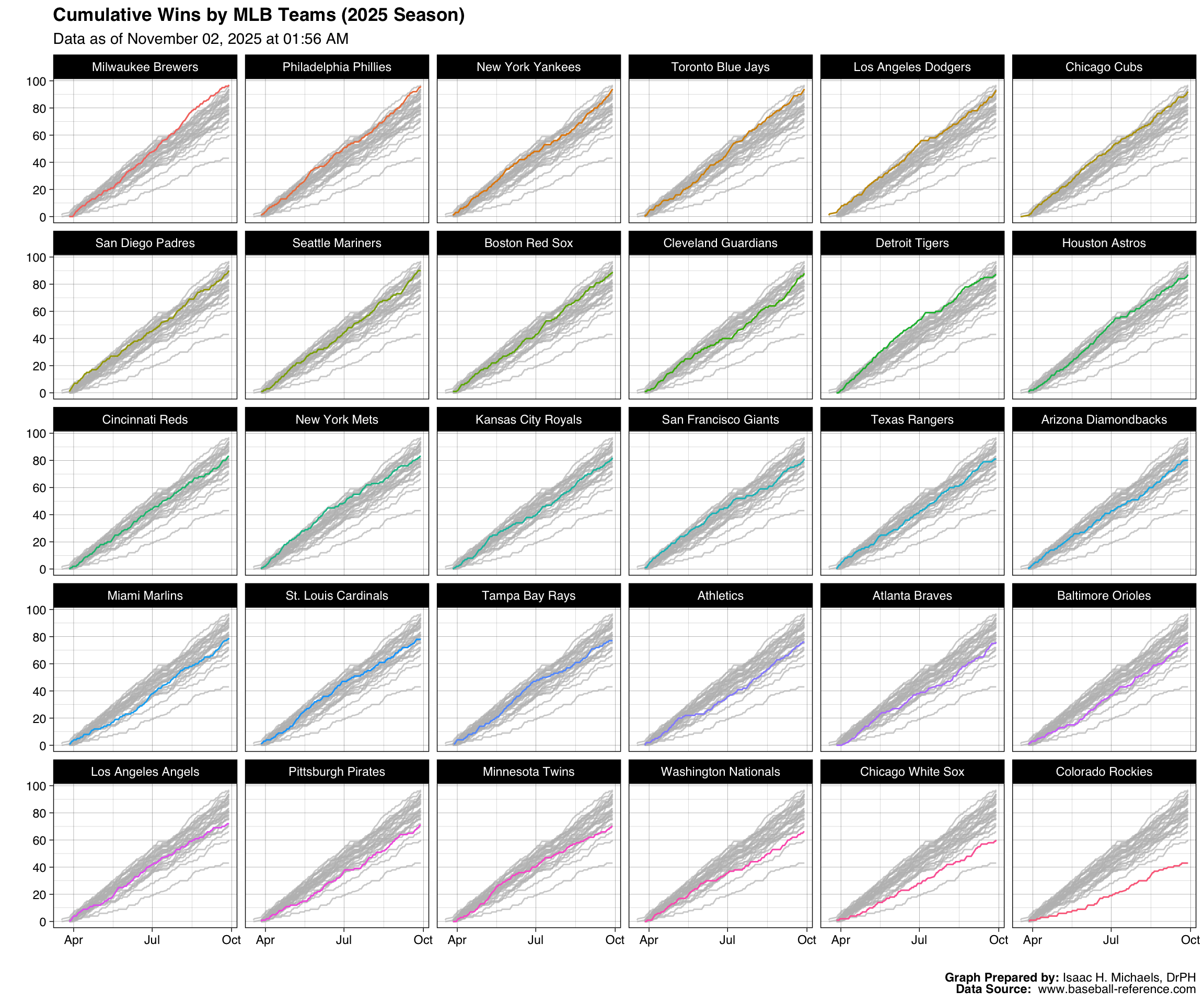
As the 2026 Major League Baseball season moves through June, team performances are beginning to solidify, with a distinct group of frontrunners establishing separation. The Los Angeles Dodgers currently lead all of baseball with 48 wins, followed closely by the Atlanta Braves (46), Milwaukee Brewers (45), and New York Yankees (45). These teams have built their success on strong win percentages, all exceeding 62.5%. The data also show a tightly clustered middle tier, where 19 teams are grouped between 35 and 41 wins, suggesting a competitive race for playoff positioning is well underway across both leagues.
One of the most notable patterns in recent play involves the diverging paths of two of the league’s elite clubs. The Los Angeles Dodgers have sustained their momentum, adding six wins since June 8th to solidify their top position. In contrast, the Atlanta Braves, despite their excellent overall record, have cooled substantially, securing only one victory over that same period. The Dodgers’ 64.0% win percentage is supported by a median run differential of +1, although their runs allowed standard deviation of 3.81 could indicate some volatility in their defensive and pitching performances. This contrast in recent form between two top contenders is a key development to monitor.
A second pattern emerges from the pitching data, highlighting the Toronto Blue Jays’ heavy reliance on their bullpen. Five Blue Jays pitchers—Louis Varland, Tyler Rogers, Braydon Fisher, Mason Fluharty, and Jeff Hoffman—rank in the top 11 for most game appearances this season. This high frequency of use may reflect a deliberate team strategy to manage starter innings or could be a response to challenges in obtaining length from their starting rotation. While this approach appears effective in run prevention, with the team allowing a median of just three runs per game, the long-term sustainability of such a substantial workload on the relief corps remains a critical variable for their season.
Analysis of run production reveals different offensive profiles across the league. Some teams display highly consistent scoring, such as the St. Louis Cardinals, whose 2.58 standard deviation in runs scored is among the lowest in baseball. Conversely, teams like the Pittsburgh Pirates (3.58 SD) and Washington Nationals (3.57 SD) exhibit more variance in their offensive output from game to game. Interestingly, these data do not suggest one model is inherently superior; the Milwaukee Brewers have one of the league’s best records despite a high runs scored standard deviation (3.54), indicating they are finding ways to win even with an inconsistent offense.
While team-level analysis provides a broad picture, exceptional individual performances are clearly influencing these results. For the Houston Astros, Yordan Alvarez has been a central offensive figure, ranking among the league leaders in walks (46), home runs (24), and OPS (1.07). On the mound, Philadelphia’s Cristopher Sánchez has been a model of efficiency, leading qualified pitchers with a 6.11 strikeout-to-walk ratio over 99 innings pitched. Similarly, rookie Nick Kurtz has provided a substantial lift for the Athletics, ranking first in home runs (18) and seventh in both OPS (.993) and Wins Above Replacement (3.8), underscoring how key contributions can shape a team’s competitiveness.
Cumulative Wins
This figure presents cumulative wins by MLB team during the current season. Each panel corresponds to a single team, with the x-axis representing the progression of the season by date and the y-axis showing the total number of wins accumulated to date. This display helps illustrate how quickly teams have been winning games relative to one another and provides a clear view of momentum, slumps, or sustained success over time. Because the plot updates automatically as new data become available, it reflects each team’s current position in the season at the time of the most recent refresh.
Graph Prepared By: Isaac H. Michaels, DrPH
Data Source: www.baseball-reference.com
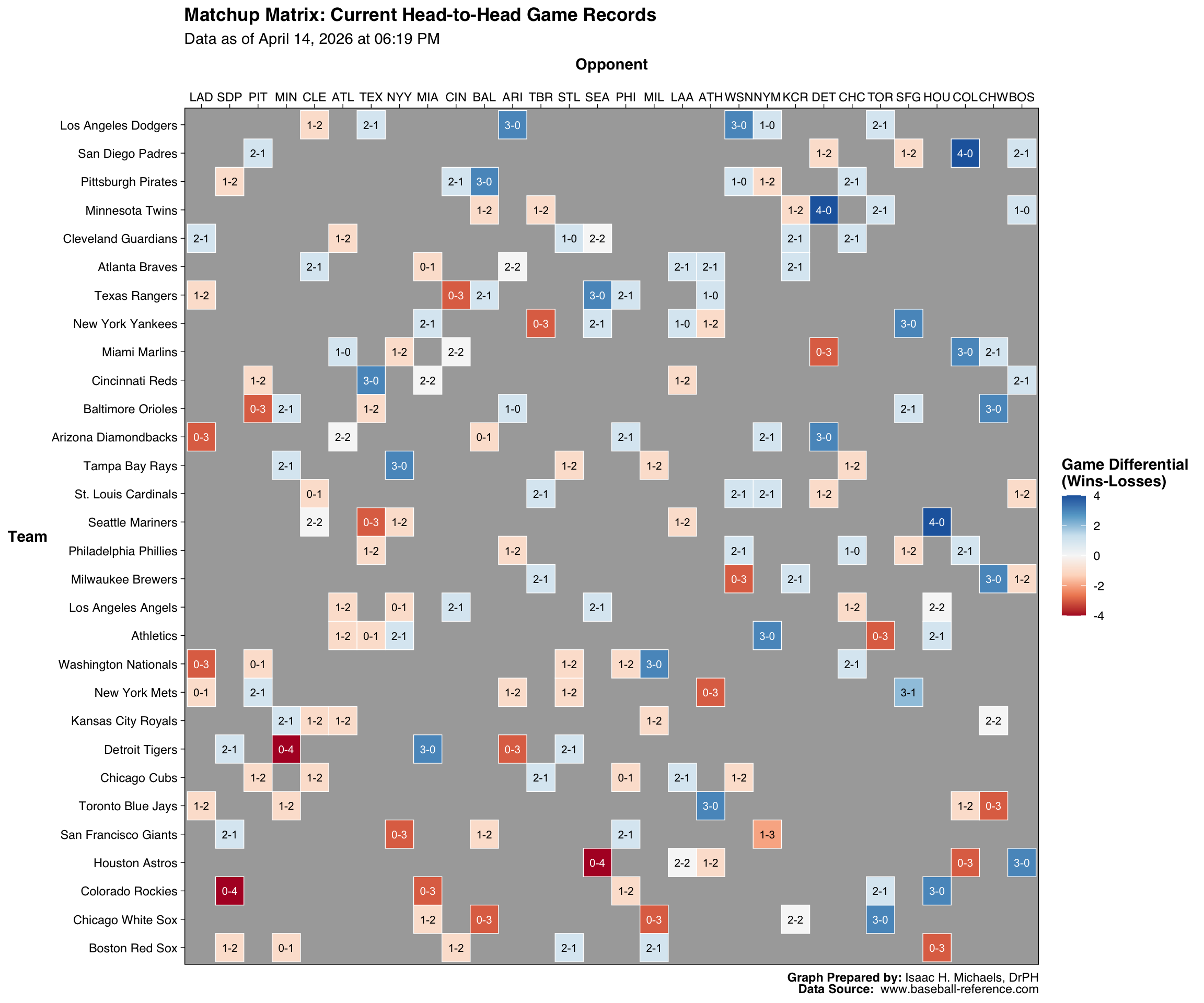
Head-to-Head Records
This figure presents a cross-tabulated heat map detailing the head-to-head performance of each MLB team during the current season. Each row corresponds to a specific team, while the columns represent their respective opponents. The intersecting cells contain text displaying the exact win-loss record for that specific matchup. Additionally, the background of each cell is colored according to the head-to-head differential using a diverging color scale, where positive values—indicating a favorable margin—and negative values—indicating an unfavorable margin—are visually distinguished. Teams whose rows feature a higher concentration of blues demonstrate broader dominance across the league. In contrast, rows saturated with reds highlight teams struggling against a variety of opponents. This visualization offers a comprehensive, at-a-glance snapshot of individual matchup advantages, intra-league parity, and overall team competitiveness to date.
Graph Prepared By: Isaac H. Michaels, DrPH
Data Source: www.baseball-reference.com
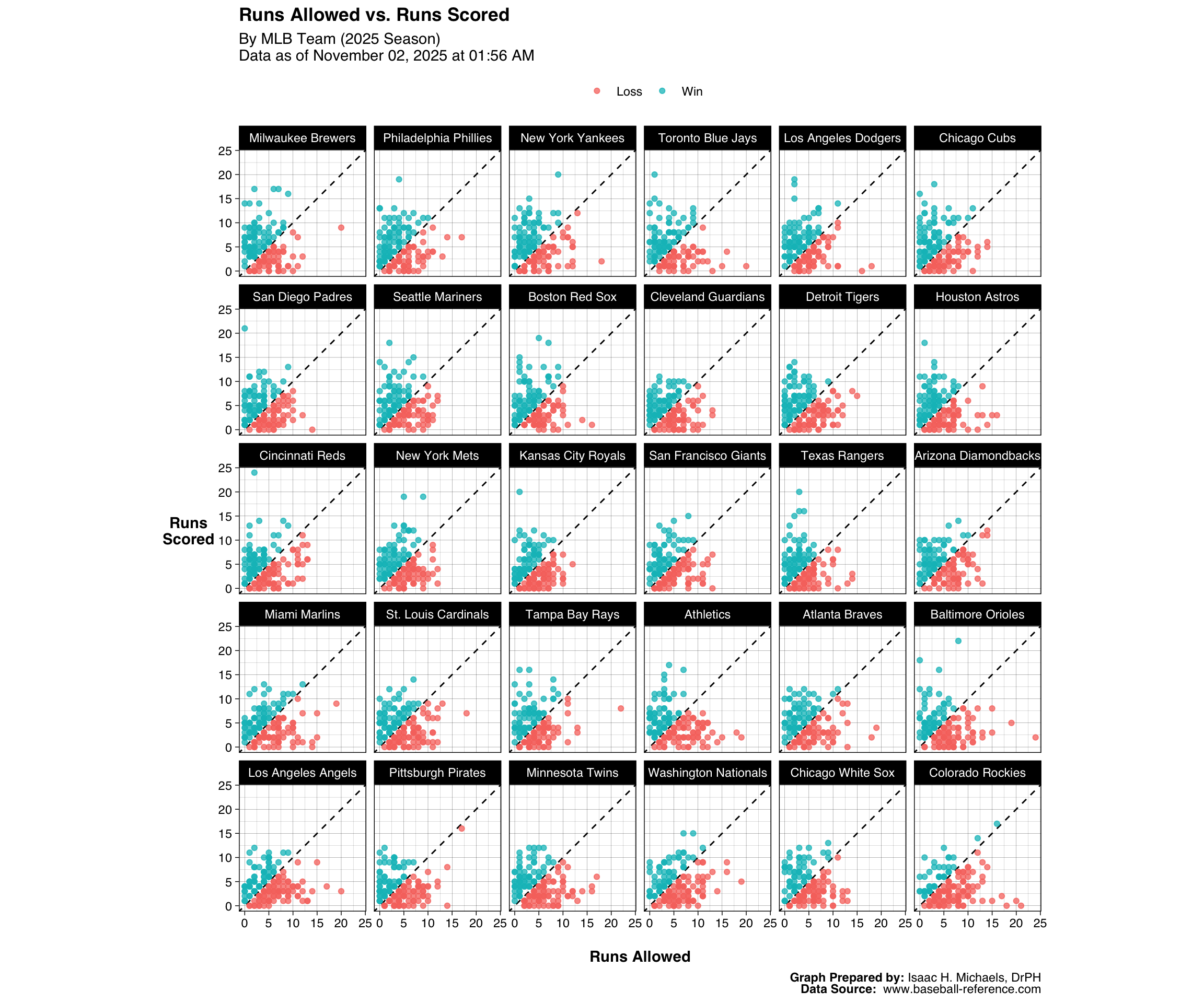
Runs Scored vs. Runs Allowed
This figure plots runs scored against runs allowed for each MLB team during the current season. Each panel corresponds to a single team, with individual points representing games. Points above the diagonal dashed line indicate games in which the team scored more runs than it allowed (wins), while points below the line indicate losses. Points are colored according to game outcome to distinguish between wins and losses. Teams with a larger number of points above the line tend to outscore their opponents more consistently, reflecting stronger overall performance. The figure provides a visual summary of each team’s run-scoring and defensive patterns across all games to date.
Graph Prepared By: Isaac H. Michaels, DrPH
Data Source: www.baseball-reference.com
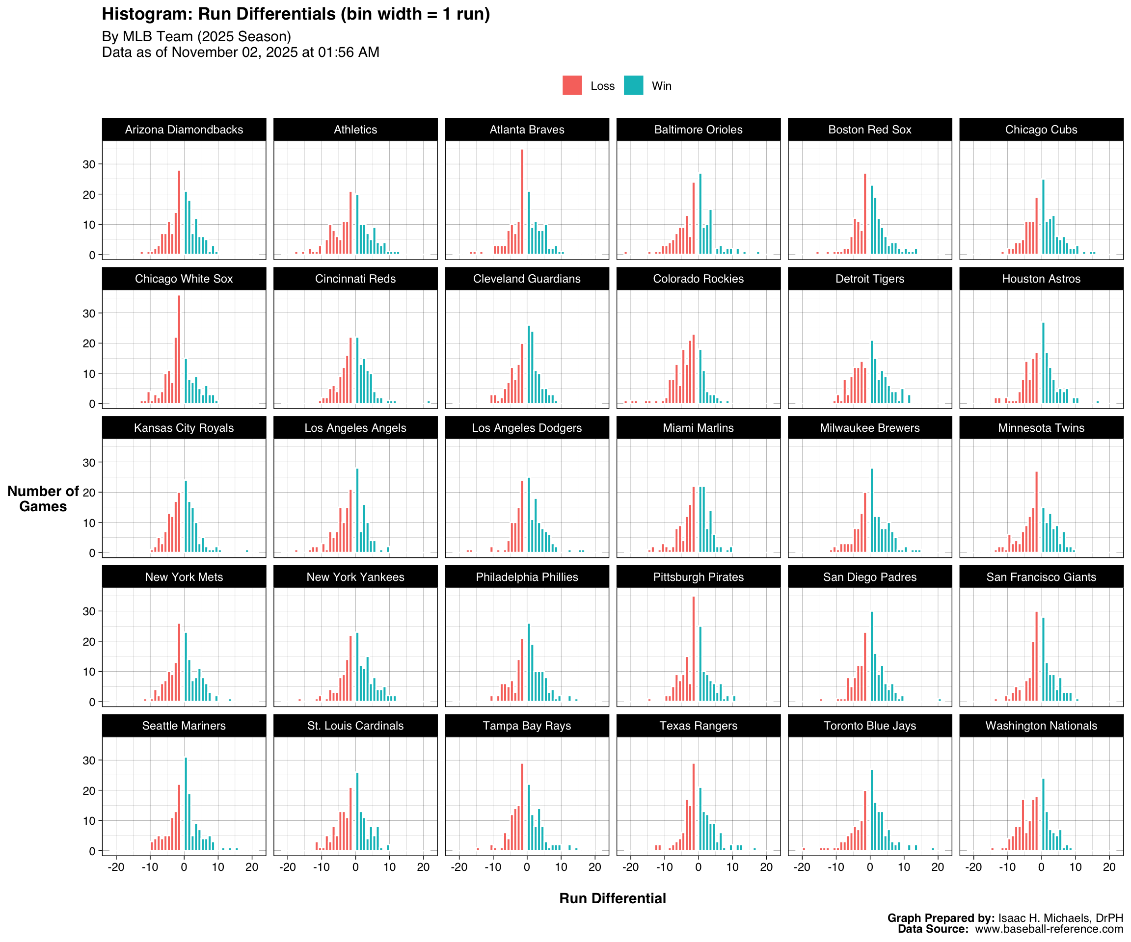
Runs Differentials
Histograms
This figure shows histograms of game-level run differentials for each MLB team during the current season. Each bar represents the number of games with a given scoring margin, using a bin width of one run. Positive run differentials correspond to wins, while negative values correspond to losses. Bars are colored according to game outcome, distinguishing victories from defeats. Teams with histograms skewed to the right tend to win by larger margins or more frequently, indicating stronger overall performance. In contrast, teams with distributions centered near zero or skewed left tend to have closer or less favorable results. The figure offers a concise visual summary of how dominant — or narrowly competitive — each team’s games have been.
Graph Prepared By: Isaac H. Michaels, DrPH
Data Source: www.baseball-reference.com
Trends
This figure presents game-by-game run differentials for each MLB team over the course of the current season. Each vertical bar represents a single game, with its height indicating the margin of victory or defeat — positive values for wins and negative values for losses. Bars are colored green for wins and red for losses. The plot provides a visual timeline of team performance, revealing patterns such as winning or losing streaks, consistency in run margins, and periods of volatility. Teams with consistently tall positive bars tend to dominate opponents, whereas those with frequent negative bars or alternating patterns suggest closer or less predictable outcomes. Displaying these bars sequentially highlights the rhythm of each team’s season.
Graph Prepared By: Isaac H. Michaels, DrPH
Data Source: www.baseball-reference.com
Player Statistics
Batting
This table summarizes individual batting performance across Major League Baseball for all players with at least 25 at bats during the current season. It provides a comprehensive view of offensive production through both traditional and advanced metrics. Basic counting statistics such as games played (G), plate appearances (PA), hits (H), home runs (HR), and runs batted in (RBI) capture each player’s volume and contribution to team scoring. Rate-based measures—including batting average (BA), on-base percentage (OBP), slugging percentage (SLG), and on-base plus slugging (OPS)—reflect overall hitting efficiency and power.
Advanced indicators such as Wins Above Replacement (WAR), OPS+, and weighted on-base average (rOBA) contextualize performance relative to league and ballpark environments. Together, these metrics allow for comparisons across teams and player types, highlighting both consistent contributors and standout performers. The table serves as a detailed reference for evaluating individual offensive value throughout the season.
Note: Table displays rows only for players with at least 25 at bats.
Table Prepared By: Isaac H. Michaels, DrPH
Data Source: www.baseball-reference.com
*: Left-Handed Batter
#: Switch Hitter
G – Games Played
PA – Plate Appearances
AB – At Bats
R – Runs Scored/Allowed
H – Hits/Hits Allowed
2B – Doubles Hit/Allowed
3B – Triples Hit/Allowed
HR – Home Runs Hit/Allowed
RBI – Runs Batted In
SB – Stolen Bases
CS – Caught Stealing
BB – Bases on Balls/Walks
SO – Strikeouts
BA – Hits/At Bats
OBP – (H + BB + HBP)/(At Bats + BB + HBP + SF)
SLG – Total Bases/At Bats
OPS – On-Base + Slugging Percentages
OPS+ – OPS+ Adjusted to the player’s ballpark(s)
GIDP – Double Plays Grounded Into
IBB – Intentional Bases on Balls
Distributions and Leaders in Selected Statistics
Wins Above Replacement
This interactive plot shows the distribution of Wins Above Replacement (WAR) for Major League Baseball batters during the current season. Each horizontal box represents the spread of WAR values among players on a given team, with individual points marking each qualifying batter. Hovering over a point reveals the player’s name, team, and WAR value. The plot excludes players who have not reached the minimum number of at-bats required for inclusion, providing a clearer view of team-level performance among regular contributors.
By displaying both central tendencies and outliers, the visualization highlights how WAR varies across teams—some showing tightly clustered distributions indicative of balanced rosters, while others have one or two high-impact players driving overall team value. These differences help illustrate where player contributions are concentrated and which teams benefit most from top-tier offensive performance.
Graph and Table Prepared By: Isaac H. Michaels, DrPH
Data Source: www.baseball-reference.com
This figure shows the distribution of Wins Above Replacement (WAR) among all qualified batters for the current season. Each bar represents the number of players within a given WAR range. The accompanying table lists the ten players with the highest WAR values, providing a reference for those whose overall contributions most exceed that of a replacement-level player. Together, the figure and table help illustrate the spread of player value across the league based on combined offensive, defensive, and baserunning performance.
| League-wide Leaders: Wins Above Replacement | |||
| 2026 Season Data as of June 18, 2026 at 06:38 PM |
|||
| Rank | Player | Team | WAR |
|---|---|---|---|
| 1 | Pete Crow-Armstrong* | CHC | 4.3 |
| 2 | Bobby Witt Jr. | KCR | 4.2 |
| 3 | Kevin McGonigle* | DET | 4.2 |
| 4 | Cody Bellinger* | NYY | 3.9 |
| 5 | Nick Kurtz* | ATH | 3.8 |
| 6 | Andy Pages | LAD | 3.7 |
| 7 | James Wood* | WSN | 3.5 |
| 8 | Yordan Alvarez* | HOU | 3.4 |
| 9 | Jordan Walker | STL | 3.4 |
| 10 | Matt Olson* | ATL | 3.2 |
| 11 | Corbin Carroll* | ARI | 3.2 |
| Table Prepared by: Isaac H. Michaels, DrPH Data Source: www.baseball-reference.com |
|||
| Note: Data exclude players with fewer than 25 at bats. | |||
Graph and Table Prepared By: Isaac H. Michaels, DrPH
Data Source: www.baseball-reference.com
On-Base Plus Slugging Percentage
This figure shows the distribution of On-Base Plus Slugging Percentage (OPS) across all qualified batters. Each bar represents the number of players whose OPS falls within a particular range. The accompanying table identifies the ten players with the highest OPS values, offering a snapshot of the league’s strongest overall offensive performers. Together, these outputs demonstrate how effectively players combine on-base ability and power hitting.
| League-wide Leaders: On-Base Plus Slugging Percentage | |||
| 2026 Season Data as of June 18, 2026 at 06:38 PM |
|||
| Rank | Player | Team | OPS |
|---|---|---|---|
| 1 | Yordan Alvarez* | HOU | 1.070 |
| 2 | Tyler Callihan* | PIT | 1.061 |
| 3 | Ben Rice* | NYY | 1.001 |
| 4 | Nick Kurtz* | ATH | 0.993 |
| 5 | Randal Grichuk | CHW | 0.978 |
| 6 | Nelson Velázquez | STL | 0.972 |
| 7 | Andrew Vaughn | MIL | 0.964 |
| 8 | Shohei Ohtani* | LAD | 0.962 |
| 9 | Bryce Eldridge* | SFG | 0.962 |
| 10 | Luis Campusano | SDP | 0.958 |
| Table Prepared by: Isaac H. Michaels, DrPH Data Source: www.baseball-reference.com |
|||
| Note: Data exclude players with fewer than 25 at bats. | |||
Graph and Table Prepared By: Isaac H. Michaels, DrPH
Data Source: www.baseball-reference.com
Runs Batted In
This figure shows the distribution of Runs Batted In (RBI) across all qualified batters. Each bar corresponds to the number of players whose RBI totals fall within a specified range. The accompanying table highlights the ten players with the highest RBI counts, illustrating the league’s top run producers. This output provides a league-wide view of offensive productivity in terms of driving in runs.
| League-wide Leaders: Runs Batted In | |||
| 2026 Season Data as of June 18, 2026 at 06:38 PM |
|||
| Rank | Player | Team | RBI |
|---|---|---|---|
| 1 | Nick Kurtz* | ATH | 57 |
| 2 | Andy Pages | LAD | 56 |
| 3 | Jordan Walker | STL | 56 |
| 4 | Yordan Alvarez* | HOU | 55 |
| 5 | CJ Abrams* | WSN | 54 |
| 6 | Alec Burleson* | STL | 53 |
| 7 | Christian Walker | HOU | 52 |
| 8 | Liam Hicks* | MIA | 52 |
| 9 | Matt Olson* | ATL | 51 |
| 10 | Dillon Dingler | DET | 51 |
| Table Prepared by: Isaac H. Michaels, DrPH Data Source: www.baseball-reference.com |
|||
| Note: Data exclude players with fewer than 25 at bats. | |||
Graph and Table Prepared By: Isaac H. Michaels, DrPH
Data Source: www.baseball-reference.com
Home Runs
This figure presents the distribution of Home Run totals among all qualified batters. Each bar indicates the number of players whose Home Run counts fall within a given range. The accompanying table lists the ten players with the most Home Runs, highlighting leading power hitters. Together, the outputs display how frequently players hit for power across the league.
| League-wide Leaders: Home Runs | |||
| 2026 Season Data as of June 18, 2026 at 06:38 PM |
|||
| Rank | Player | Team | HR |
|---|---|---|---|
| 1 | Kyle Schwarber* | PHI | 25 |
| 2 | Yordan Alvarez* | HOU | 24 |
| 3 | Byron Buxton | MIN | 23 |
| 4 | Hunter Goodman | COL | 21 |
| 5 | James Wood* | WSN | 20 |
| 6 | Matt Olson* | ATL | 20 |
| 7 | Ben Rice* | NYY | 20 |
| 8 | Munetaka Murakami* | CHW | 20 |
| 9 | Colson Montgomery* | CHW | 19 |
| 10 | Nick Kurtz* | ATH | 18 |
| 11 | Christian Walker | HOU | 18 |
| 12 | Shea Langeliers | ATH | 18 |
| 13 | Jordan Walker | STL | 18 |
| 14 | Brandon Lowe* | PIT | 18 |
| Table Prepared by: Isaac H. Michaels, DrPH Data Source: www.baseball-reference.com |
|||
| Note: Data exclude players with fewer than 25 at bats. | |||
Graph and Table Prepared By: Isaac H. Michaels, DrPH
Data Source: www.baseball-reference.com
Stolen Bases
This figure shows the distribution of Stolen Bases across all qualified batters. Each bar represents the number of players with stolen base totals in a particular range. The accompanying table identifies the ten players with the most Stolen Bases, illustrating the league’s most aggressive or successful baserunners. These outputs together highlight differences in base-stealing frequency and effectiveness among players.
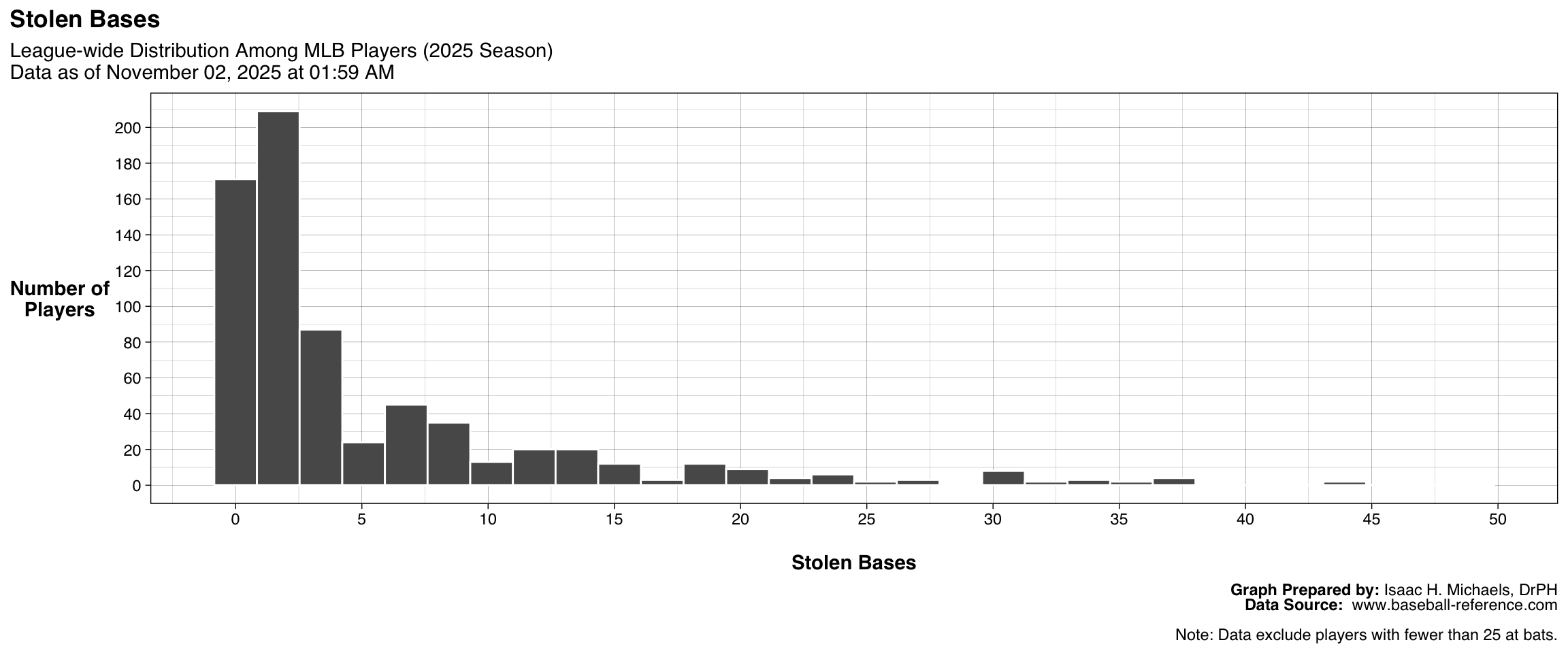
| League-wide Leaders: Stolen Bases | |||
| 2026 Season Data as of June 18, 2026 at 06:38 PM |
|||
| Rank | Player | Team | SB |
|---|---|---|---|
| 1 | Bobby Witt Jr. | KCR | 28 |
| 2 | Nasim Nuñez# | WSN | 26 |
| 3 | José Ramírez# | CLE | 24 |
| 4 | Oneil Cruz* | PIT | 21 |
| 5 | Jazz Chisholm Jr.* | NYY | 20 |
| 6 | Randy Arozarena | SEA | 19 |
| 7 | Fernando Tatis Jr. | SDP | 18 |
| 8 | Jakob Marsee* | MIA | 17 |
| 9 | Pete Crow-Armstrong* | CHC | 16 |
| 10 | Trea Turner | PHI | 15 |
| 11 | Ronald Acuña Jr. | ATL | 15 |
| 12 | José Caballero | NYY | 15 |
| 13 | David Hamilton* | MIL | 15 |
| Table Prepared by: Isaac H. Michaels, DrPH Data Source: www.baseball-reference.com |
|||
| Note: Data exclude players with fewer than 25 at bats. | |||
Graph and Table Prepared By: Isaac H. Michaels, DrPH
Data Source: www.baseball-reference.com
Bases on Balls/Walks
This figure displays the distribution of Bases on Balls (Walks) among all qualified batters. Each bar represents the number of players whose walk totals fall within a given range. The accompanying table lists the ten players with the highest walk counts, identifying those with the greatest plate discipline and strike zone awareness. These outputs together illustrate variation in on-base skill and patience at the plate across the league.
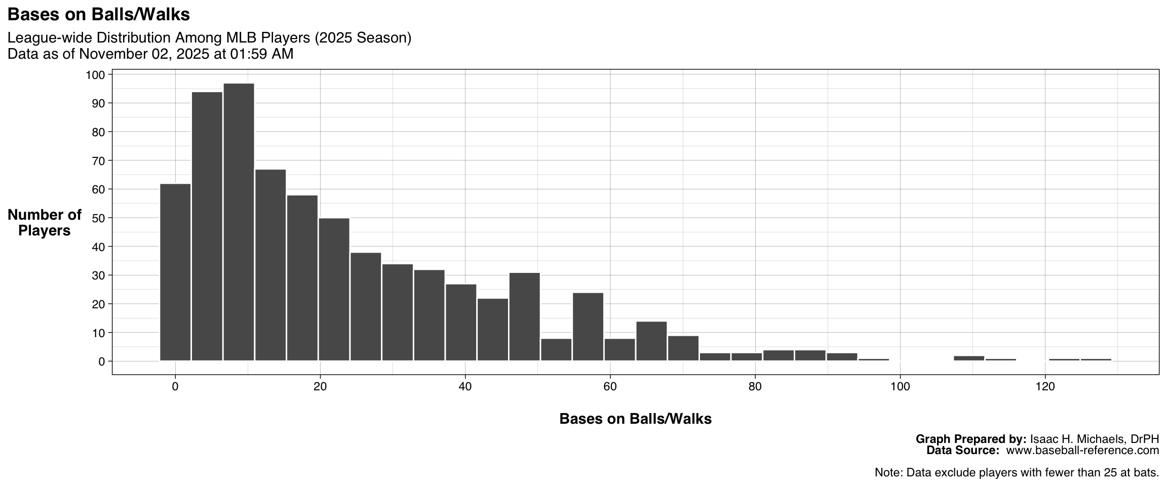
| League-wide Leaders: Bases on Balls/Walks | |||
| 2026 Season Data as of June 18, 2026 at 06:38 PM |
|||
| Rank | Player | Team | BB |
|---|---|---|---|
| 1 | Nick Kurtz* | ATH | 68 |
| 2 | Mike Trout | LAA | 66 |
| 3 | Taylor Ward | BAL | 63 |
| 4 | James Wood* | WSN | 59 |
| 5 | Shohei Ohtani* | LAD | 51 |
| 6 | Michael Busch* | CHC | 50 |
| 7 | Bryan Reynolds# | PIT | 49 |
| 8 | Brice Turang* | MIL | 48 |
| 9 | Bryce Harper* | PHI | 47 |
| 10 | Yordan Alvarez* | HOU | 46 |
| 11 | Kyle Schwarber* | PHI | 46 |
| Table Prepared by: Isaac H. Michaels, DrPH Data Source: www.baseball-reference.com |
|||
| Note: Data exclude players with fewer than 25 at bats. | |||
Graph and Table Prepared By: Isaac H. Michaels, DrPH
Data Source: www.baseball-reference.com
Double Plays Grounded Into
This figure shows the distribution of Double Plays Grounded Into among all qualified batters. Each bar represents the number of players whose GIDP totals fall within a specific range. The accompanying table lists the ten players who have grounded into the most double plays, providing insight into tendencies related to contact type and situational hitting. These outputs together help illustrate how frequently players contribute to defensive double plays when batting with runners on base.
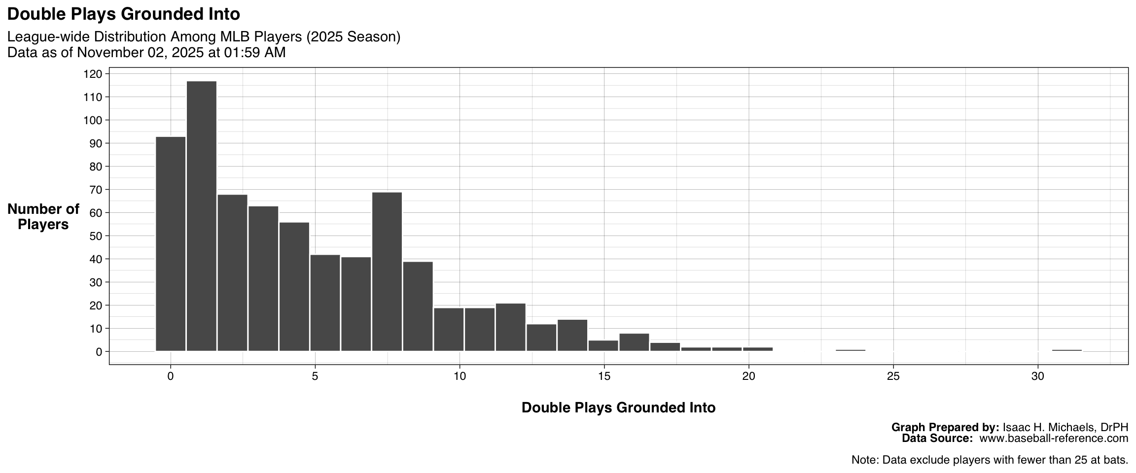
| League-wide Leaders: Double Plays Grounded Into | |||
| 2026 Season Data as of June 18, 2026 at 06:38 PM |
|||
| Rank | Player | Team | GIDP |
|---|---|---|---|
| 1 | Junior Caminero | TBR | 12 |
| 2 | Josh Jung | TEX | 12 |
| 3 | Freddie Freeman* | LAD | 11 |
| 4 | Josh Naylor* | SEA | 11 |
| 5 | Ryan O'Hearn* | PIT | 11 |
| 6 | Francisco Alvarez | NYM | 11 |
| 7 | Mark Vientos | NYM | 10 |
| 8 | Jeremiah Jackson | BAL | 10 |
| 9 | Yandy Díaz | TBR | 9 |
| 10 | Jose Altuve | HOU | 9 |
| Table Prepared by: Isaac H. Michaels, DrPH Data Source: www.baseball-reference.com |
|||
| Note: Data exclude players with fewer than 25 at bats. | |||
Graph and Table Prepared By: Isaac H. Michaels, DrPH
Data Source: www.baseball-reference.com
Pitching
This table presents pitching performance across Major League Baseball for all pitchers who have appeared in at least 10 games during the current season. It includes both traditional and advanced measures of pitching effectiveness and workload. Core statistics such as wins (W), losses (L), earned run average (ERA), games started (GS), and innings pitched (IP) summarize each pitcher’s role and overall contribution. Additional categories—such as complete games (CG), shutouts (SHO), and saves (SV)—highlight specific game outcomes and pitching durability.
Rate-based indicators including WHIP (walks plus hits per inning pitched), strikeouts per nine innings (SO9), and walks per nine innings (BB9) quantify efficiency and control, while advanced metrics such as Wins Above Replacement (WAR), ERA+, and fielding independent pitching (FIP) adjust for ballpark and defensive effects. Together, these data provide a nuanced view of pitcher performance, distinguishing consistent starters, high-leverage relievers, and emerging contributors across teams and leagues.
Note: Table displays rows only for players that played in at least 10 games.
Table Prepared By: Isaac H. Michaels, DrPH
Data Source: www.baseball-reference.com
•: Left-Handed Pitcher
W – Wins
L – Losses
W-L% – Win-Loss Percentage
ERA – 9 * ER / IP
G – Games Played or Pitched
GS – Games Started
GF – Games Finished
CG – Complete Game
SHO – Shutouts
SV – Saves
IP – Innings Pitched
H – Hits/Hits Allowed
R – Runs Scored/Allowed
ER – Earned Runs Allowed
HR – Home Runs Hit/Allowed
BB – Bases on Balls/Walks
IBB – Intentional Bases on Balls
SO – Strikeouts
HBP – Times Hit by a Pitch
BK – Balks
WP – Wild Pitches
BF – Batters Faced
ERA+ – ERA+ Adjusted to the player’s ballpark(s)
WHIP – (BB + H)/IP
H9 – 9 x H / IP
HR9 – 9 x HR / IP
BB9 – 9 x BB / IP
SO9 – 9 x SO / IP
SO/W – SO/W or SO/BB
Distributions and Leaders in Selected Statistics
Wins Above Replacement
This interactive visualization displays the distribution of Wins Above Replacement (WAR) for Major League Baseball pitchers during the current season. Each horizontal boxplot represents the spread of WAR values among pitchers on a given team, while individual points correspond to qualifying players who have appeared in the minimum number of games required for inclusion. Hovering over a point reveals the pitcher’s name, team, and WAR value.
The plot allows comparisons of pitching depth and performance across teams. Teams with higher median WAR values or a few standout outliers may rely heavily on elite pitching contributions, whereas more evenly distributed clusters suggest balanced rotations or bullpens. By examining the variation in WAR among teams, the figure highlights both dominant aces and the broader distribution of value among supporting pitchers.
Graph Prepared By: Isaac H. Michaels, DrPH
Data Source: www.baseball-reference.com
This figure displays the distribution of Wins Above Replacement (WAR) among all qualified pitchers for the current season. Each bar represents the number of pitchers whose WAR values fall within a particular range. The accompanying table lists the ten pitchers with the highest WAR, identifying those whose overall contributions most exceed those of replacement-level players. Together, these outputs provide a structural overview of how pitcher value is distributed across the league.
| League-wide Leaders: Wins Above Replacement | |||
| 2026 Season Data as of June 18, 2026 at 06:38 PM |
|||
| Rank | Player | Team | WAR |
|---|---|---|---|
| 1 | Cristopher Sánchez* | PHI | 5.1 |
| 2 | Jacob Misiorowski | MIL | 3.9 |
| 3 | Chase Burns | CIN | 3.9 |
| 4 | Cam Schlittler | NYY | 3.8 |
| 5 | Zack Wheeler | PHI | 3.3 |
| 6 | Eduardo Rodríguez* | ARI | 2.8 |
| 7 | Nick Martinez | TBR | 2.7 |
| 8 | José Soriano | LAA | 2.6 |
| 9 | Max Meyer | MIA | 2.6 |
| 10 | J.T. Ginn | ATH | 2.6 |
| Table Prepared by: Isaac H. Michaels, DrPH Data Source: www.baseball-reference.com |
|||
| Note: Data exclude pitchers with fewer than 10 game appearances. | |||
Graph and Table Prepared By: Isaac H. Michaels, DrPH
Data Source: www.baseball-reference.com
Earned Run Average
This figure illustrates the distribution of Earned Run Average (ERA) among all qualified pitchers. Each bar represents the number of pitchers whose ERA falls within a given range. The accompanying table lists the ten pitchers with the lowest ERA, highlighting those who have allowed the fewest earned runs per nine innings pitched. Together, these outputs show how pitching effectiveness is distributed across the league in terms of run prevention.
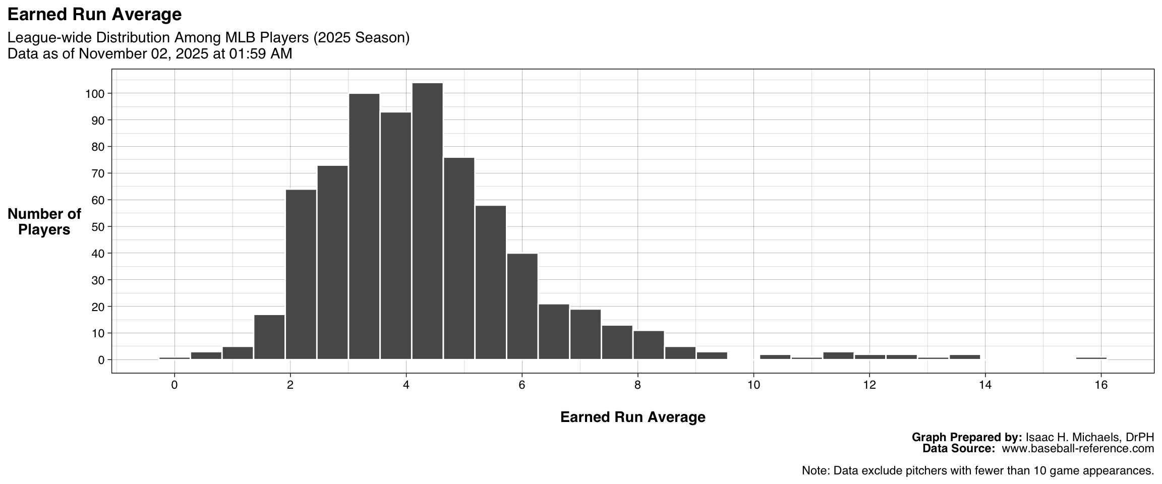
| League-wide Leaders: Earned Run Average | |||
| 2026 Season Data as of June 18, 2026 at 06:38 PM |
|||
| Rank | Player | Team | ERA |
|---|---|---|---|
| 1 | Nick Davila | SEA | 0.00 |
| 2 | Aroldis Chapman* | BOS | 0.44 |
| 3 | Matt Brash | SEA | 0.54 |
| 4 | Robert Suarez | ATL | 0.59 |
| 5 | Louis Varland | TOR | 0.90 |
| 6 | Mason Miller | SDP | 0.90 |
| 7 | Dylan Lee* | ATL | 1.14 |
| 8 | Raisel Iglesias | ATL | 1.16 |
| 9 | Jacob Misiorowski | MIL | 1.34 |
| 10 | Sam Hentges* | SFG | 1.46 |
| Table Prepared by: Isaac H. Michaels, DrPH Data Source: www.baseball-reference.com |
|||
| Note: Data exclude pitchers with fewer than 10 game appearances. | |||
Graph and Table Prepared By: Isaac H. Michaels, DrPH
Data Source: www.baseball-reference.com
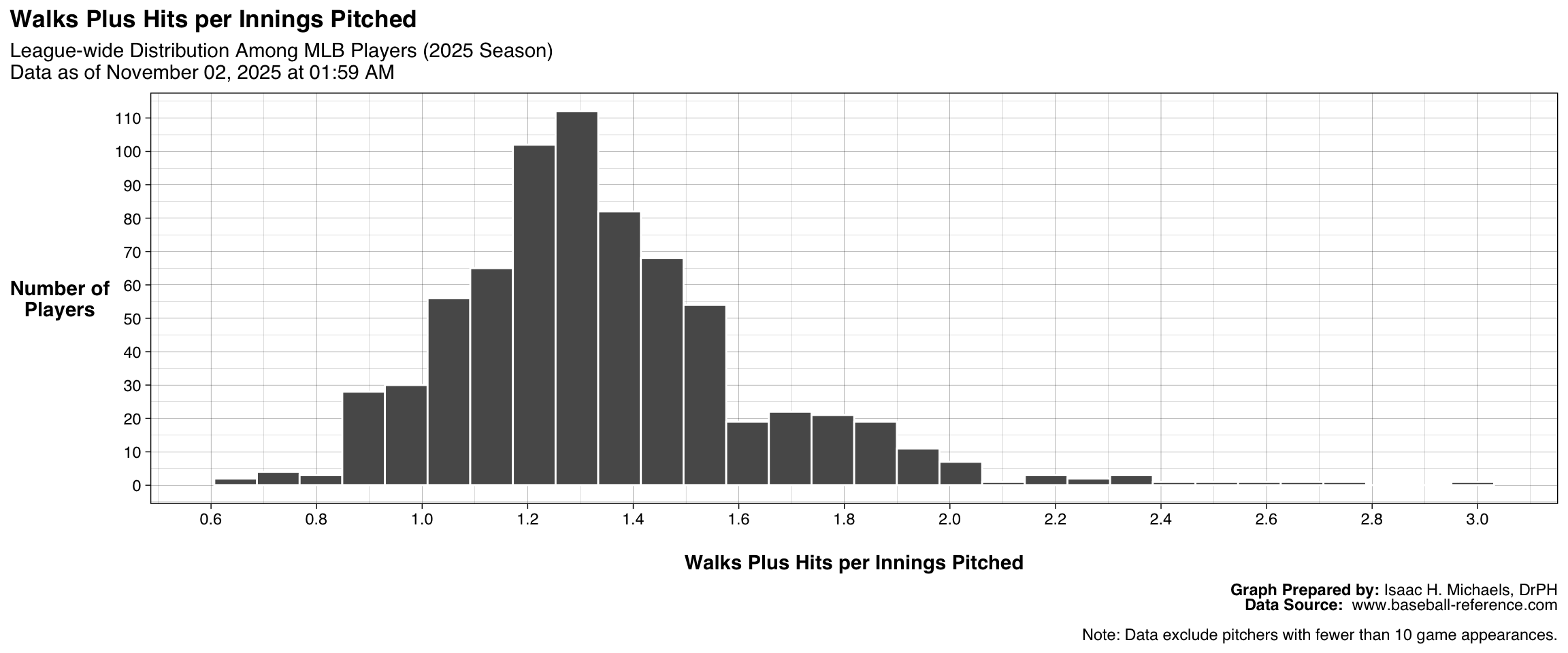
(Walks + Hits) per Innings Pitched
This figure shows the distribution of (Walks + Hits) per Innings Pitched (WHIP) among all qualified pitchers. Each bar represents the number of pitchers whose WHIP falls within a certain range. The accompanying table identifies the ten pitchers with the lowest WHIP, reflecting the most efficient at limiting baserunners. Together, these outputs demonstrate variation in pitcher control and contact management across the league.
| League-wide Leaders: Walks Plus Hits per Innings Pitched | |||
| 2026 Season Data as of June 18, 2026 at 06:38 PM |
|||
| Rank | Player | Team | WHIP |
|---|---|---|---|
| 1 | Jacob Latz* | TEX | 0.600 |
| 2 | Dylan Lee* | ATL | 0.632 |
| 3 | John King* | MIA | 0.710 |
| 4 | Tanner Scott* | LAD | 0.710 |
| 5 | Paul Sewald | ARI | 0.732 |
| 6 | Jacob Misiorowski | MIL | 0.736 |
| 7 | Rico Garcia | BAL | 0.742 |
| 8 | Robert Suarez | ATL | 0.783 |
| 9 | Colin Holderman | CLE | 0.797 |
| 10 | Mason Miller | SDP | 0.800 |
| 11 | Yennier Cano | BAL | 0.800 |
| Table Prepared by: Isaac H. Michaels, DrPH Data Source: www.baseball-reference.com |
|||
| Note: Data exclude pitchers with fewer than 10 game appearances. | |||
Graph and Table Prepared By: Isaac H. Michaels, DrPH
Data Source: www.baseball-reference.com
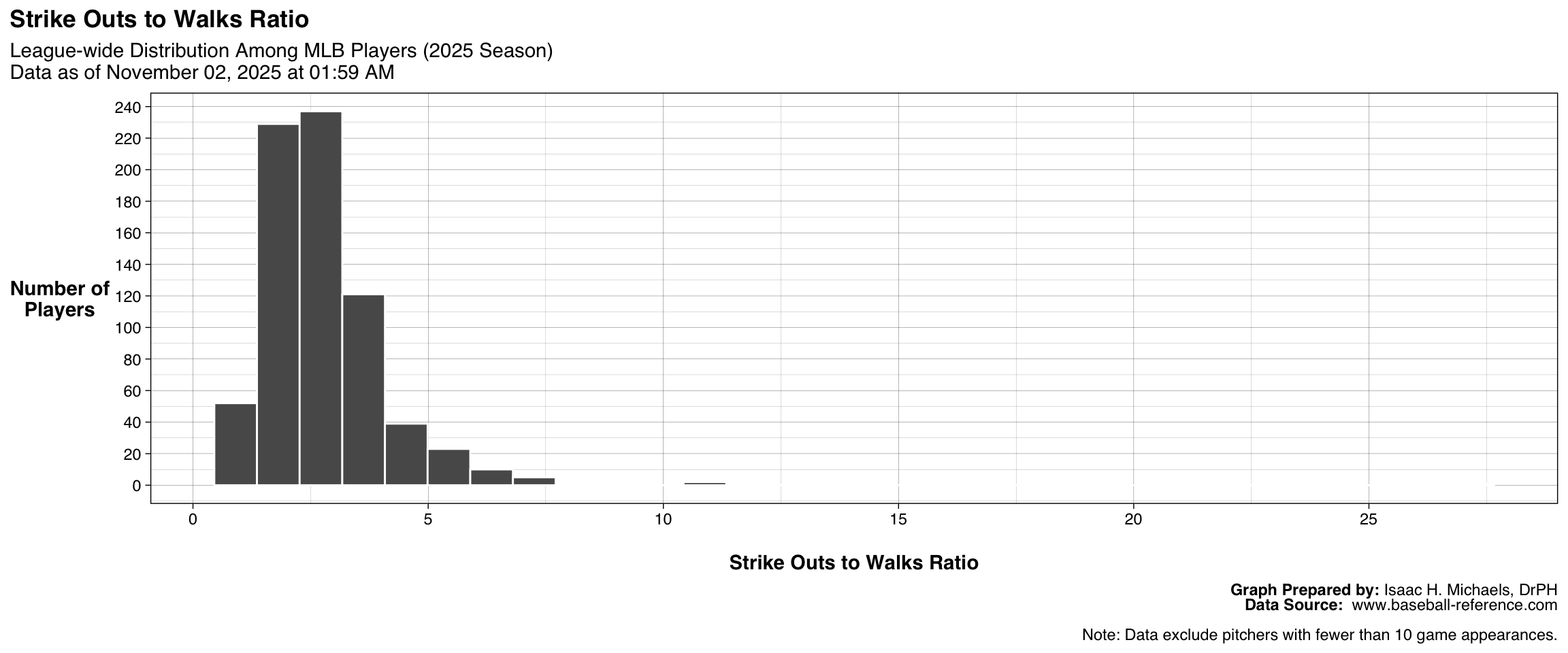
Strike Outs to Walks Ratio
This figure presents the distribution of Strikeouts-to-Walks Ratio (SO/BB) among all qualified pitchers. Each bar corresponds to the number of pitchers whose SO/BB ratio falls within a given range. The accompanying table lists the ten pitchers with the highest ratios, indicating the best combination of strikeout ability and control. Together, these outputs illustrate the range of pitching command and dominance across the league.
| League-wide Leaders: Strike Outs to Walks Ratio | |||
| 2026 Season Data as of June 18, 2026 at 06:38 PM |
|||
| Rank | Player | Team | SO/BB |
|---|---|---|---|
| 1 | Tyron Guerrero | BOS | 16.00 |
| 2 | Tanner Scott* | LAD | 12.67 |
| 3 | Kyle Backhus* | PHI | 10.00 |
| 4 | Cade Smith | CLE | 8.17 |
| 5 | Dylan Lee* | ATL | 8.00 |
| 6 | Grant Wolfram* | BAL | 8.00 |
| 7 | Jhoan Duran | PHI | 7.00 |
| 8 | Drew Rasmussen | TBR | 6.46 |
| 9 | Paul Skenes | PIT | 6.19 |
| 10 | Cristopher Sánchez* | PHI | 6.11 |
| Table Prepared by: Isaac H. Michaels, DrPH Data Source: www.baseball-reference.com |
|||
| Note: Data exclude pitchers with fewer than 10 game appearances. | |||
Graph and Table Prepared By: Isaac H. Michaels, DrPH
Data Source: www.baseball-reference.com
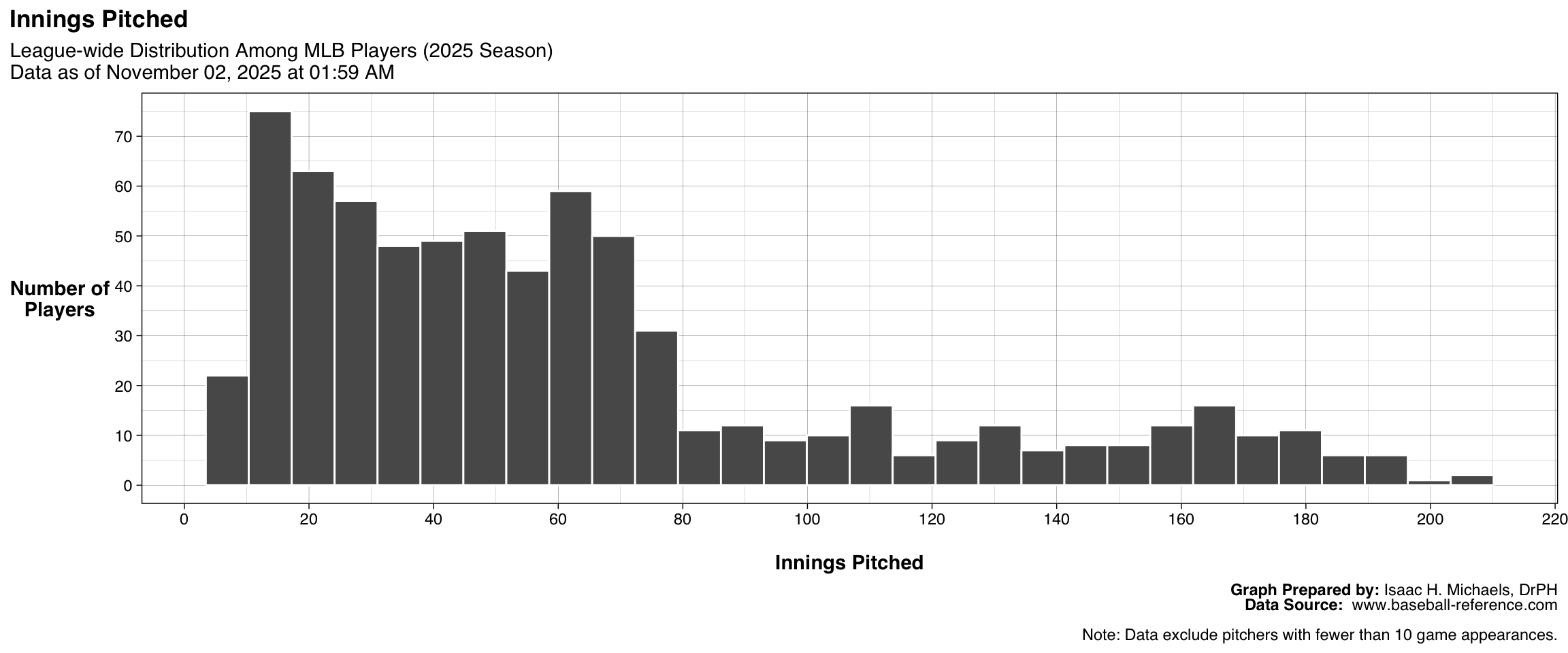
Innings Pitched
This figure shows the distribution of Innings Pitched among all qualified pitchers. Each bar represents the number of pitchers who have thrown within a specific range of innings. The accompanying table highlights the ten pitchers with the highest innings totals, reflecting those most relied upon for workload and durability. Together, these outputs illustrate the distribution of pitching volume across the league.
| League-wide Leaders: Innings Pitched | |||
| 2026 Season Data as of June 18, 2026 at 06:38 PM |
|||
| Rank | Player | Team | IP |
|---|---|---|---|
| 1 | Sandy Alcantara | MIA | 103.1 |
| 2 | Cristopher Sánchez* | PHI | 99.0 |
| 3 | Michael Wacha | KCR | 94.0 |
| 4 | Gavin Williams | CLE | 91.2 |
| 5 | Braxton Ashcraft | PIT | 90.2 |
| 6 | George Kirby | SEA | 90.0 |
| 7 | Cam Schlittler | NYY | 89.0 |
| 8 | Bryce Elder | ATL | 88.2 |
| 9 | Eduardo Rodríguez* | ARI | 88.1 |
| 10 | Reid Detmers* | LAA | 88.0 |
| Table Prepared by: Isaac H. Michaels, DrPH Data Source: www.baseball-reference.com |
|||
| Note: Data exclude pitchers with fewer than 10 game appearances. | |||
Graph and Table Prepared By: Isaac H. Michaels, DrPH
Data Source: www.baseball-reference.com
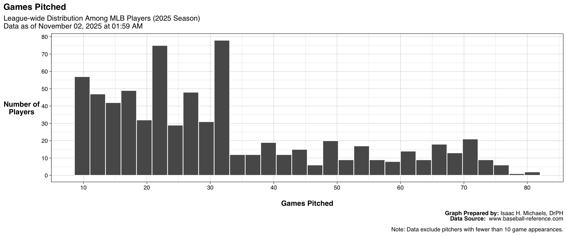
Games Pitched
This figure displays the distribution of Games Pitched among all qualified pitchers. Each bar represents the number of pitchers who have appeared in a certain range of games. The accompanying table identifies the ten pitchers with the most appearances, often reflecting bullpen specialists or high-usage relievers. Together, these outputs illustrate variation in how frequently pitchers take the mound throughout the season.
| League-wide Leaders: Games Pitched | |||
| 2026 Season Data as of June 18, 2026 at 06:38 PM |
|||
| Rank | Player | Team | G |
|---|---|---|---|
| 1 | Mason Fluharty* | TOR | 39 |
| 2 | Braydon Fisher | TOR | 37 |
| 3 | Hogan Harris* | ATH | 37 |
| 4 | Louis Varland | TOR | 36 |
| 5 | Brock Burke* | CIN | 36 |
| 6 | Tyler Rogers | TOR | 36 |
| 7 | Brent Headrick* | NYY | 36 |
| 8 | Justin Sterner | ATH | 35 |
| 9 | Jeff Hoffman | TOR | 35 |
| 10 | Jose A. Ferrer* | SEA | 35 |
| 11 | Brennan Bernardino* | COL | 35 |
| Table Prepared by: Isaac H. Michaels, DrPH Data Source: www.baseball-reference.com |
|||
| Note: Data exclude pitchers with fewer than 10 game appearances. | |||
Graph and Table Prepared By: Isaac H. Michaels, DrPH
Data Source: www.baseball-reference.com
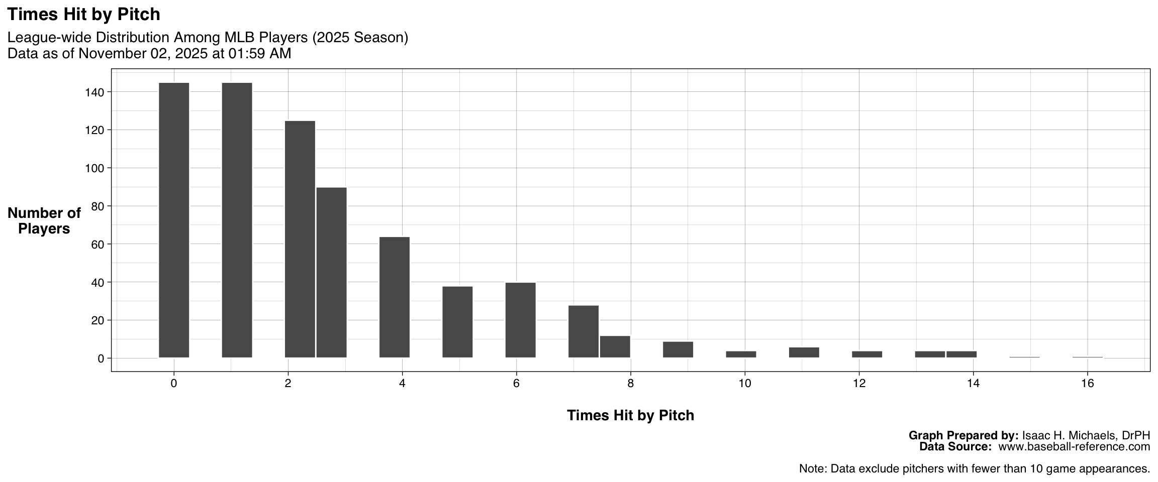
Times Hit by Pitch
This figure presents the distribution of Times Hit by Pitch among all qualified pitchers, reflecting how often each has struck opposing batters with a pitch. Each bar represents the number of pitchers with hit-by-pitch totals within a specific range. The accompanying table lists the ten pitchers with the highest HBP counts, indicating those whose pitching style, control, or aggressiveness results in more hit batters. These outputs together illustrate league-wide variation in hit-by-pitch frequency.
| League-wide Leaders: Times Hit by Pitch | |||
| 2026 Season Data as of June 18, 2026 at 06:38 PM |
|||
| Rank | Player | Team | HBP |
|---|---|---|---|
| 1 | Anthony Kay* | CHW | 13 |
| 2 | Cade Cavalli | WSN | 11 |
| 3 | Spencer Arrighetti | HOU | 10 |
| 4 | Nolan McLean | NYM | 9 |
| 5 | Framber Valdez* | DET | 8 |
| 6 | Chris Sale* | ATL | 8 |
| 7 | Chris Bassitt | BAL | 8 |
| 8 | Jacob Misiorowski | MIL | 7 |
| 9 | Foster Griffin* | WSN | 7 |
| 10 | Yohan Ramírez | PIT | 7 |
| 11 | Scott Barlow | ATH | 7 |
| Table Prepared by: Isaac H. Michaels, DrPH Data Source: www.baseball-reference.com |
|||
| Note: Data exclude pitchers with fewer than 10 game appearances. | |||
Graph and Table Prepared By: Isaac H. Michaels, DrPH
Data Source: www.baseball-reference.com
Fielding
This table presents fielding statistics for Major League Baseball players who have appeared in at least 10 games during the current season. The data summarize individual defensive performance across positions and teams, emphasizing both opportunity and execution in the field. Traditional indicators such as games played (G), innings in the field (Inn), putouts (PO), assists (A), and errors (E) describe the frequency and outcomes of defensive chances (Ch). Fielding percentage (Fld%) offers a basic efficiency measure, while double plays (DP) illustrate situational impact.
More advanced measures—including total runs above average (Rtot), defensive runs saved (Rdrs), and range factors (RF/9 and RF/G)—capture defensive range, positioning, and overall run prevention value. Comparative metrics such as league-average range factors (lgRF9 and lgRFG) provide contextual benchmarks for evaluating fielding performance relative to peers. Together, these data give a comprehensive view of how fielders contribute to team defense, from routine plays to high-impact run-saving efforts.