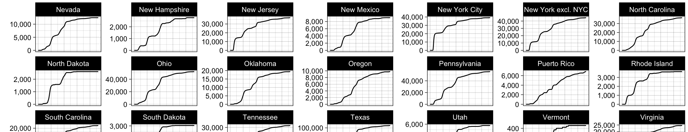
A new article published in Preventing Chronic Disease presents a novel technique for visualizing temporal trends in spatial data related to cancer mortality in the United States. Titled “Visualizing 50 Years of Cancer Mortality Rates Across the US at Multiple Geographic Levels Using a Synchronized Map and Graph Animation,” the article, authored by Isaac H. Michaels, Sylvia J. Pirani, and Alvaro Carrascal, presents an animated choropleth map alongside a synchronized animated horizontal bar chart.
The study analyzed data on cancer deaths from 1968 to 2017 at the county, state, and national levels. Age-adjusted mortality rates were obtained from the Centers for Disease Control and Prevention (CDC) WONDER database and defined as deaths with any malignant cancer listed as the underlying cause.
The resulting synchronized map and graph animation allows viewers to easily select trends of interest for a particular state, region, or time interval. This visualization tool has the potential to help health officials and stakeholders target prevention and treatment efforts more effectively in the fight against cancer, which is the second leading cause of death in the United States.
“We are excited to share this new method for visualizing spatial data with the public health community,” said lead author Isaac H. Michaels. “We believe it has the potential to improve our understanding of cancer mortality trends over time and inform more targeted prevention and treatment efforts.”
The article can be accessed at https://www.cdc.gov/pcd/issues/2020/19_0286.htm.
Article Citation:
Michaels IH, Pirani SJ, Carrascal A. Visualizing 50 Years of Cancer Mortality Rates Across the US at Multiple Geographic Levels Using a Synchronized Map and Graph Animation. Prev Chronic Dis 2020;17:190286. DOI: http://dx.doi.org/10.5888/pcd17.190286external
https://www.cdc.gov/pcd/issues/2020/19_0286.htm