Published: June 25, 2021
Updated: November 02, 2025 at 01:59AM
Welcome
Welcome to my baseball season data analysis. This page offers interactive visualizations and detailed data tables that capture team and player performance throughout Major League Baseball (MLB) seasons. You can explore cumulative wins, run differentials, scoring trends, and advanced player statistics such as Wins Above Replacement, on-base plus slugging, and earned run average. The charts and tables highlight team momentum, offensive and defensive strengths, and individual contributions, providing a clear view of which teams and players are excelling over time.
All data are sourced from Baseball Reference and updated daily during the regular season, allowing you to track changes as the season unfolds. Whether you’re a fan, analyst, or fantasy baseball player, these visualizations offer an accessible, data-driven perspective on MLB performance. I hope you find these visualizations and data tables helpful in understanding the current MLB season. Thank you for visiting the page.
Executive Summary1
To the Fans,
This briefing analyzes the final team and player statistics for the 2025 Major League Baseball season, drawing from a complete set of box score data. The season concluded with several teams crossing the 90-win threshold, including the Milwaukee Brewers (97 wins), Philadelphia Phillies (96), New York Yankees (94), and Toronto Blue Jays (94). At the other end of the spectrum, the Colorado Rockies finished with a league-low 43 wins. The following analysis examines the key team-level patterns and individual performances that defined the season, offering a data-driven perspective on how the most successful clubs separated themselves from the rest of the league.
A primary pattern emerging from the data is that the league’s top teams combined consistent run prevention with timely, rather than necessarily overwhelming, offense. The Milwaukee Brewers, for example, led MLB with 97 wins despite a median of just 4 runs scored per game, a figure common across the league, even among many teams with losing records. Their success may reflect superior pitching and defense, as their positive run differential median of +1 suggests a pattern of winning close contests. Similarly, the 96-win Philadelphia Phillies posted a median of 3 runs allowed per game, among the best in the league, complementing an offense that featured Kyle Schwarber’s powerful 56 home run season.
Conversely, a substantial gap in performance consistency appears to separate the top and bottom teams. The Colorado Rockies, who lost 119 games, had the same median runs scored (4) and allowed (4) as the 97-win Brewers. However, the standard deviation in their runs allowed was 4.13, one of the highest in baseball and notably greater than Milwaukee’s 3.56. This greater variance could indicate a susceptibility to high-scoring losses that undermined their overall record. This pattern suggests that limiting poor defensive and pitching outings is as crucial to a successful season as producing high-scoring offensive games.
On the individual level, the data highlight several exceptional offensive seasons. The home run race was fiercely contested, with Seattle’s Cal Raleigh leading the league with a remarkable 60 home runs. He was followed by Kyle Schwarber (56), Shohei Ohtani (55), and Aaron Judge (53). Judge’s performance was particularly notable, as he also posted a 9.7 Wins Above Replacement (WAR), the highest score among all position players, indicating an unparalleled all-around contribution to the Yankees. Raleigh also demonstrated remarkable value beyond his power; his league-leading home run total was complemented by a 7.3 WAR, placing him in the top tier for overall performance.
The pitching leaderboards reveal dominance achieved through different means. Pittsburgh’s Paul Skenes (7.6) and Philadelphia’s Cristopher Sánchez (8.0) led all pitchers in WAR, suggesting their performances provided immense value to their respective teams. Workhorse starters like San Francisco’s Logan Webb (207 innings) and Boston’s Garrett Crochet (205.1 innings) anchored their rotations through sheer volume. In the bullpen, relievers like Hunter Harvey of the Kansas City Royals achieved near-perfection, posting a 0.00 ERA and a 0.656 WHIP (walks and hits per inning pitched) across his appearances, demonstrating how specialized roles can produce impactful results.
It is important to note a potential limitation within this dataset. The median run differential is reported as +1 for the vast majority of teams, including those with highly disparate win-loss records, which may not accurately capture game-to-game scoring margins. Consequently, metrics such as the standard deviation of runs allowed or overall win percentage may offer a clearer picture of team consistency. The data strongly suggest that while elite individual talent is critical, a team’s ability to maintain a consistent, balanced performance in scoring and run prevention remains a key driver of success over a 162-game season.
Cumulative Wins
This figure presents cumulative wins by Major League Baseball (MLB) team during the current season. Each panel corresponds to a single team, with the x-axis representing the progression of the season by date and the y-axis showing the total number of wins accumulated to date. This display helps illustrate how quickly teams have been winning games relative to one another and provides a clear view of momentum, slumps, or sustained success over time. Because the plot updates automatically as new data become available, it reflects each team’s current position in the season at the time of the most recent refresh.
Graph Prepared By: Isaac H. Michaels, DrPH
Data Source: www.baseball-reference.com
Runs Scored vs. Runs Allowed
This figure plots runs scored against runs allowed for each Major League Baseball (MLB) team during the current season. Each panel corresponds to a single team, with individual points representing games. Points above the diagonal dashed line indicate games in which the team scored more runs than it allowed (wins), while points below the line indicate losses. Points are colored according to game outcome to distinguish between wins and losses. Teams with a larger number of points above the line tend to outscore their opponents more consistently, reflecting stronger overall performance. The figure provides a visual summary of each team’s run-scoring and defensive patterns across all games to date.
Graph Prepared By: Isaac H. Michaels, DrPH
Data Source: www.baseball-reference.com
Runs Differentials
Histograms
This figure shows histograms of game-level run differentials for each Major League Baseball (MLB) team during the current season. Each bar represents the number of games with a given scoring margin, using a bin width of one run. Positive run differentials correspond to wins, while negative values correspond to losses. Bars are colored according to game outcome, distinguishing victories from defeats. Teams with histograms skewed to the right tend to win by larger margins or more frequently, indicating stronger overall performance. In contrast, teams with distributions centered near zero or skewed left tend to have closer or less favorable results. The figure offers a concise visual summary of how dominant — or narrowly competitive — each team’s games have been.
Graph Prepared By: Isaac H. Michaels, DrPH
Data Source: www.baseball-reference.com
Trends
This figure presents game-by-game run differentials for each Major League Baseball (MLB) team over the course of the current season. Each vertical bar represents a single game, with its height indicating the margin of victory or defeat — positive values for wins and negative values for losses. Bars are colored green for wins and red for losses. The plot provides a visual timeline of team performance, revealing patterns such as winning or losing streaks, consistency in run margins, and periods of volatility. Teams with consistently tall positive bars tend to dominate opponents, whereas those with frequent negative bars or alternating patterns suggest closer or less predictable outcomes. Displaying these bars sequentially highlights the rhythm of each team’s season.
Graph Prepared By: Isaac H. Michaels, DrPH
Data Source: www.baseball-reference.com
Player Statistics
Batting
This table summarizes individual batting performance across Major League Baseball for all players with at least 25 at bats during the current season. It provides a comprehensive view of offensive production through both traditional and advanced metrics. Basic counting statistics such as games played (G), plate appearances (PA), hits (H), home runs (HR), and runs batted in (RBI) capture each player’s volume and contribution to team scoring. Rate-based measures—including batting average (BA), on-base percentage (OBP), slugging percentage (SLG), and on-base plus slugging (OPS)—reflect overall hitting efficiency and power.
Advanced indicators such as Wins Above Replacement (WAR), OPS+, and weighted on-base average (rOBA) contextualize performance relative to league and ballpark environments. Together, these metrics allow for comparisons across teams and player types, highlighting both consistent contributors and standout performers. The table serves as a detailed reference for evaluating individual offensive value throughout the season.
Note: Table displays rows only for players with at least 25 at bats.
Table Prepared By: Isaac H. Michaels, DrPH
Data Source: www.baseball-reference.com
*: Left-Handed Batter
#: Switch Hitter
G – Games Played
PA – Plate Appearances
AB – At Bats
R – Runs Scored/Allowed
H – Hits/Hits Allowed
2B – Doubles Hit/Allowed
3B – Triples Hit/Allowed
HR – Home Runs Hit/Allowed
RBI – Runs Batted In
SB – Stolen Bases
CS – Caught Stealing
BB – Bases on Balls/Walks
SO – Strikeouts
BA – Hits/At Bats
OBP – (H + BB + HBP)/(At Bats + BB + HBP + SF)
SLG – Total Bases/At Bats
OPS – On-Base + Slugging Percentages
OPS+ – OPS+ Adjusted to the player’s ballpark(s)
GIDP – Double Plays Grounded Into
IBB – Intentional Bases on Balls
Distributions and Leaders in Selected Statistics
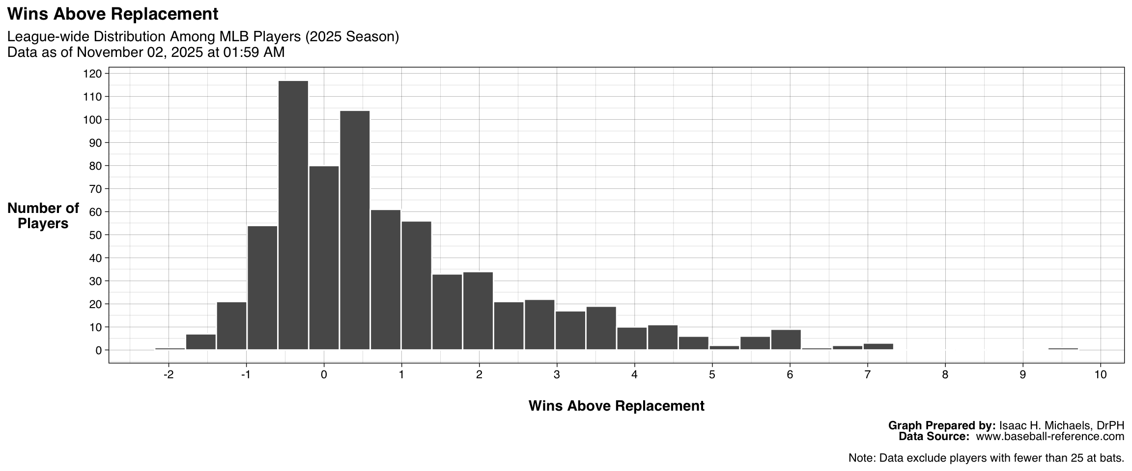
Wins Above Replacement
This interactive plot shows the distribution of Wins Above Replacement (WAR) for Major League Baseball batters during the current season. Each horizontal box represents the spread of WAR values among players on a given team, with individual points marking each qualifying batter. Hovering over a point reveals the player’s name, team, and WAR value. The plot excludes players who have not reached the minimum number of at-bats required for inclusion, providing a clearer view of team-level performance among regular contributors.
By displaying both central tendencies and outliers, the visualization highlights how WAR varies across teams—some showing tightly clustered distributions indicative of balanced rosters, while others have one or two high-impact players driving overall team value. These differences help illustrate where player contributions are concentrated and which teams benefit most from top-tier offensive performance.
Graph and Table Prepared By: Isaac H. Michaels, DrPH
Data Source: www.baseball-reference.com
This figure shows the distribution of Wins Above Replacement (WAR) among all qualified batters for the current season. Each bar represents the number of players within a given WAR range. The accompanying table lists the ten players with the highest WAR values, providing a reference for those whose overall contributions most exceed that of a replacement-level player. Together, the figure and table help illustrate the spread of player value across the league based on combined offensive, defensive, and baserunning performance.
| League-wide Leaders: Wins Above Replacement | |||
| 2025 Season Data as of November 02, 2025 at 01:59 AM |
|||
| Rank | Player | Team | WAR |
|---|---|---|---|
| 1 | Aaron Judge | NYY | 9.7 |
| 2 | Cal Raleigh# | SEA | 7.3 |
| 3 | Bobby Witt Jr. | KCR | 7.1 |
| 4 | Geraldo Perdomo# | ARI | 7.0 |
| 5 | Julio Rodríguez | SEA | 6.8 |
| 6 | Shohei Ohtani* | LAD | 6.6 |
| 7 | Juan Soto* | NYM | 6.2 |
| 8 | Matt Olson* | ATL | 6.1 |
| 9 | Nico Hoerner | CHC | 6.1 |
| 10 | Corey Seager* | TEX | 6.1 |
| Table Prepared by: Isaac H. Michaels, DrPH Data Source: www.baseball-reference.com |
|||
| Note: Data exclude players with fewer than 25 at bats. | |||
Graph and Table Prepared By: Isaac H. Michaels, DrPH
Data Source: www.baseball-reference.com
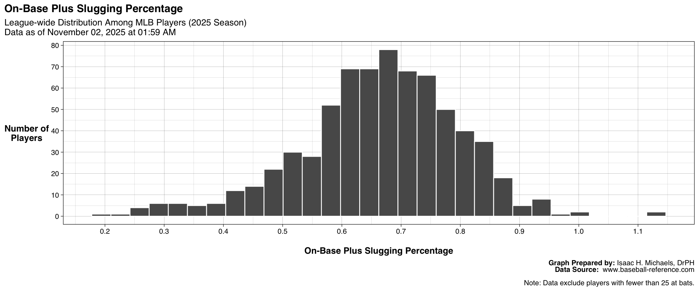
On-Base Plus Slugging Percentage
This figure shows the distribution of On-Base Plus Slugging Percentage (OPS) across all qualified batters. Each bar represents the number of players whose OPS falls within a particular range. The accompanying table identifies the ten players with the highest OPS values, offering a snapshot of the league’s strongest overall offensive performers. Together, these outputs demonstrate how effectively players combine on-base ability and power hitting.
| League-wide Leaders: On-Base Plus Slugging Percentage | |||
| 2025 Season Data as of November 02, 2025 at 01:59 AM |
|||
| Rank | Player | Team | OPS |
|---|---|---|---|
| 1 | Aaron Judge | NYY | 1.144 |
| 2 | Austin Wynns | CIN | 1.142 |
| 3 | Shohei Ohtani* | LAD | 1.014 |
| 4 | Nick Kurtz* | ATH | 1.002 |
| 5 | George Springer | TOR | 0.959 |
| 6 | Cal Raleigh# | SEA | 0.948 |
| 7 | Miguel Andujar | CIN | 0.944 |
| 8 | Giancarlo Stanton | NYY | 0.944 |
| 9 | Carter Jensen* | KCR | 0.941 |
| 10 | Jahmai Jones | DET | 0.937 |
| Table Prepared by: Isaac H. Michaels, DrPH Data Source: www.baseball-reference.com |
|||
| Note: Data exclude players with fewer than 25 at bats. | |||
Graph and Table Prepared By: Isaac H. Michaels, DrPH
Data Source: www.baseball-reference.com
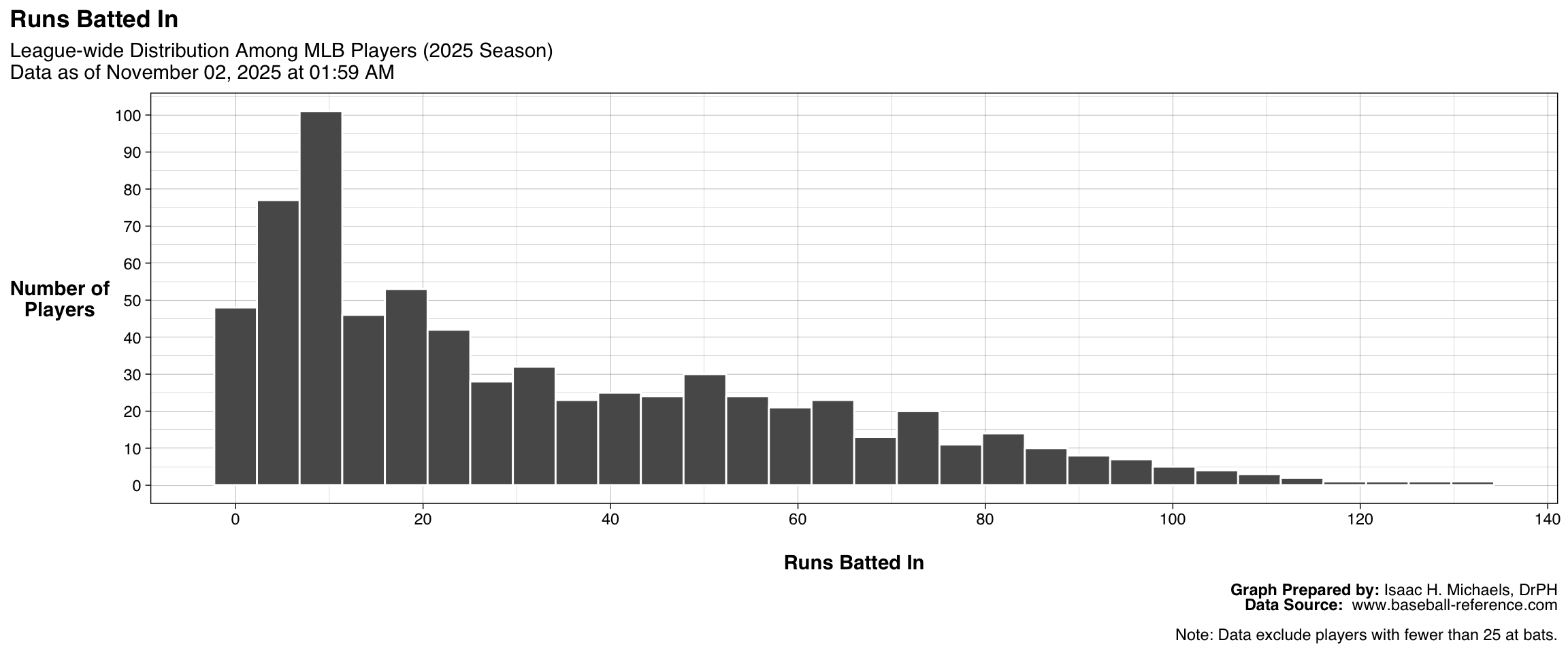
Runs Batted In
This figure shows the distribution of Runs Batted In (RBI) across all qualified batters. Each bar corresponds to the number of players whose RBI totals fall within a specified range. The accompanying table highlights the ten players with the highest RBI counts, illustrating the league’s top run producers. This output provides a league-wide view of offensive productivity in terms of driving in runs.
| League-wide Leaders: Runs Batted In | |||
| 2025 Season Data as of November 02, 2025 at 01:59 AM |
|||
| Rank | Player | Team | RBI |
|---|---|---|---|
| 1 | Kyle Schwarber* | PHI | 132 |
| 2 | Pete Alonso | NYM | 126 |
| 3 | Cal Raleigh# | SEA | 125 |
| 4 | Eugenio Suárez | 2TM | 118 |
| 5 | Aaron Judge | NYY | 114 |
| 6 | Vinnie Pasquantino* | KCR | 113 |
| 7 | Riley Greene* | DET | 111 |
| 8 | Junior Caminero | TBR | 110 |
| 9 | Rafael Devers* | 2TM | 109 |
| 10 | Juan Soto* | NYM | 105 |
| Table Prepared by: Isaac H. Michaels, DrPH Data Source: www.baseball-reference.com |
|||
| Note: Data exclude players with fewer than 25 at bats. | |||
Graph and Table Prepared By: Isaac H. Michaels, DrPH
Data Source: www.baseball-reference.com
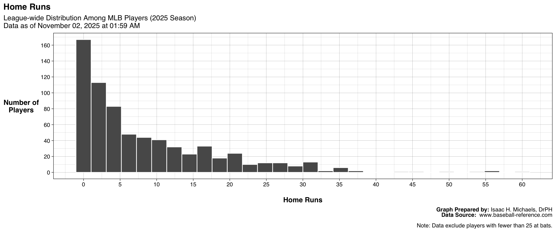
Home Runs
This figure presents the distribution of Home Run totals among all qualified batters. Each bar indicates the number of players whose Home Run counts fall within a given range. The accompanying table lists the ten players with the most Home Runs, highlighting leading power hitters. Together, the outputs display how frequently players hit for power across the league.
| League-wide Leaders: Home Runs | |||
| 2025 Season Data as of November 02, 2025 at 01:59 AM |
|||
| Rank | Player | Team | HR |
|---|---|---|---|
| 1 | Cal Raleigh# | SEA | 60 |
| 2 | Kyle Schwarber* | PHI | 56 |
| 3 | Shohei Ohtani* | LAD | 55 |
| 4 | Aaron Judge | NYY | 53 |
| 5 | Eugenio Suárez | 2TM | 49 |
| 6 | Junior Caminero | TBR | 45 |
| 7 | Juan Soto* | NYM | 43 |
| 8 | Pete Alonso | NYM | 38 |
| 9 | Jo Adell | LAA | 37 |
| 10 | Taylor Ward | LAA | 36 |
| 11 | Eugenio Suárez | ARI | 36 |
| 12 | Riley Greene* | DET | 36 |
| 13 | Nick Kurtz* | ATH | 36 |
| Table Prepared by: Isaac H. Michaels, DrPH Data Source: www.baseball-reference.com |
|||
| Note: Data exclude players with fewer than 25 at bats. | |||
Graph and Table Prepared By: Isaac H. Michaels, DrPH
Data Source: www.baseball-reference.com
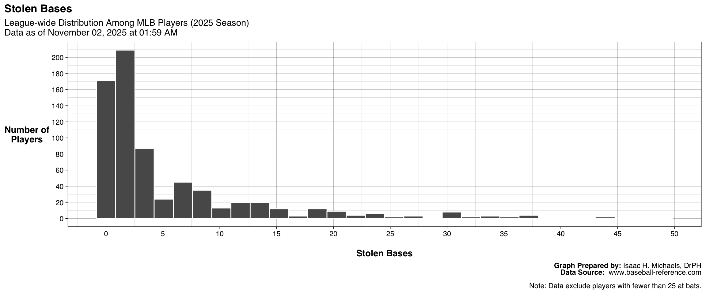
Stolen Bases
This figure shows the distribution of Stolen Bases across all qualified batters. Each bar represents the number of players with stolen base totals in a particular range. The accompanying table identifies the ten players with the most Stolen Bases, illustrating the league’s most aggressive or successful baserunners. These outputs together highlight differences in base-stealing frequency and effectiveness among players.
| League-wide Leaders: Stolen Bases | |||
| 2025 Season Data as of November 02, 2025 at 01:59 AM |
|||
| Rank | Player | Team | SB |
|---|---|---|---|
| 1 | José Caballero | 2TM | 49 |
| 2 | José Ramírez# | CLE | 44 |
| 3 | Chandler Simpson* | TBR | 44 |
| 4 | Juan Soto* | NYM | 38 |
| 5 | Bobby Witt Jr. | KCR | 38 |
| 6 | Oneil Cruz* | PIT | 38 |
| 7 | Elly De La Cruz# | CIN | 37 |
| 8 | Trea Turner | PHI | 36 |
| 9 | Pete Crow-Armstrong* | CHC | 35 |
| 10 | Victor Scott II* | STL | 34 |
| 11 | José Caballero | TBR | 34 |
| Table Prepared by: Isaac H. Michaels, DrPH Data Source: www.baseball-reference.com |
|||
| Note: Data exclude players with fewer than 25 at bats. | |||
Graph and Table Prepared By: Isaac H. Michaels, DrPH
Data Source: www.baseball-reference.com
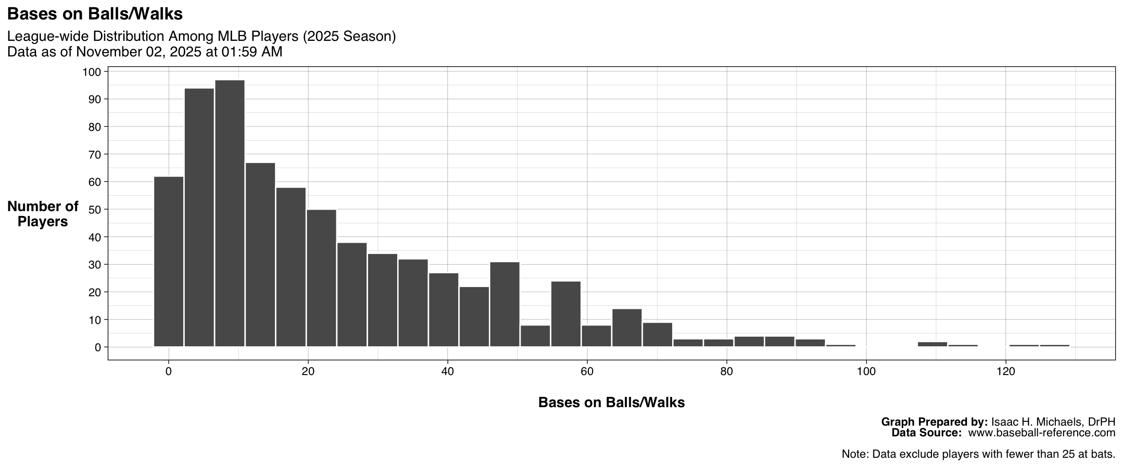
Bases on Balls/Walks
This figure displays the distribution of Bases on Balls (Walks) among all qualified batters. Each bar represents the number of players whose walk totals fall within a given range. The accompanying table lists the ten players with the highest walk counts, identifying those with the greatest plate discipline and strike zone awareness. These outputs together illustrate variation in on-base skill and patience at the plate across the league.
| League-wide Leaders: Bases on Balls/Walks | |||
| 2025 Season Data as of November 02, 2025 at 01:59 AM |
|||
| Rank | Player | Team | BB |
|---|---|---|---|
| 1 | Juan Soto* | NYM | 127 |
| 2 | Aaron Judge | NYY | 124 |
| 3 | Rafael Devers* | 2TM | 112 |
| 4 | Shohei Ohtani* | LAD | 109 |
| 5 | Kyle Schwarber* | PHI | 108 |
| 6 | Cal Raleigh# | SEA | 97 |
| 7 | Geraldo Perdomo# | ARI | 94 |
| 8 | Marcell Ozuna | ATL | 94 |
| 9 | Matt Olson* | ATL | 91 |
| 10 | Fernando Tatis Jr. | SDP | 89 |
| Table Prepared by: Isaac H. Michaels, DrPH Data Source: www.baseball-reference.com |
|||
| Note: Data exclude players with fewer than 25 at bats. | |||
Graph and Table Prepared By: Isaac H. Michaels, DrPH
Data Source: www.baseball-reference.com
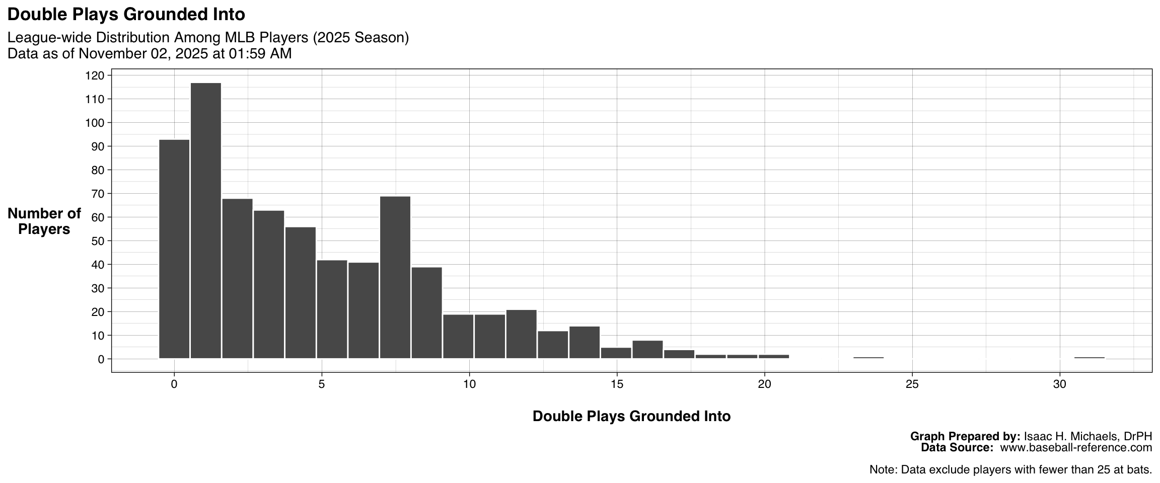
Double Plays Grounded Into
This figure shows the distribution of Double Plays Grounded Into among all qualified batters. Each bar represents the number of players whose GIDP totals fall within a specific range. The accompanying table lists the ten players who have grounded into the most double plays, providing insight into tendencies related to contact type and situational hitting. These outputs together help illustrate how frequently players contribute to defensive double plays when batting with runners on base.
| League-wide Leaders: Double Plays Grounded Into | |||
| 2025 Season Data as of November 02, 2025 at 01:59 AM |
|||
| Rank | Player | Team | GIDP |
|---|---|---|---|
| 1 | Junior Caminero | TBR | 31 |
| 2 | Pete Alonso | NYM | 23 |
| 3 | Jose Altuve | HOU | 20 |
| 4 | Iván Herrera | STL | 20 |
| 5 | Carlos Correa | 2TM | 19 |
| 6 | Trevor Larnach* | MIN | 19 |
| 7 | Tyler Soderstrom* | ATH | 18 |
| 8 | Ben Rice* | NYY | 18 |
| 9 | Juan Soto* | NYM | 17 |
| 10 | Vladimir Guerrero Jr. | TOR | 17 |
| 11 | Bo Bichette | TOR | 17 |
| 12 | Josh Naylor* | 2TM | 17 |
| Table Prepared by: Isaac H. Michaels, DrPH Data Source: www.baseball-reference.com |
|||
| Note: Data exclude players with fewer than 25 at bats. | |||
Graph and Table Prepared By: Isaac H. Michaels, DrPH
Data Source: www.baseball-reference.com
Pitching
This table presents pitching performance across Major League Baseball for all pitchers who have appeared in at least 10 games during the current season. It includes both traditional and advanced measures of pitching effectiveness and workload. Core statistics such as wins (W), losses (L), earned run average (ERA), games started (GS), and innings pitched (IP) summarize each pitcher’s role and overall contribution. Additional categories—such as complete games (CG), shutouts (SHO), and saves (SV)—highlight specific game outcomes and pitching durability.
Rate-based indicators including WHIP (walks plus hits per inning pitched), strikeouts per nine innings (SO9), and walks per nine innings (BB9) quantify efficiency and control, while advanced metrics such as Wins Above Replacement (WAR), ERA+, and fielding independent pitching (FIP) adjust for ballpark and defensive effects. Together, these data provide a nuanced view of pitcher performance, distinguishing consistent starters, high-leverage relievers, and emerging contributors across teams and leagues.