Published: October 3, 2023
Updated: October 10, 2025 at 11:20AM
Welcome
The dataset on potentially preventable readmission (PPR) rates summarizes hospital-level readmission patterns across New York State from 2009 through the most recent release. This page presents an accessible, data-driven description of risk-adjusted PPR rates, highlighting statewide trends, the distribution of hospital rates, and variation across counties and hospital sizes. The narrative and figures below are intended to help policymakers, hospital quality teams, and community partners identify patterns that may warrant further investigation or quality improvement efforts.
Data Overview
This dataset includes hospital-level observed, expected, and risk-adjusted PPR rates together with counts of at-risk admissions for each discharge year. The records cover general acute care hospitals across New York State and include auxiliary metadata such as software version used to compute rates. The data are structured as a time series by discharge year and allow comparison of hospital performance relative to expected readmission patterns after accounting for measured patient- and hospital-level factors. Where present, statewide aggregate rows are retained in the raw import but excluded from most hospital-level analyses to avoid double counting.
How to Use These Data
Researchers and analysts can use these data to summarize temporal trends in readmission-related outcomes, to compare hospital performance within and across counties, and to prioritize hospitals or regions for further inquiry. The data are suitable for descriptive analyses, benchmarking, and exploratory modeling; however, investigators should pay attention to small-sample instability for hospitals with very low numbers of at-risk admissions. Because the risk-adjusted rates are already adjusted using the provider-supplied methodology, comparisons should be contextualized with information about case mix, hospital service lines, and changes in software versions that may affect calculations across years.
Why Are These Data Important?
Potentially preventable readmissions are a commonly used indicator of quality and coordination of care. Tracking risk-adjusted PPR rates over time provides insight into whether hospital-level readmission outcomes are improving, worsening, or stable after accounting for case mix. These data are useful to health system leaders, payers, and public health agencies seeking to target interventions that reduce unnecessary readmissions and improve care transitions. They are also valuable for community stakeholders interested in accountability and monitoring of hospital performance.
What These Data Show
The outputs below move from a statewide descriptive view to more focused hospital- and county-level summaries. They illustrate overarching time trends in mean risk-adjusted PPR rates, the hospital-level distribution in the most recent year, notable high- and low-rate hospitals, variation across counties with a minimum level of hospital coverage, and the relationship between hospital size and risk-adjusted rates.
What These Data Do Not Show
These data do not provide patient-level clinical detail, diagnoses, or the specific reasons for readmission, and therefore they cannot be used to attribute causality for elevated readmission rates. They also do not include comprehensive measures of outpatient services, social determinants, or community-level resources that influence readmissions. Where software versions differ across years, some changes in rates may be attributable to methodological updates rather than true changes in clinical performance.
Implications for Public Health Practice
For public health practice, the data offer a basis for monitoring hospital performance and identifying regions where readmissions may be concentrated. The findings can inform the targeting of transitional care programs, partnerships with community-based organizations, and investments in post-discharge support. Because the data are observational and aggregated, follow-up investigations and local clinical reviews are necessary before implementing system-level changes.
Analyses
Key Statewide Summary Statistics (2016)
Below is a concise table of key statewide summary statistics for the most recent year to serve as a quick reference for readers and decisionmakers. These values summarize the central tendency and count-based thresholds that are often used in prioritization.
| Key Statewide Summary Statistics (2016) | ||||
| Year | Number of Hospitals | Mean Risk-Adjusted Rate | Median Risk-Adjusted Rate | Hospitals with Rate > 10 |
|---|---|---|---|---|
| 2016 | 211 | 6.32 | 6.37 | 4 |
Table Prepared By: Isaac H. Michaels, DrPH
Data Source: New York State Department of Health
Statewide Trend
The paragraph below describes the statewide trend visualization and links to the distribution view that follows.
This figure shows the mean risk-adjusted PPR rate across New York hospitals for each available discharge year. Observing the average over time helps identify whether statewide risk-adjusted readmission rates are moving in a consistent direction or fluctuating. Having seen the statewide pattern, we next examine how individual hospital rates are distributed in the most recent year to understand whether statewide trends reflect broad change or are driven by a subset of hospitals.
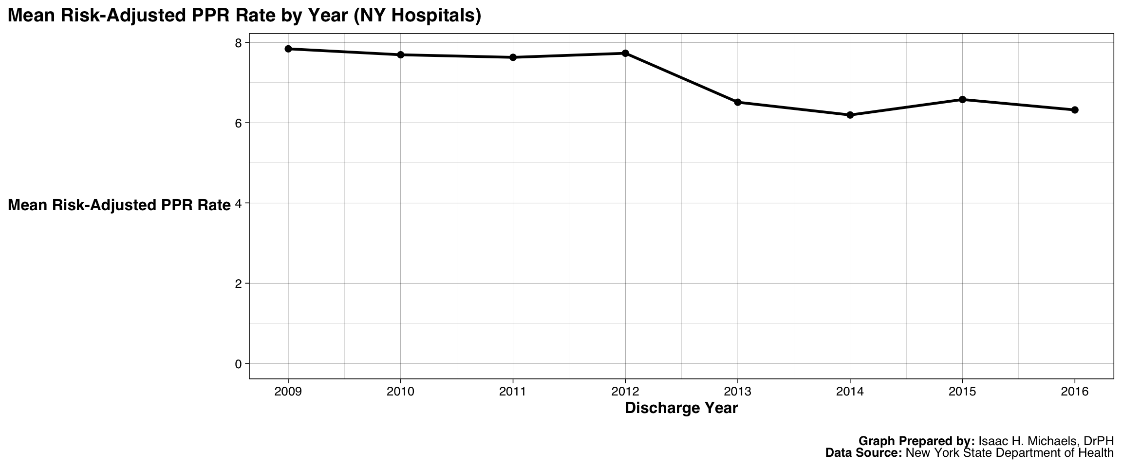
Graph Prepared By: Isaac H. Michaels, DrPH
Data Source: New York State Department of Health
Distribution of Hospital Rates (2016)
The histogram below displays the distribution of hospital-level risk-adjusted PPR rates for the most recent year of available data. This distribution reveals whether most hospitals cluster near the statewide mean or whether there is wide variability that could signal pockets of higher readmission risk. After reviewing this distribution, the next table highlights hospitals with the highest rates to focus attention on potentially actionable outliers.
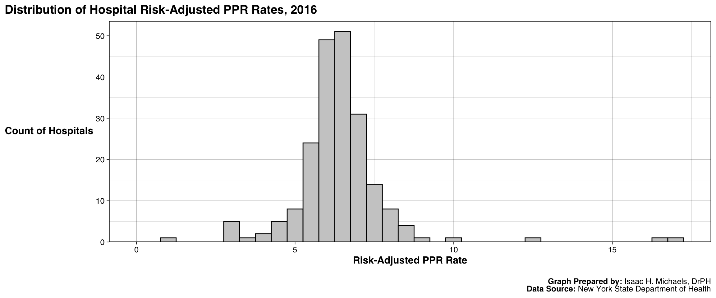
Graph Prepared By: Isaac H. Michaels, DrPH
Data Source: New York State Department of Health
Top 10 Hospitals by Risk-Adjusted Rate (2016)
The table below lists the 10 hospitals with the highest risk-adjusted PPR rates in the most recent year. Focusing on the top decile helps identify institutions that may benefit from additional review or targeted quality improvement. The following section then expands the view to examine county-level variation among counties with multiple reporting hospitals.
| Top 10 Hospitals by Risk-Adjusted PPR Rate (2016) | |||||
| Year | Facility ID | Facility Name | County | At-Risk Admissions | Risk-Adjusted PPR Rate |
|---|---|---|---|---|---|
| 2016 | 482 | St. Mary's Healthcare - Amsterdam Memorial Campus | Montgomery | 10 | 17.22 |
| 2016 | 1460 | New York Eye and Ear Infirmary of Mount Sinai | Manhattan | 231 | 16.27 |
| 2016 | 817 | Clifton-Fine Hospital | Saint Lawrence | 38 | 12.38 |
| 2016 | 379 | Carthage Area Hospital Inc | Jefferson | 1135 | 10.14 |
| 2016 | 377 | River Hospital, Inc. | Jefferson | 52 | 8.93 |
| 2016 | 1318 | Wyckoff Heights Medical Center | Kings | 10422 | 8.69 |
| 2016 | 114 | TLC Health Network Lake Shore Hospital | Chautauqua | 790 | 8.52 |
| 2016 | 1002 | Ellenville Regional Hospital | Ulster | 207 | 8.35 |
| 2016 | 102 | Womans Christian Assoc Hospital - WCA Hosp at Jones Memorial Health Ce | Chautauqua | 895 | 8.26 |
| 2016 | 1635 | St Johns Episcopal Hospital So Shore | Queens | 6215 | 8.10 |
Table Prepared By: Isaac H. Michaels, DrPH
Data Source: New York State Department of Health
County-Level Variation (Selected Counties)
This boxplot summarizes hospital-level risk-adjusted PPR rates across counties that have at least five reporting hospitals in the most recent year. Using counties with multiple hospitals reduces instability from single-hospital counties and allows comparison of central tendency and spread across counties. After examining county variation, we consider whether hospital size is associated with higher or lower risk-adjusted rates.
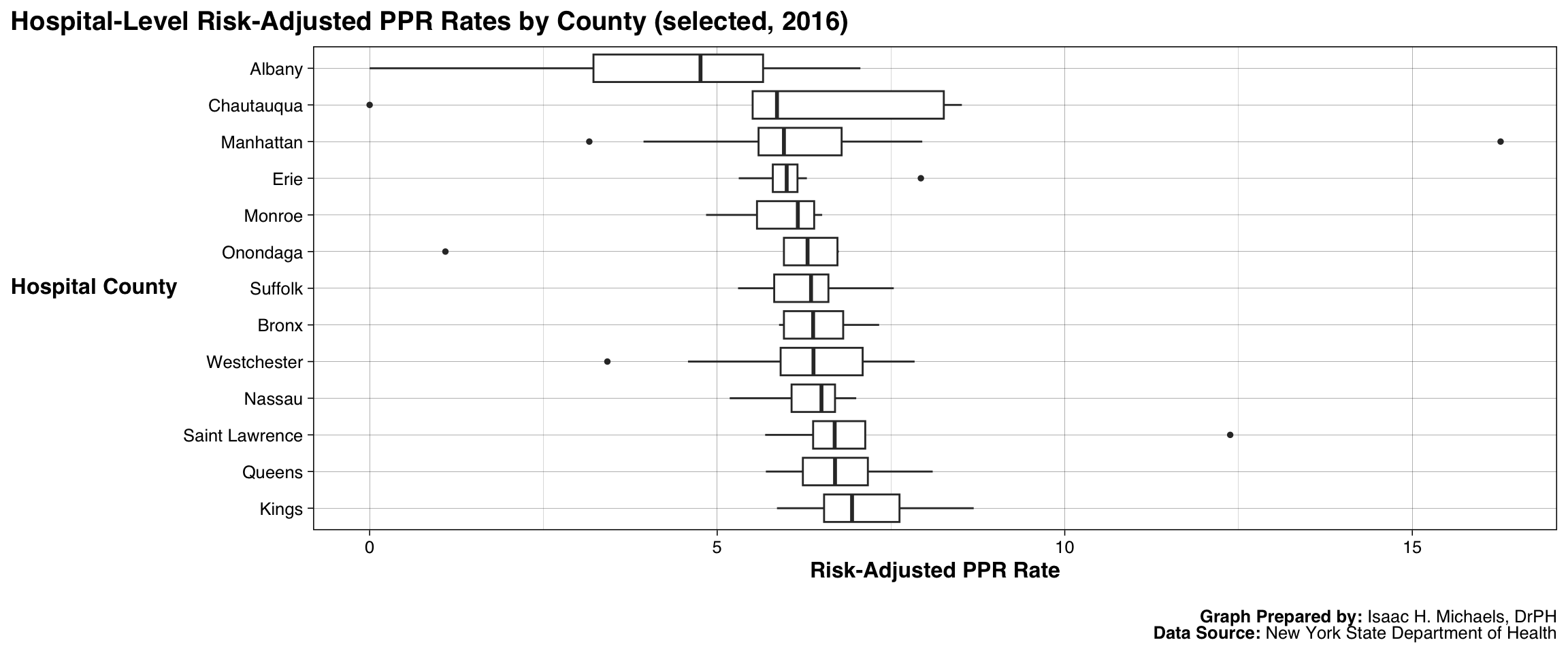
Graph Prepared By: Isaac H. Michaels, DrPH
Data Source: New York State Department of Health
Hospital Size and PPR Rate
The scatterplot below examines the relationship between hospital size (measured as at-risk admissions, in thousands) and the risk-adjusted PPR rate in the most recent year. Visualizing this association helps assess whether smaller hospitals systematically differ from larger hospitals in readmission rates, acknowledging that many unmeasured factors influence both size and outcomes. The final output presents a compact set of key statewide summary statistics for quick reference.
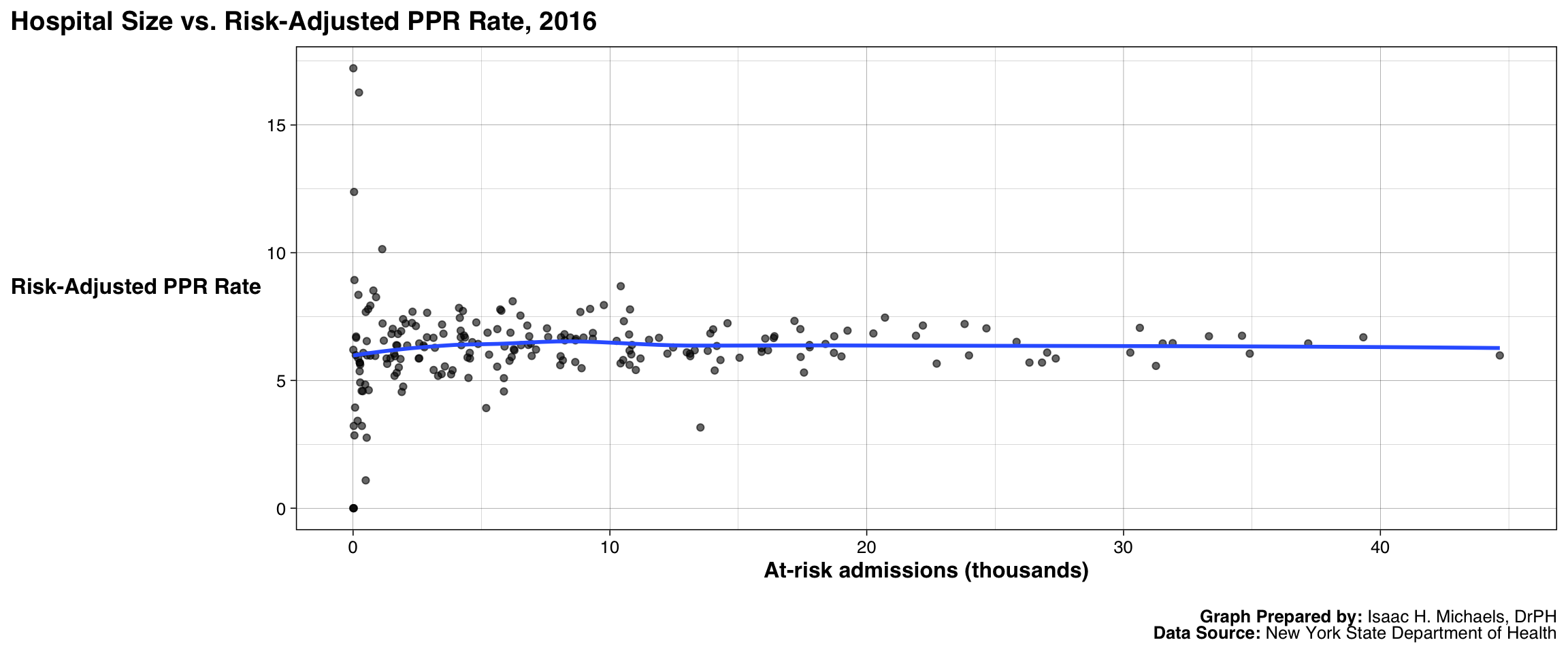
Graph Prepared By: Isaac H. Michaels, DrPH
Data Source: New York State Department of Health
PPR Rates by Hospital
The table below presents potentially preventable readmission (PPR) rates for hospitals in New York State, showing both the most recent rate available and trends over time. Each row represents an individual hospital, allowing readers to quickly compare current performance with historical patterns. The sparklines illustrate whether readmission rates have been generally rising, falling, or remaining stable across the reporting period. While these visualizations help highlight broad trajectories, they do not capture all of the factors influencing hospital readmissions, such as differences in patient populations, community conditions, or care practices. Instead, they provide a concise view of hospital-level patterns that can guide further exploration into the underlying causes of variation in readmission rates across the state.
| Hospital Potentially Preventable Readmission (PPR) Risk-Adjusted Rates in New York | |||||
| Hospital | County | Latest Discharge Year | Latest At-Risk Admissions | Latest PPR Rate | Trend Over Time |
|---|---|---|---|---|---|
| Adirondack Medical Center-Saranac Lake Site | Franklin | 2016 | 1,872 | 6.9 | |
| Albany Medical Center - South Clinical Campus | Albany | 2016 | 6 | 0.0 | |
| Albany Medical Center Hospital | Albany | 2016 | 30,634 | 7.1 | |
| Albany Memorial Hospital | Albany | 2016 | 1,951 | 4.8 | |
| Alice Hyde Medical Center | Franklin | 2016 | 1,495 | 6.8 | |
| Arnot Ogden Medical Center | Chemung | 2016 | 8,973 | 6.7 | |
| Auburn Community Hospital | Cayuga | 2016 | 4,156 | 7.5 | |
| Aurelia Osborn Fox Memorial Hospital | Otsego | 2016 | 1,748 | 6.8 | |
| Bellevue Hospital Center | Manhattan | 2016 | 20,710 | 7.5 | |
| Benedictine Hospital | Ulster | 2012 | 2,802 | 7.4 | |
| Bertrand Chaffee Hospital | Erie | 2016 | 672 | 7.9 | |
| Beth Israel Med Center-Kings Hwy Div | Kings | 2012 | 8,449 | 8.5 | |
| Beth Israel Medical Center/Beth Israel Brooklyn | Kings | 2013 | 7,803 | 7.8 | |
| Beth Israel Medical Center/Petrie Campus | Manhattan | 2013 | 33,426 | 7.3 | |
| Blythedale Childrens Hospital | Westchester | 2016 | 177 | 3.4 | |
| Bon Secours Community Hospital | Orange | 2016 | 2,575 | 6.5 | |
| Bronx-Lebanon Hospital Center - Concourse Division | Bronx | 2016 | 20,259 | 6.8 | |
| Bronx-Lebanon Hospital Center - Fulton Division | Bronx | 2016 | 2,747 | 6.4 | |
| Brookdale Hospital Medical Center | Kings | 2016 | 11,192 | 5.9 | |
| Brookhaven Memorial Hospital Medical Center Inc | Suffolk | 2016 | 8,897 | 5.5 | |
| Brooklyn Hospital Center - Downtown Campus | Kings | 2016 | 10,783 | 7.8 | |
| Brooks Memorial Hospital | Chautauqua | 2016 | 1,780 | 5.5 | |
| Buffalo General Medical Center | Erie | 2016 | 18,723 | 6.1 | |
| Calvary Hospital Inc | Bronx | 2016 | 105 | 6.0 | |
| Canton-Potsdam Hospital | Saint Lawrence | 2016 | 4,191 | 6.7 | |
| Carthage Area Hospital Inc | Jefferson | 2016 | 1,135 | 10.1 | |
| Catskill Regional Medical Center | Sullivan | 2016 | 3,465 | 7.2 | |
| Catskill Regional Medical Center - G. Hermann Site | Sullivan | 2016 | 26 | 3.2 | |
| Cayuga Medical Center at Ithaca | Tompkins | 2016 | 5,873 | 4.6 | |
| Champlain Valley Physicians Hospital Medical Center | Clinton | 2014 | 8,019 | 6.1 | |
| Chenango Memorial Hospital Inc | Chenango | 2016 | 1,303 | 5.9 | |
| Claxton-Hepburn Medical Center | Saint Lawrence | 2016 | 2,446 | 7.1 | |
| Clifton Springs Hospital and Clinic | Ontario | 2016 | 1,600 | 6.0 | |
| Clifton-Fine Hospital | Saint Lawrence | 2016 | 38 | 12.4 | |
| Cobleskill Regional Hospital | Schoharie | 2016 | 333 | 4.6 | |
| Coler-Goldwater Spec Hosp&Nurs Fac - Goldwater Hospital Site | Manhattan | 2013 | 48 | 2.5 | |
| Coler-Goldwater Specialty Hospital & Nursing Facility - Coler Hospital | Manhattan | 2012 | 10 | 12.3 | |
| Columbia Memorial Hospital | Columbia | 2016 | 4,277 | 7.7 | |
| Community Memorial Hospital Inc | Madison | 2016 | 1,197 | 6.6 | |
| Coney Island Hospital | Kings | 2016 | 10,748 | 6.8 | |
| Corning Hospital | Steuben | 2016 | 3,816 | 5.2 | |
| Cortland Regional Medical Center Inc | Cortland | 2016 | 2,776 | 6.3 | |
| Crouse Hospital | Onondaga | 2016 | 17,781 | 6.3 | |
| Crouse Hospital - Commonwealth Division | Onondaga | 2016 | 492 | 1.1 | |
| Cuba Memorial Hospital Inc | Allegany | 2016 | 27 | 0.0 | |
| Degraff Memorial Hospital | Niagara | 2016 | 1,328 | 5.7 | |
| Delaware Valley Hospital Inc | Delaware | 2016 | 277 | 5.6 | |
| Eastern Long Island Hospital | Suffolk | 2016 | 1,698 | 5.3 | |
| Eastern Niagara Hospital - Lockport Division | Niagara | 2016 | 3,519 | 6.8 | |
| Eastern Niagara Hospital - Newfane Division | Niagara | 2014 | 513 | 6.7 | |
| Edward John Noble Hospital of Gouverneur | Saint Lawrence | 2013 | 282 | 9.0 | |
| Elizabethtown Community Hospital | Essex | 2014 | 217 | 6.5 | |
| Ellenville Regional Hospital | Ulster | 2016 | 207 | 8.3 | |
| Ellis Hospital | Schenectady | 2016 | 11,911 | 6.7 | |
| Ellis Hospital - Bellevue Woman's Care Center Division | Schenectady | 2016 | 5,183 | 3.9 | |
| Elmhurst Hospital Center | Queens | 2016 | 15,906 | 6.3 | |
| Erie County Medical Center | Erie | 2016 | 12,239 | 6.0 | |
| F F Thompson Hospital | Ontario | 2016 | 4,543 | 6.1 | |
| Faxton-St Lukes Healthcare St Lukes Division | Oneida | 2016 | 11,524 | 6.6 | |
| Flushing Hospital Medical Center | Queens | 2016 | 14,579 | 7.2 | |
| Forest Hills Hospital | Queens | 2015 | 13,693 | 6.5 | |
| Franklin Hospital | Nassau | 2015 | 6,940 | 6.6 | |
| Geneva General Hospital | Ontario | 2016 | 2,876 | 6.7 | |
| Glen Cove Hospital | Nassau | 2016 | 2,555 | 5.9 | |
| Glens Falls Hospital | Warren | 2016 | 10,765 | 6.2 | |
| Good Samaritan Hospital Medical Center | Suffolk | 2016 | 22,187 | 7.2 | |
| Good Samaritan Hospital of Suffern | Rockland | 2016 | 13,809 | 6.2 | |
| Gouverneur Hospital | Saint Lawrence | 2016 | 266 | 5.7 | |
| Harlem Hospital Center | Manhattan | 2016 | 9,765 | 8.0 | |
| HealthAlliance Hospital Broadway Campus | Ulster | 2016 | 5,774 | 7.7 | |
| HealthAlliance Hospital Mary's Avenue Campus | Ulster | 2016 | 2,045 | 7.2 | |
| Helen Hayes Hospital | Rockland | 2016 | 197 | 5.9 | |
| Henry J. Carter Specialty Hospital | Manhattan | 2016 | 77 | 3.9 | |
| Highland Hospital | Monroe | 2016 | 15,906 | 6.1 | |
| Hospital for Special Surgery | Manhattan | 2016 | 13,525 | 3.2 | |
| Hudson Valley Hospital Center | Westchester | 2015 | 6,600 | 6.4 | |
| Huntington Hospital | Suffolk | 2016 | 14,163 | 6.3 | |
| Institute of Rehab Medicine NYU Medical Center | Manhattan | 2011 | 1 | 0.0 | |
| Interfaith Medical Center | Kings | 2016 | 6,128 | 6.9 | |
| Ira Davenport Memorial Hospital Inc | Steuben | 2016 | 277 | 4.9 | |
| Jacobi Medical Center | Bronx | 2016 | 15,047 | 5.9 | |
| Jamaica Hospital Medical Center | Queens | 2016 | 19,252 | 7.0 | |
| John T Mather Memorial Hospital of Port Jefferson New York Inc | Suffolk | 2016 | 8,678 | 6.6 | |
| Kenmore Mercy Hospital | Erie | 2016 | 6,284 | 6.2 | |
| Kings County Hospital Center | Kings | 2016 | 17,415 | 7.0 | |
| Kingsbrook Jewish Medical Center | Kings | 2016 | 5,730 | 7.8 | |
| Kingston Hospital | Ulster | 2012 | 7,057 | 8.8 | |
| Lakeside Memorial Hospital | Monroe | 2013 | 324 | 7.0 | |
| Lawrence Hospital Center | Westchester | 2014 | 9,441 | 5.9 | |
| Lenox Hill Hospital | Manhattan | 2016 | 26,825 | 5.7 | |
| Lewis County General Hospital | Lewis | 2016 | 1,149 | 7.2 | |
| Lincoln Medical & Mental Health Center | Bronx | 2016 | 17,186 | 7.3 | |
| Little Falls Hospital | Herkimer | 2016 | 532 | 6.5 | |
| Long Beach Medical Center | Nassau | 2012 | 2,188 | 8.8 | |
| Long Island Jewish Forest Hills | Queens | 2016 | 12,992 | 6.1 | |
| Long Island Jewish Medical Center | Queens | 2016 | 34,612 | 6.8 | |
| Long Island Jewish Schneiders Children's Hospital Division | Queens | 2016 | 16,049 | 6.6 | |
| Long Island Jewish Valley Stream | Nassau | 2016 | 6,859 | 6.7 | |
| Lutheran Medical Center | Kings | 2014 | 21,280 | 6.7 | |
| Maimonides Medical Center | Kings | 2016 | 34,914 | 6.0 | |
| Margaretville Hospital | Delaware | 2016 | 117 | 6.7 | |
| Mary Imogene Bassett Hospital | Otsego | 2016 | 8,458 | 6.7 | |
| Massena Memorial Hospital | Saint Lawrence | 2016 | 1,684 | 6.4 | |
| Medina Memorial Hospital | Orleans | 2016 | 495 | 7.7 | |
| Memorial Hosp of Wm F & Gertrude F Jones A/K/A Jones Memorial Hosp | Allegany | 2016 | 1,614 | 5.2 | |
| Memorial Hospital for Cancer and Allied Diseases | Manhattan | 2016 | 5,237 | 6.9 | |
| Mercy Hospital | Erie | 2015 | 16,881 | 5.1 | |
| Mercy Hospital of Buffalo | Erie | 2016 | 17,557 | 5.3 | |
| Mercy Medical Center | Nassau | 2016 | 7,597 | 6.7 | |
| Metropolitan Hospital Center | Manhattan | 2016 | 8,850 | 7.7 | |
| Mid-Hudson Valley Division of Westchester Medical Center | Dutchess | 2016 | 4,189 | 7.0 | |
| Millard Fillmore Hospital | Erie | 2012 | 1,295 | 7.4 | |
| Millard Fillmore Suburban Hospital | Erie | 2016 | 14,305 | 5.8 | |
| Monroe Community Hospital | Monroe | 2016 | 10 | 6.2 | |
| Montefiore Med Center - Jack D Weiler Hosp of A Einstein College Div | Bronx | 2016 | 23,811 | 7.2 | |
| Montefiore Medical Center - Henry & Lucy Moses Div | Bronx | 2016 | 33,324 | 6.7 | |
| Montefiore Medical Center - North Division | Bronx | 2013 | 13,564 | 6.0 | |
| Montefiore Medical Center-Wakefield Hospital | Bronx | 2016 | 13,129 | 6.0 | |
| Montefiore Mount Vernon Hospital | Westchester | 2016 | 2,294 | 7.2 | |
| Montefiore New Rochelle Hospital | Westchester | 2016 | 5,899 | 6.3 | |
| Moses-Ludington Hospital | Essex | 2016 | 51 | 2.9 | |
| Mount Sinai Beth Israel | Manhattan | 2016 | 23,981 | 6.0 | |
| Mount Sinai Beth Israel Brooklyn | Kings | 2015 | 7,160 | 7.4 | |
| Mount Sinai Brooklyn | Kings | 2016 | 6,783 | 7.2 | |
| Mount Sinai Hospital | Manhattan | 2016 | 44,650 | 6.0 | |
| Mount Sinai Hospital - Mount Sinai Hospital of Queens | Queens | 2016 | 6,256 | 6.2 | |
| Mount Sinai Roosevelt | Manhattan | 2015 | 20,623 | 6.5 | |
| Mount Sinai St. Luke's | Manhattan | 2016 | 10,262 | 6.5 | |
| Mount Sinai West | Manhattan | 2016 | 19,015 | 5.9 | |
| Mount St Marys Hospital and Health Center | Niagara | 2016 | 4,318 | 6.8 | |
| Mount Vernon Hospital | Westchester | 2012 | 2,559 | 8.0 | |
| NY Eye and Ear Infirmary | Manhattan | 2012 | 476 | 4.7 | |
| NYU Hospital for Joint Diseases | Manhattan | 2016 | 5,873 | 5.1 | |
| NYU Hospitals Center | Manhattan | 2016 | 27,359 | 5.9 | |
| NYU Lutheran Medical Center | Kings | 2016 | 17,771 | 6.4 | |
| Nassau University Medical Center | Nassau | 2016 | 14,020 | 7.0 | |
| Nathan Littauer Hospital | Fulton | 2016 | 1,845 | 5.8 | |
| New York Community Hospital of Brooklyn, Inc | Kings | 2016 | 5,617 | 7.0 | |
| New York Downtown Hospital | Manhattan | 2012 | 7,199 | 7.5 | |
| New York Eye and Ear Infirmary of Mount Sinai | Manhattan | 2016 | 231 | 16.3 | |
| New York Hospital Medical Center of Queens | Queens | 2014 | 26,017 | 6.2 | |
| New York Methodist Hospital | Kings | 2016 | 31,524 | 6.5 | |
| New York Presbyterian Hospital - Allen Hospital | Manhattan | 2016 | 10,414 | 5.7 | |
| New York Presbyterian Hospital - Columbia Presbyterian Center | Manhattan | 2016 | 37,190 | 6.5 | |
| New York Presbyterian Hospital - New York Weill Cornell Center | Manhattan | 2016 | 31,261 | 5.6 | |
| New York Presbyterian Hospital - Westchester Division | Westchester | 2016 | 3,875 | 5.4 | |
| New York Westchester Square Medical Center | Bronx | 2012 | 3,602 | 7.5 | |
| New York-Presbyterian/Lower Manhattan Hospital | Manhattan | 2016 | 11,009 | 5.4 | |
| New York-Presbyterian/Queens | Queens | 2015 | 26,180 | 6.2 | |
| NewYork-Presbyterian/Hudson Valley Hospital | Westchester | 2016 | 6,922 | 6.4 | |
| NewYork-Presbyterian/Lawrence Hospital | Westchester | 2016 | 9,332 | 6.6 | |
| NewYork-Presbyterian/Queens | Queens | 2016 | 26,335 | 5.7 | |
| Newark-Wayne Community Hospital | Wayne | 2016 | 4,797 | 7.3 | |
| Niagara Falls Memorial Medical Center | Niagara | 2016 | 4,358 | 6.7 | |
| Nicholas H Noyes Memorial Hospital | Livingston | 2016 | 1,947 | 7.4 | |
| North Central Bronx Hospital | Bronx | 2016 | 6,175 | 5.9 | |
| North General Hospital | Manhattan | 2009 | 4,663 | 10.7 | |
| North Shore University Hospital | Nassau | 2016 | 39,336 | 6.7 | |
| Northern Dutchess Hospital | Dutchess | 2016 | 4,456 | 5.9 | |
| Northern Westchester Hospital | Westchester | 2016 | 8,658 | 6.6 | |
| Nyack Hospital | Rockland | 2016 | 10,832 | 6.0 | |
| O'Connor Hospital | Delaware | 2016 | 118 | 6.7 | |
| Olean General Hospital | Cattaraugus | 2016 | 4,493 | 5.1 | |
| Oneida Healthcare | Madison | 2016 | 2,577 | 5.9 | |
| Oneida Healthcare Center | Madison | 2012 | 2,332 | 7.4 | |
| Orange Regional Medical Center | Orange | 2016 | 18,393 | 6.4 | |
| Orange Regional Medical Center-Middletown Campus | Orange | 2011 | 5,896 | 8.6 | |
| Oswego Hospital | Oswego | 2016 | 3,186 | 6.3 | |
| Oswego Hospital - Alvin L Krakau Comm Mtl Health Center Div | Oswego | 2016 | 588 | 7.8 | |
| Our Lady of Lourdes Memorial Hospital Inc | Broome | 2016 | 8,080 | 6.0 | |
| Peconic Bay Medical Center | Suffolk | 2016 | 6,516 | 7.5 | |
| Peninsula Hospital Center | Queens | 2012 | 456 | 7.3 | |
| Phelps Memorial Hospital Assn | Westchester | 2016 | 6,092 | 5.8 | |
| Plainview Hospital | Nassau | 2016 | 6,539 | 6.4 | |
| Putnam Hospital Center | Putnam | 2016 | 5,611 | 5.5 | |
| Queens Hospital Center | Queens | 2016 | 10,543 | 7.3 | |
| RUMC-Bayley Seton | Richmond | 2016 | 671 | 6.0 | |
| Richmond University Medical Center | Richmond | 2016 | 13,910 | 6.8 | |
| River Hospital, Inc. | Jefferson | 2016 | 52 | 8.9 | |
| Rochester General Hospital | Monroe | 2016 | 25,834 | 6.5 | |
| Rockefeller University Hospital | Manhattan | 2011 | 13 | 0.0 | |
| Rome Memorial Hospital, Inc | Oneida | 2016 | 3,130 | 6.7 | |
| Roswell Park Cancer Institute | Erie | 2016 | 1,631 | 6.0 | |
| SBH Health System | Bronx | 2016 | 10,860 | 6.4 | |
| SJRH - Dobbs Ferry Pavillion | Westchester | 2016 | 861 | 6.0 | |
| SJRH - Park Care Pavilion | Westchester | 2016 | 4,125 | 7.8 | |
| SJRH - St Johns Division | Westchester | 2016 | 7,550 | 7.0 | |
| SUNY Downstate Medical Center at LICH | Kings | 2014 | 629 | 8.6 | |
| SVCMC-St Vincents Manhattan | Manhattan | 2010 | 3,649 | 7.9 | |
| Samaritan Hospital | Rensselaer | 2016 | 5,296 | 6.0 | |
| Samaritan Medical Center | Jefferson | 2016 | 8,066 | 5.6 | |
| Saratoga Hospital | Saratoga | 2016 | 8,168 | 5.8 | |
| Schuyler Hospital | Schuyler | 2016 | 397 | 6.1 | |
| Seton Health System-St Mary's Campus | Rensselaer | 2012 | 3,932 | 7.2 | |
| Sheehan Memorial Hospital | Erie | 2012 | 202 | 5.9 | |
| Sisters of Charity Hospital | Erie | 2016 | 12,464 | 6.3 | |
| Sisters of Charity Hospital - St Joseph Campus | Erie | 2016 | 3,137 | 5.4 | |
| Soldiers and Sailors Memorial Hospital of Yates County Inc | Yates | 2016 | 545 | 6.0 | |
| Sound Shore Medical Center of Westchester | Westchester | 2012 | 6,570 | 8.7 | |
| South Nassau Communities Hospital | Nassau | 2016 | 16,378 | 6.7 | |
| Southampton Hospital | Suffolk | 2016 | 4,215 | 6.4 | |
| Southside Hospital | Suffolk | 2016 | 17,427 | 5.9 | |
| St Anthony Community Hospital | Orange | 2016 | 2,107 | 6.4 | |
| St Barnabas Hospital | Bronx | 2013 | 13,473 | 7.8 | |
| St Catherine of Siena Hospital | Suffolk | 2016 | 8,651 | 5.7 | |
| St Charles Hospital | Suffolk | 2016 | 8,245 | 6.6 | |
| St Elizabeth Medical Center | Oneida | 2016 | 8,096 | 6.7 | |
| St Francis Hospital | Dutchess | 2013 | 4,912 | 5.8 | |
| St Francis Hospital | Nassau | 2016 | 13,120 | 6.0 | |
| St Francis Hospital - St Francis Hospital Beacon Div | Dutchess | 2011 | 90 | 22.6 | |
| St James Mercy Hospital | Steuben | 2016 | 609 | 4.6 | |
| St James Mercy Hospital - Mercycare | Steuben | 2015 | 106 | 5.5 | |
| St Johns Episcopal Hospital So Shore | Queens | 2016 | 6,215 | 8.1 | |
| St Joseph's MC-St Vincents Westchester Division | Westchester | 2016 | 2,314 | 7.7 | |
| St Joseph's Medical Center | Westchester | 2016 | 2,884 | 7.7 | |
| St Josephs Hospital | Chemung | 2016 | 1,455 | 5.9 | |
| St Josephs Hospital Health Center | Onondaga | 2016 | 21,917 | 6.8 | |
| St Luke's Cornwall Hospital/Newburgh | Orange | 2016 | 8,231 | 6.8 | |
| St Lukes Roosevelt Hospital - St Lukes Hospital Division | Manhattan | 2013 | 11,431 | 7.2 | |
| St Lukes Roosevelt Hospital Center - Roosevelt Hospital Division | Manhattan | 2013 | 23,434 | 6.7 | |
| St Peters Hospital | Albany | 2016 | 22,724 | 5.7 | |
| St. Joseph Hospital | Nassau | 2016 | 4,641 | 6.5 | |
| St. Luke's Cornwall Hospital/Cornwall | Orange | 2011 | 143 | 7.9 | |
| St. Mary's Healthcare | Montgomery | 2016 | 4,869 | 6.4 | |
| St. Mary's Healthcare - Amsterdam Memorial Campus | Montgomery | 2016 | 10 | 17.2 | |
| St. Mary's Hospital | Rensselaer | 2016 | 1,718 | 6.4 | |
| St. Peter's Addiction Recovery Center | Albany | 2016 | 343 | 3.2 | |
| Staten Island University Hosp-North | Richmond | 2016 | 24,660 | 7.0 | |
| Staten Island University Hosp-South | Richmond | 2016 | 6,826 | 6.4 | |
| Strong Memorial Hospital | Monroe | 2016 | 31,913 | 6.5 | |
| Summit Park Hospital-Rockland County Infirmary | Rockland | 2015 | 41 | 1.5 | |
| Sunnyview Hospital and Rehabilitation Center | Schenectady | 2016 | 530 | 2.8 | |
| Syosset Hospital | Nassau | 2016 | 3,310 | 5.2 | |
| TLC Health Network Lake Shore Hospital | Chautauqua | 2016 | 790 | 8.5 | |
| TLC Health Network Tri-County Memorial Hospital | Cattaraugus | 2009 | 332 | 6.6 | |
| The Burdett Care Center | Rensselaer | 2016 | 1,895 | 4.5 | |
| The Unity Hospital of Rochester | Monroe | 2016 | 14,080 | 5.4 | |
| The Unity Hospital of Rochester-St Marys Campus | Monroe | 2016 | 471 | 4.8 | |
| The University of Vermont Health Network - Champlain Valley Physicians | Clinton | 2016 | 7,123 | 6.2 | |
| The University of Vermont Health Network - Elizabethtown Community Hos | Essex | 2016 | 257 | 5.7 | |
| UPSTATE University Hospital at Community General | Onondaga | 2016 | 6,955 | 6.0 | |
| United Health Services Hospitals Inc. - Binghamton General Hospital | Broome | 2016 | 3,447 | 5.2 | |
| United Health Services Hospitals Inc. - Wilson Medical Center | Broome | 2016 | 10,765 | 5.6 | |
| United Memorial Medical Center Bank Street Campus | Genesee | 2016 | 256 | 5.4 | |
| United Memorial Medical Center North Street Campus | Genesee | 2016 | 3,574 | 5.5 | |
| University Hospital | Suffolk | 2016 | 27,025 | 6.1 | |
| University Hospital SUNY Health Science Center | Onondaga | 2016 | 16,407 | 6.7 | |
| University Hospital of Brooklyn | Kings | 2016 | 9,230 | 7.8 | |
| Vassar Brothers Medical Center | Dutchess | 2016 | 18,735 | 6.7 | |
| Westchester Medical Center | Westchester | 2016 | 16,155 | 6.2 | |
| Westfield Memorial Hospital Inc | Chautauqua | 2016 | 19 | 0.0 | |
| White Plains Hospital Center | Westchester | 2016 | 13,301 | 6.2 | |
| Winifred Masterson Burke Rehabilitation Hospital | Westchester | 2016 | 377 | 4.6 | |
| Winthrop-University Hospital | Nassau | 2016 | 30,262 | 6.1 | |
| Woman's Christian Association | Chautauqua | 2016 | 4,551 | 5.9 | |
| Womans Christian Assoc Hospital - WCA Hosp at Jones Memorial Health Ce | Chautauqua | 2016 | 895 | 8.3 | |
| Women And Children's Hospital Of Buffalo | Erie | 2016 | 10,516 | 5.8 | |
| Woodhull Medical & Mental Health Center | Kings | 2016 | 9,336 | 6.9 | |
| Wyckoff Heights Medical Center | Kings | 2016 | 10,422 | 8.7 | |
| Wyoming County Community Hospital | Wyoming | 2016 | 1,545 | 7.0 | |
| Data as of: October 10, 2025 | |||||
Table Prepared By: Isaac H. Michaels, DrPH
Data Source: New York State Department of Health