Published: January 27, 2023
Updated: October 27, 2025 at 02:50AM
Note: The weekly data on this page are no longer being updated because CDC (as of September 27, 2023) is no longer updating the Weekly Counts of Deaths by Jurisdiction and Age dataset on data.cdc.gov.
Welcome
Welcome to this page presenting data on all-cause mortality among New York State residents. This analysis provides insights into mortality trends over time and across different age groups. The data are ascertained from CDC WONDER, a trusted source for health-related statistics in the United States. The weekly data I use for these analyses are obtained from the National Center for Health Statistics via the data.cdc.gov open data platform, and the annual data are obtained via CDC WONDER.
Data Overview
The annual data in this analysis reflect information on all-cause mortality among New York State residents spanning from 1999 to the present. They includes mortality counts, population figures, and crude mortality rates per 100,000 population. The data is categorized by age groups, making it possible to analyze how mortality rates vary across different life stages.
The weekly data in this analysis cover the period from 2015 to present. These data are presented in various forms, including as line graphs, bar graphs, and heat maps. The line graphs show overall trends, as well as trends by jurisdiction and age group. The bar graphs show trends by year. The heat maps show trends by age group and year, as well as by age group, year, and jurisdiction, by year and month, by year, month, and jurisdiction, and by year, month, and age group.
How to Use These Data
These data are intended for public health professionals, researchers, policymakers, and anyone interested in understanding the patterns and trends in mortality rates among New York State residents. This analysis can be used to identify specific age groups or years with notable changes in mortality, allowing for informed decision-making and targeted interventions.
Why are these data important?
Understanding all-cause mortality rates is crucial for public health planning and intervention strategies. These data serve as a foundation for identifying potential health disparities, evaluating the effectiveness of healthcare programs, and allocating resources to address specific age groups or time periods with elevated mortality rates. By analyzing these trends, policymakers and healthcare professionals can work to reduce mortality and improve overall community health.
What do these data show?
This analysis displays all-cause mortality counts and crude mortality rates per 100,000 population for New York State residents, organized by year and age group. It reveals how mortality rates have changed over time and highlights variations across different age groups. The data allow for an in-depth examination of mortality trends, enabling stakeholders to identify periods or demographics that may require targeted public health interventions.
What do these data not show?
While these data provide valuable insights into all-cause mortality trends, they do not provide specific information about the underlying causes of death or the impact of individual risk factors. To gain a comprehensive understanding of mortality patterns, additional data sources and analyses are necessary to explore the underlying causes and contributors to mortality among New York State residents.
Implications for Public Health Practice
The data presented here underscore the importance of ongoing monitoring and analysis of all-cause mortality rates. Public health practitioners should consider the following implications:
Targeted Interventions: Identifying age groups and years with increased mortality rates is essential for designing and implementing targeted public health interventions. Resources can be allocated to address specific health challenges within these groups.
Health Disparities: Disparities in mortality rates among different age groups may highlight the need for addressing social determinants of health and improving healthcare access for vulnerable populations.
Data-Informed Decision-Making: Policymakers and healthcare professionals can use these data to make evidence-based decisions about resource allocation, health policy development, and healthcare system improvements.
Continuous Monitoring: Regular updates and analysis of mortality data are crucial for staying informed about evolving health trends and ensuring that public health strategies remain effective.
Collaboration: Collaboration between public health agencies, healthcare providers, and community organizations is essential for implementing effective interventions and addressing the root causes of mortality disparities.
Annual Trends
Death Counts
By Year and Age Group
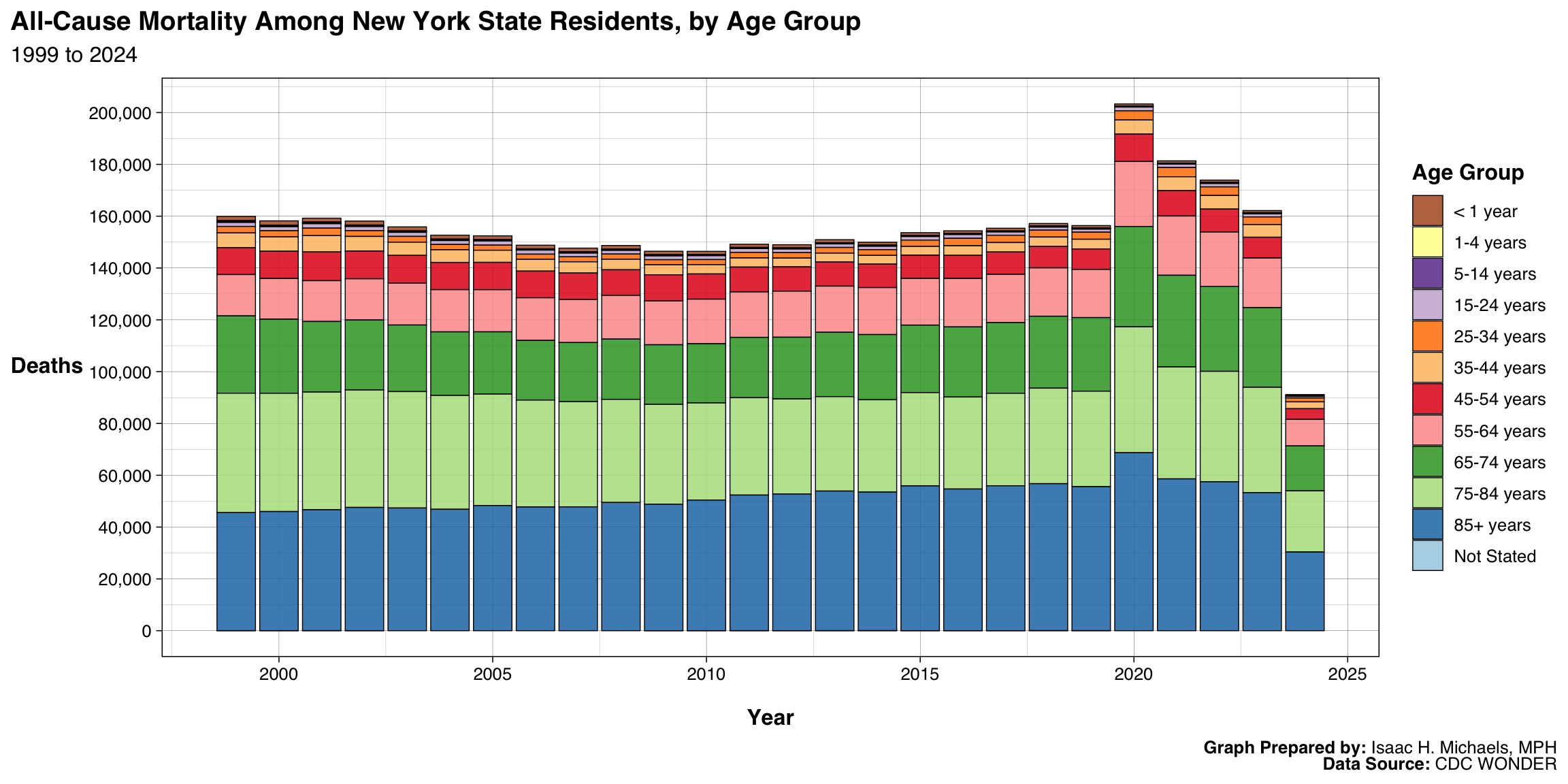
This stacked bar chart displays the number of deaths from all causes among New York State residents by year and age group. Each bar represents a single year, while the segments within each bar show the distribution of deaths across ten-year age groups. The visualization highlights both the overall trend in mortality over time and the relative contribution of each age group to total deaths.
Over the years shown, mortality generally follows predictable demographic patterns, with older age groups consistently accounting for most deaths. The gradual changes in bar height and color composition over time reflect shifts in population aging, public health improvements, and disease burden across generations. This chart provides an overview of long-term mortality trends and the demographic structure of deaths statewide.
 Graphs Prepared By: Isaac H. Michaels, MPH
Data Source: CDC WONDER
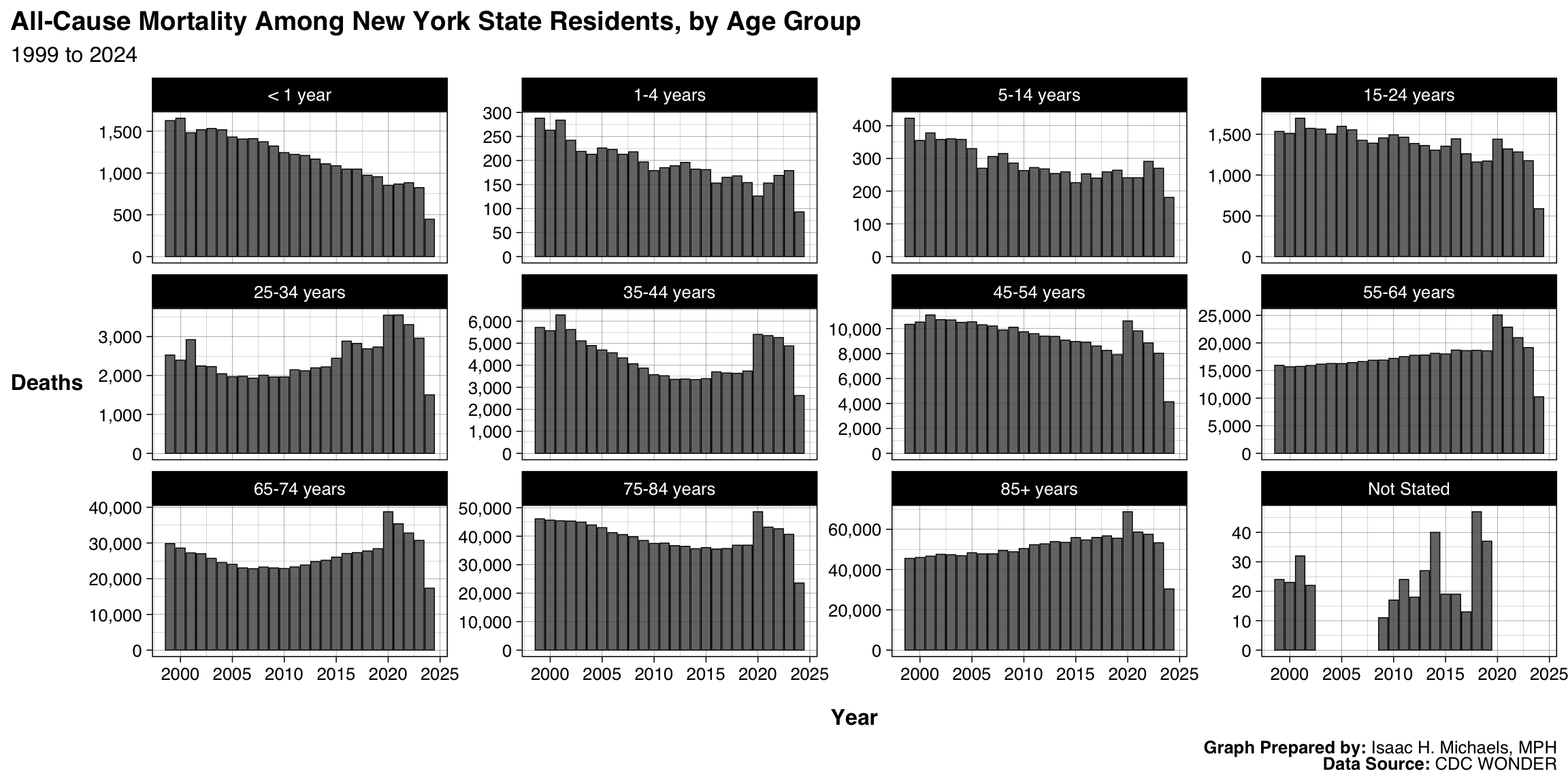
This series of bar charts shows annual all-cause mortality among New York State residents, broken down by ten-year age groups. Each panel represents one age group, with bars showing the total number of deaths per year. The differing y-axis scales allow age-specific trends to be observed without being overshadowed by the higher mortality counts among older adults.
Across all age groups, older populations continue to experience the highest mortality counts, while younger age groups display lower and more stable levels over time. The visualization highlights the age-dependent structure of mortality and allows for quick comparison of patterns across cohorts.
 Graphs Prepared By: Isaac H. Michaels, MPH
Data Source: CDC WONDER
Mortality Rates
By Year and Age Group
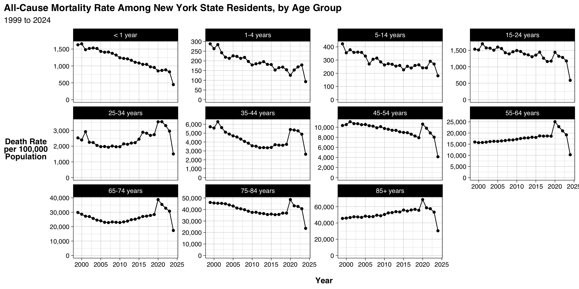
This figure displays annual all-cause mortality rates per 100,000 population among New York State residents, separated by ten-year age groups. Each panel tracks trends within a specific age group, illustrating how death rates have changed over time. The use of lines and points emphasizes gradual increases or decreases in mortality rather than abrupt shifts.
Overall, mortality rates rise with age, and temporal patterns differ across age groups—some showing steady declines consistent with improvements in public health and medical care, while others fluctuate modestly from year to year. These distinctions provide insight into how mortality risk evolves across the lifespan.
 Graphs Prepared By: Isaac H. Michaels, MPH
Data Source: CDC WONDER
Weekly Counts
Trends
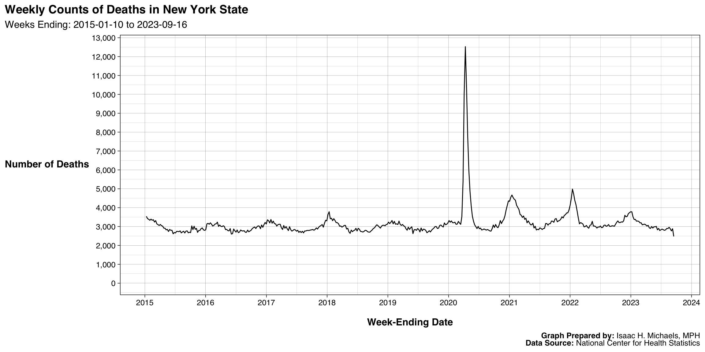
Overall
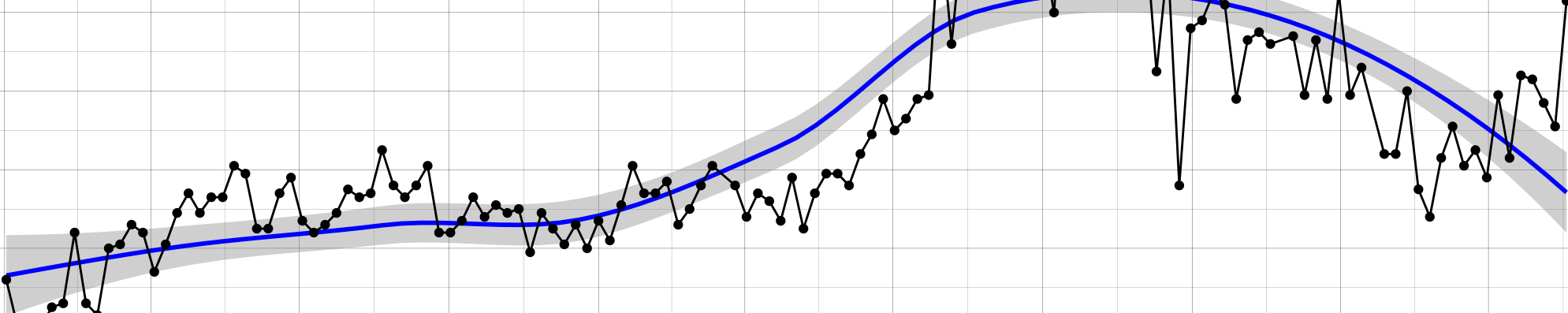
This line graph presents the total number of deaths from all causes in New York State on a weekly basis. Each point on the curve corresponds to the week ending on the date shown along the x-axis, capturing seasonal and short-term fluctuations in mortality throughout the period observed.
The data reveal expected seasonal patterns, with peaks typically occurring during winter months when respiratory illnesses are more common, and troughs during summer. This high-frequency view of mortality helps detect both routine variations and unusual surges in deaths over time.
 Graphs Prepared By: Isaac H. Michaels, MPH
Data Source: National Center for Health Statistics
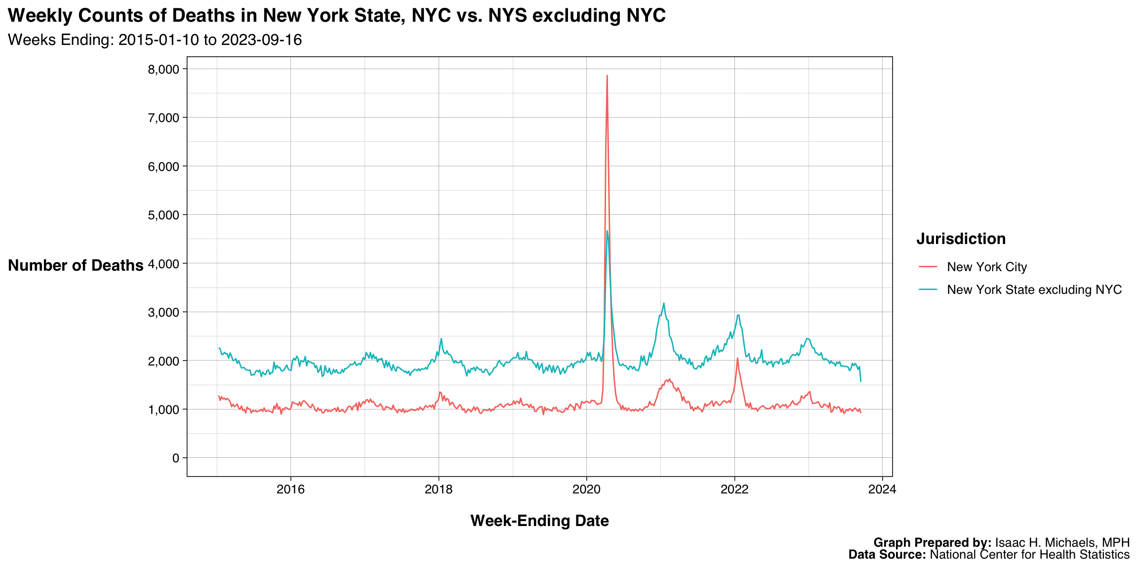
By Jurisdiction
This line graph compares weekly counts of all-cause deaths between New York City and the rest of New York State. Each line traces the number of deaths reported for each week, allowing clear visualization of parallel or divergent mortality patterns between the two jurisdictions.
The figure highlights the pronounced concentration of deaths in New York City during certain periods, particularly during large-scale public health events, while showing that mortality in the rest of the state follows similar seasonal patterns at a lower magnitude. This side-by-side view underscores both the demographic weight and the distinct temporal dynamics of New York City relative to the rest of the state.
 Graphs Prepared By: Isaac H. Michaels, MPH
Data Source: National Center for Health Statistics
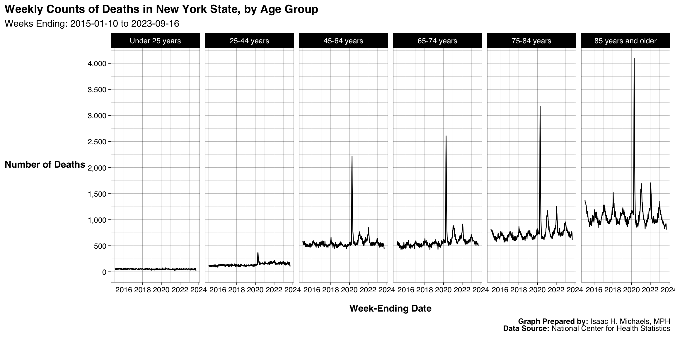
By Age Group
This figure presents weekly counts of all-cause deaths in New York State by age group. Each panel shows trends for one age group, enabling comparison of how mortality varies across the lifespan on a week-to-week basis.
The visualization illustrates that older adults experience markedly higher weekly mortality counts, with clear seasonal fluctuations, while deaths among younger groups remain lower and more stable. This disaggregation provides a fine-grained view of how mortality dynamics differ by age, revealing both expected seasonal peaks and the disproportionate impact of public health crises on older populations.
 Graphs Prepared By: Isaac H. Michaels, MPH
Data Source: National Center for Health Statistics
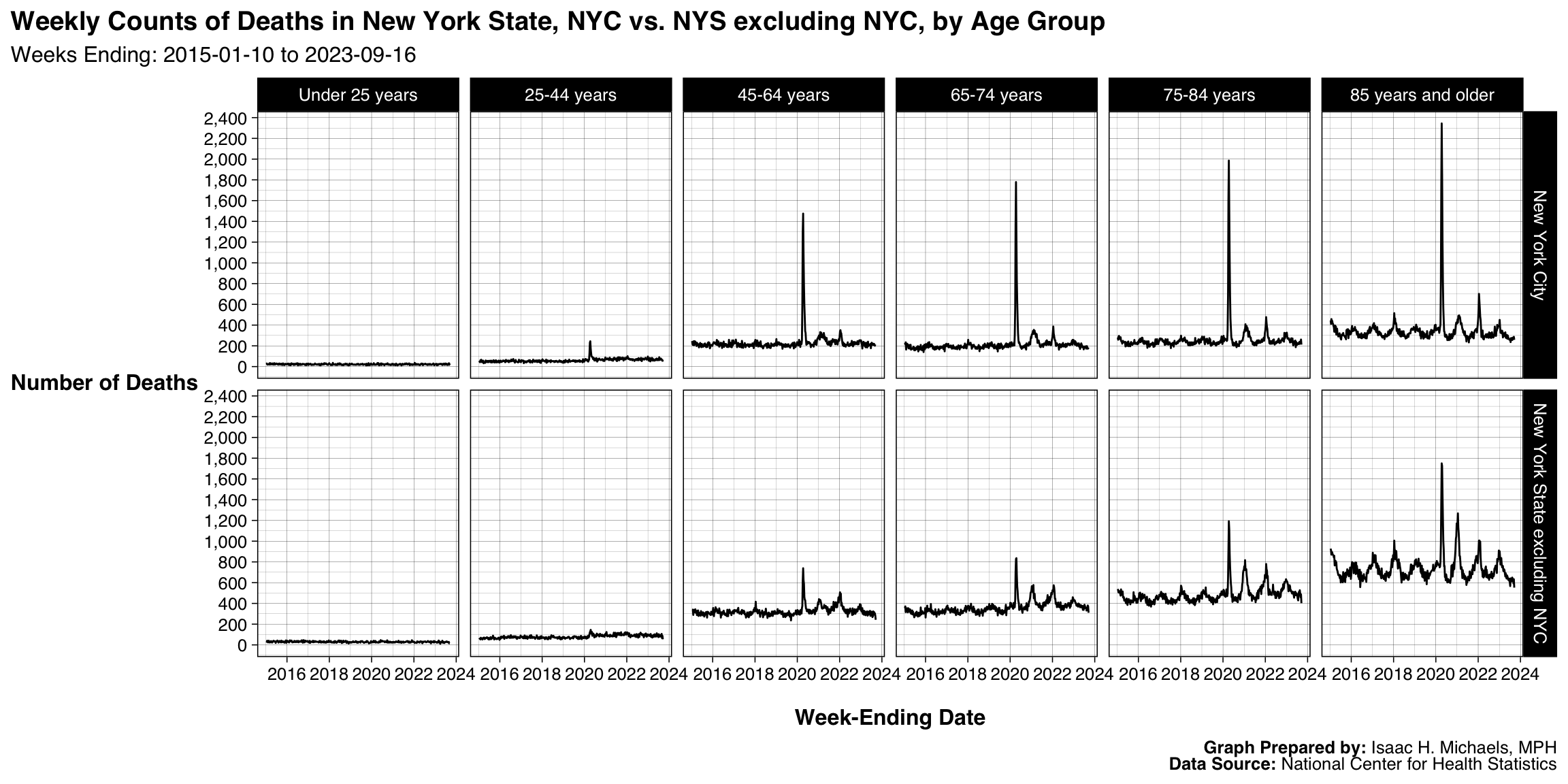
By Jurisdiction and Age Group
This grid of line charts shows weekly all-cause deaths in New York State, divided by both jurisdiction (New York City vs. the rest of the state) and age group. Each cell combines these dimensions, allowing direct comparison across locations and demographic categories.
 Graphs Prepared By: Isaac H. Michaels, MPH
Data Source: National Center for Health Statistics
Bar Graphs
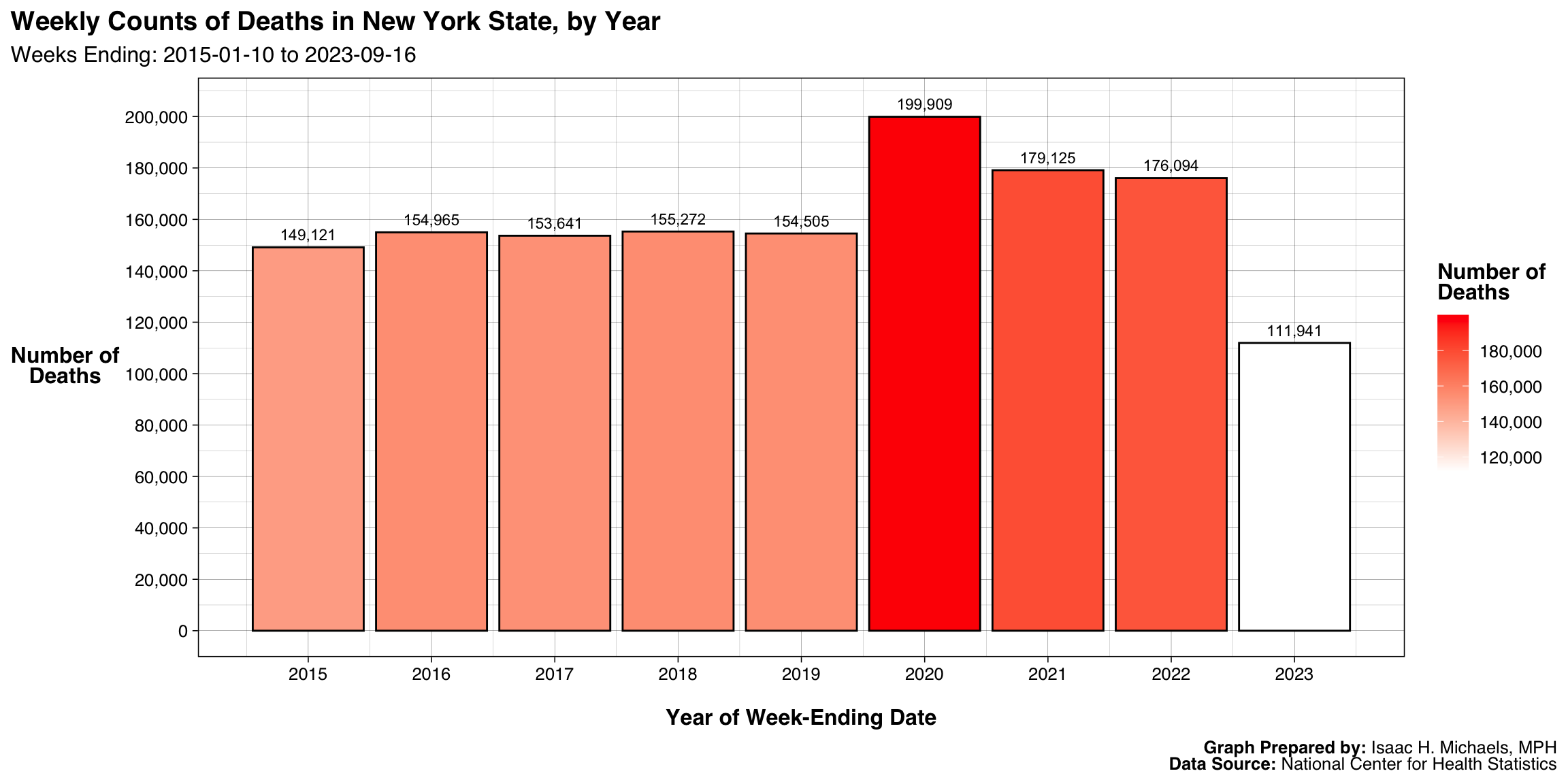
By Year
This bar chart displays the total number of deaths in New York State aggregated by calendar year, based on weekly data. The color gradient accentuates relative differences in annual totals, with darker bars representing years with more deaths.
The figure makes it easy to identify years with unusually high mortality, such as those affected by major public health events. Overall, the chart provides a succinct summary of annual mortality burdens and how they have shifted over time within the state.
 Graphs Prepared By: Isaac H. Michaels, MPH
Data Source: National Center for Health Statistics
Crosstabs
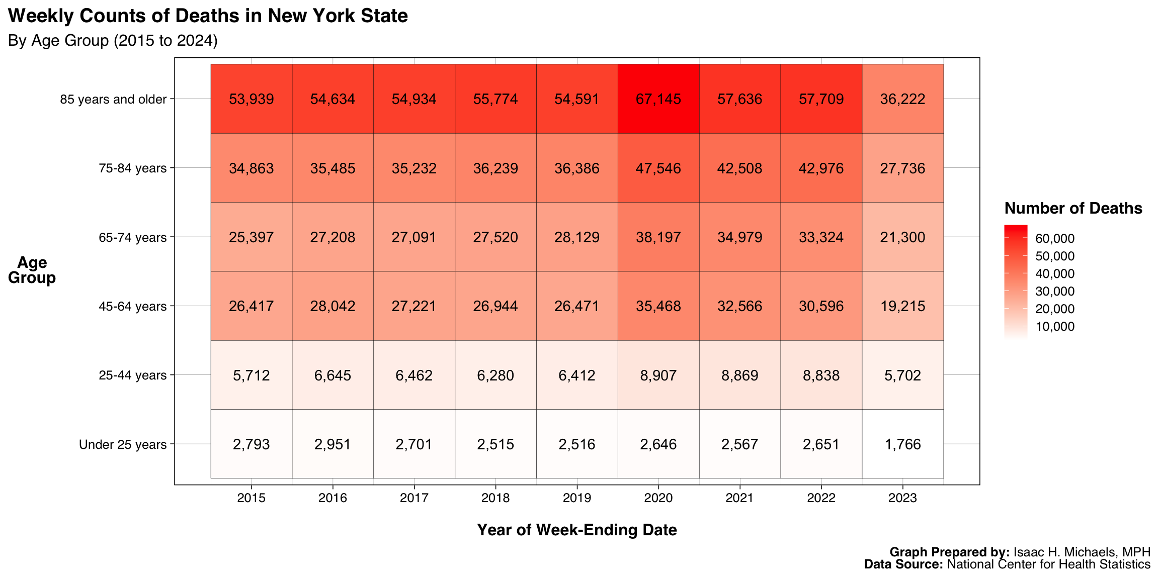
By Age Group and Year
This heatmap summarizes total deaths in New York State by age group and year. Each cell represents the number of deaths for a given age group in a specific year, with darker red shades indicating higher mortality counts. Text labels display exact values, allowing for both quantitative and visual interpretation.
 Graphs Prepared By: Isaac H. Michaels, MPH
Data Source: National Center for Health Statistics
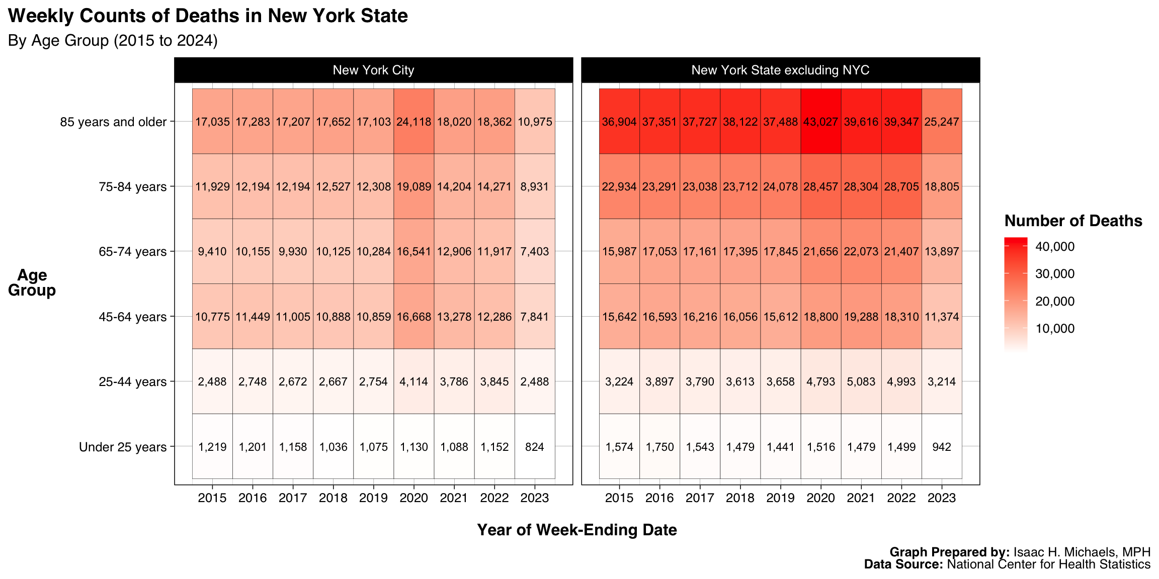
By Age Group, Year, and Jurisdiction
This heatmap extends the previous figure by comparing deaths by age group and year across two jurisdictions—New York City and the rest of New York State. Each panel displays the same scale, making differences in magnitude and pattern easily discernible. The paired panels emphasize how geography intersects with age to shape overall mortality patterns within the state.
 Graphs Prepared By: Isaac H. Michaels, MPH
Data Source: National Center for Health Statistics
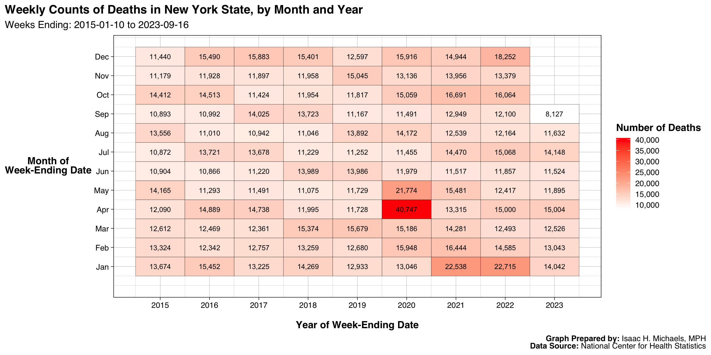
By Year and Month
This figure displays a heatmap of weekly death totals in New York State aggregated by month and year. The grid’s color gradient highlights seasonal and annual variation in mortality, with darker red cells marking months of elevated deaths. This view provides a concise visualization of how mortality fluctuates both seasonally and year to year.
 Graphs Prepared By: Isaac H. Michaels, MPH
Data Source: National Center for Health Statistics
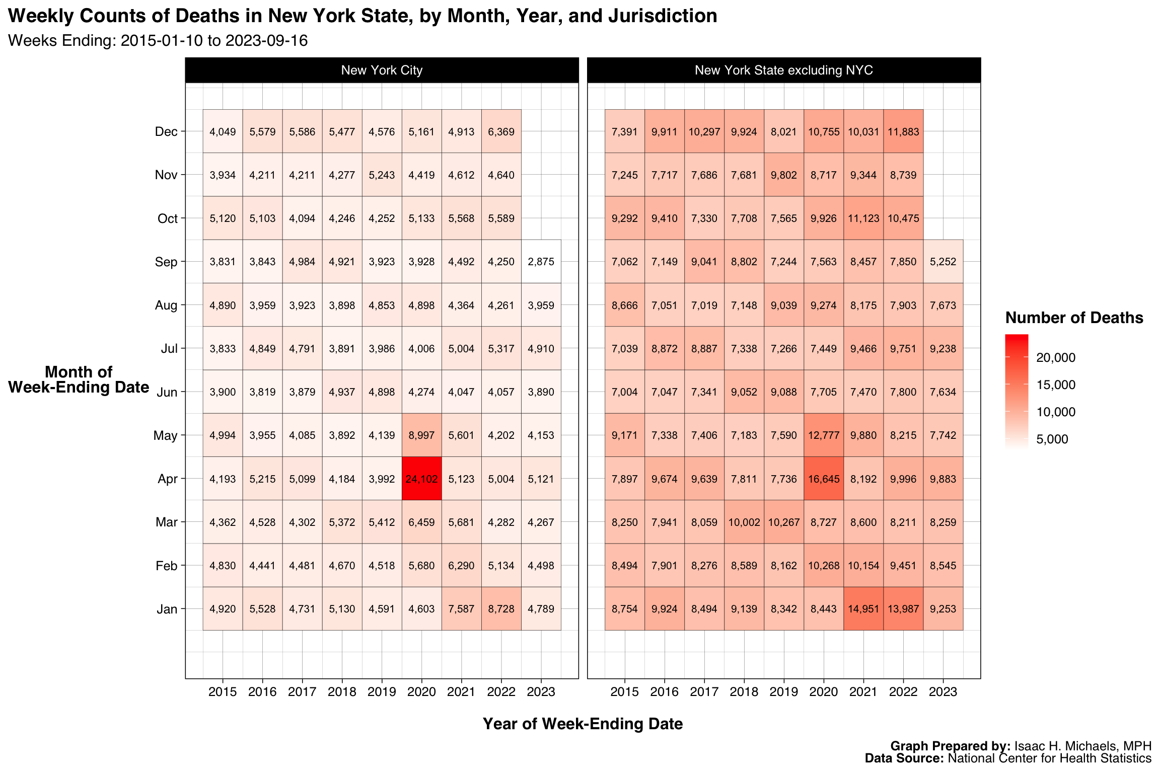
By Year, Month, and Jurisdiction
This panelled heatmap builds upon the previous figure by disaggregating monthly and annual deaths by jurisdiction—New York City and the rest of New York State. Each panel displays monthly death counts within its respective area, with shading intensity proportional to mortality volume. Together, the panels illustrate both the temporal synchrony and regional scale differences in statewide mortality trends.
 Graphs Prepared By: Isaac H. Michaels, MPH
Data Source: National Center for Health Statistics
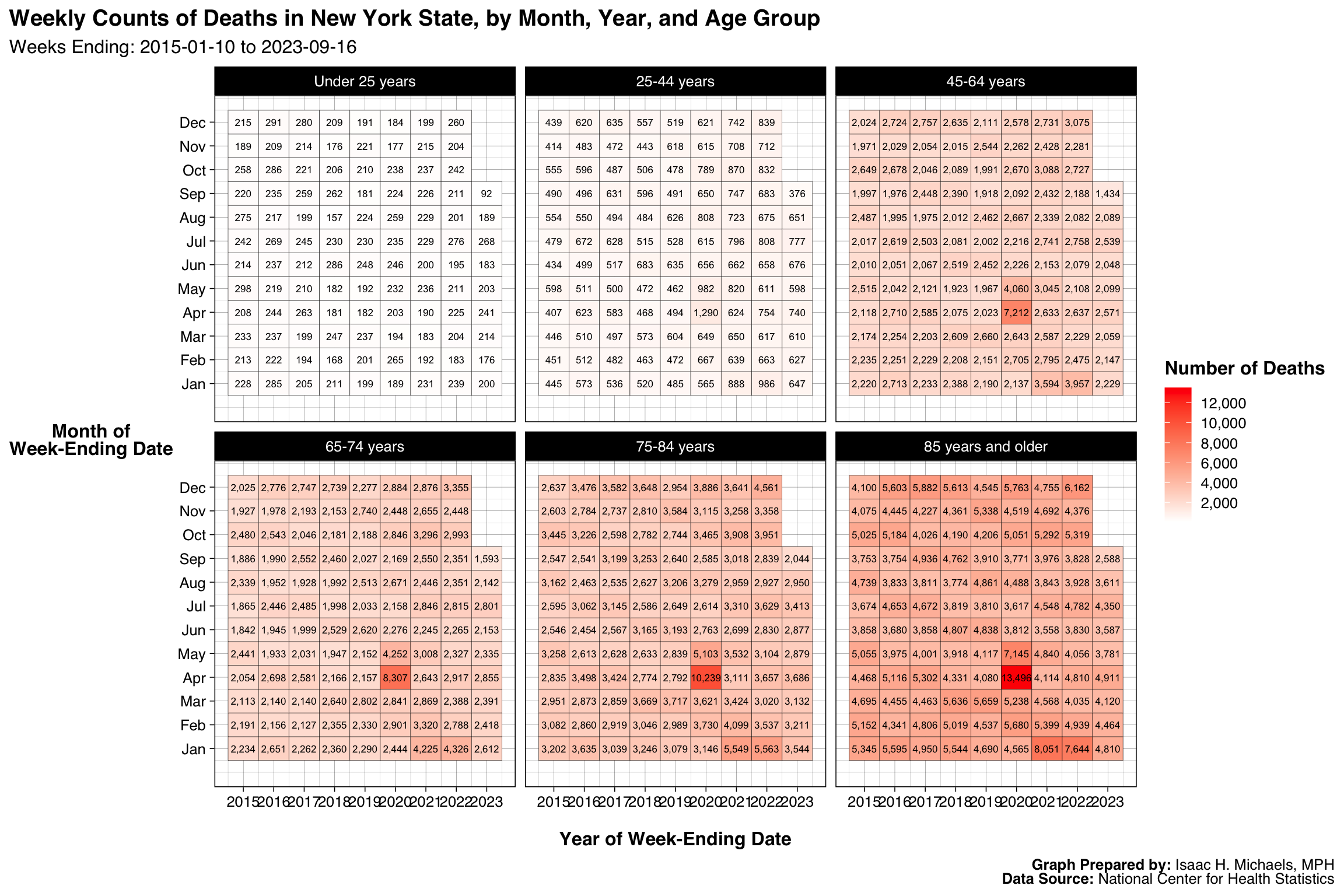
By Year, Month, and Age Group
This final heatmap presents monthly and annual deaths in New York State stratified by age group. Each facet represents one age group, with color intensity indicating the number of deaths per month and year. This format succinctly demonstrates how age and season jointly influence statewide mortality dynamics.
 Graphs Prepared By: Isaac H. Michaels, MPH
Data Source: National Center for Health Statistics